-
Interactive DashboardsCreate interactive BI dashboards with dynamic visuals.
-
End-User BI ReportsCreate and deploy enterprise BI reports for use in any vertical.
-
Wyn AlertsSet up always-on threshold notifications and alerts.
-
Localization SupportChange titles, labels, text explanations, and more.
-
Wyn ArchitectureA lightweight server offers flexible deployment.
-
 Wyn Enterprise 7.1 is ReleasedThis release emphasizes Wyn document embedding and enhanced analytical express...
 -
 Choosing an Embedded BI Solution for SaaS ProvidersAdding BI features to your applications will improve your products, better serve your customers, and more. But where to start? In this guide, we discuss the many options.
-
Visual GalleryInteractive sample dashboards and reports.
-
BlogExplore Wyn, BI trends, and more.
-
WebinarsDiscover live and on-demand webinars.
-
Customer SuccessVisualize operational efficiency and streamline manufacturing processes.
-
Knowledge BaseGet quick answers with articles and guides.
-
VideosVideo tutorials, trends and best practices.
-
WhitepapersDetailed reports on the latest trends in BI.
-
 Choosing an Embedded BI Solution for SaaS ProvidersAdding BI features to your applications will impr...
 -

- Getting Started
- Administration Guide
-
User Guide
- An Introduction to Wyn Enterprise
- Document Portal for End Users
- Data Governance and Modeling
- View and Manage Documents
- Working with Resources
- Working with Reports
-
Working with Dashboards
- Tour the Dashboard Designer
- Create a Dashboard
- Configure Dashboard
- Dashboard Data Binding
-
Scenarios
- Common Scenario Properties
- Charts
- Tables
- Indicators
- Maps
- Slicers
- Others
- Topology
- ECharts
- 3D Scenes
- Floorplan
- Component Templates
- Appearance
- Component Management
- Parameters
- Interactions
- Finalize Your Dashboard
- Using AI in Wyn
- Working with Notebooks
- Wyn Analytical Expressions
- Section 508 Compliance
- Subscribe to RSS Feed for Wyn Builds Site
- Developer Guide
Date Range Slicer
The Date Range Slicer is highly configurable date slicer that supports filtering by multiple date granularities and two display modes: single period and date range. It allows users to filter data in the dashboard dataset by a single period (Date, Year, Year-Quarter, Year-Month) or filtering on a selected range of dates. It’s ideal for dashboards that track trends over time—such as sales, performance, or activity logs.
This slicer is useful when:
You need to filter data by a specific time period (e.g., last 30 days, Q1 2024).
Users need the flexibility to adjust time filters.
You’re analyzing trends across months, quarters, or years.
Examples:
Filter sales by fiscal quarter.
View support tickets created within the last 7 days.
Data Binding
Columns – Bind a date field to use for filtering.
Date Range Slicer Properties
You can customize the appearance and behavior of the Date Range slicer using the Inspector Panel.
Slicer Style
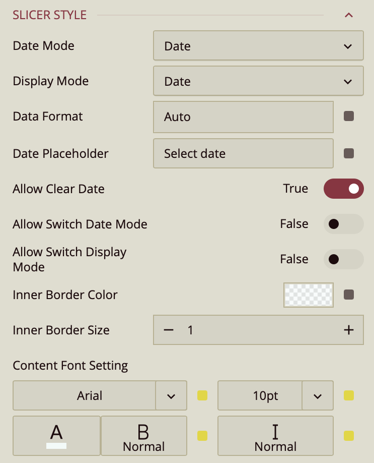
The Date Mode property specifies the period the users select to filter the dashboard. It supports filtering by Date, Year, Year-Quarter, and Year-Month. By default, users can only filter by the mode you choose but you can enable the Allow Switch Date Mode property if you want the users to change the date mode to filter by a different period.
Use the Display Mode property to change the behavior of the slicer from filtering by a single period to a date range slicer. Users would then be able to select a range with a start and end periods (e.g. between two dates or two years). Furthermore, you can enable the Allow Switch Display Mode to allow the users to switch between filtering based on a single period or range of periods.
In date range mode, you can make it easy for your users to select date ranges by specifying quick range selections. If this option is enabled and you have defined quick date ranges, a quick range selector icon will appear inside the slicer. When the user clicks the icon, a pull down appear where they can select one of the quick ranges you defined or create new one. Refer to the Defining Quick Date Range topic.
Other properties
Default Value: Specify a default value by which to filter the data.
Data Format: This controls how the bound date values are displayed. By default, it's set to
Auto, but you can change it to:DateTimeor define a Custom Format using formatting patterns (e.g.
MM/dd/yyyy).
Date Placeholder: If you do not specify a default value for the dates, you can specify a string (like Pick a Start Date) to display inside the control.
Allow Clear Date: When a date is selected in the control and the user hovers over the control, a clear symbol appears inside the control to clear the selection. If this is disabled, the user can only select another date.
Selectable Date Range: By default, the control allows selection based on the dates in the bound field. This property allows you to specify a custom date range for the users to select from. The start and end dates of this range can be bound to dashboard parameters. Dates outside the range will be dimmed and users would only be able to select dates from the specified date range.
You can adjust the look of the slicer:
Inner Border Color and Inner Border Size control the border inside the dropdown.
Content Font Settings let you set the font family, size, color, weight, and style for the slicer’s text.