-
Interactive DashboardsCreate interactive BI dashboards with dynamic visuals.
-
End-User BI ReportsCreate and deploy enterprise BI reports for use in any vertical.
-
Wyn AlertsSet up always-on threshold notifications and alerts.
-
Localization SupportChange titles, labels, text explanations, and more.
-
Wyn ArchitectureA lightweight server offers flexible deployment.
-
 Wyn Enterprise 7.1 is ReleasedThis release emphasizes Wyn document embedding and enhanced analytical express...
 -
 Choosing an Embedded BI Solution for SaaS ProvidersAdding BI features to your applications will improve your products, better serve your customers, and more. But where to start? In this guide, we discuss the many options.
-
Visual GalleryInteractive sample dashboards and reports.
-
BlogExplore Wyn, BI trends, and more.
-
WebinarsDiscover live and on-demand webinars.
-
Customer SuccessVisualize operational efficiency and streamline manufacturing processes.
-
Knowledge BaseGet quick answers with articles and guides.
-
VideosVideo tutorials, trends and best practices.
-
WhitepapersDetailed reports on the latest trends in BI.
-
 Choosing an Embedded BI Solution for SaaS ProvidersAdding BI features to your applications will impr...
 -

- Getting Started
- Administration Guide
-
User Guide
- An Introduction to Wyn Enterprise
- Document Portal for End Users
- Data Governance and Modeling
- View and Manage Documents
- Working with Resources
- Working with Reports
-
Working with Dashboards
- Tour the Dashboard Designer
- Create a Dashboard
- Configure Dashboard
-
Dashboard Data Binding
- Data Attributes
- Scenarios
- Appearance
- Component Management
- Parameters
- Interactions
- Finalize Your Dashboard
- Using AI in Wyn
- Working with Notebooks
- Wyn Analytical Expressions
- Section 508 Compliance
- Subscribe to RSS Feed for Wyn Builds Site
- Developer Guide
Percentile Calculation

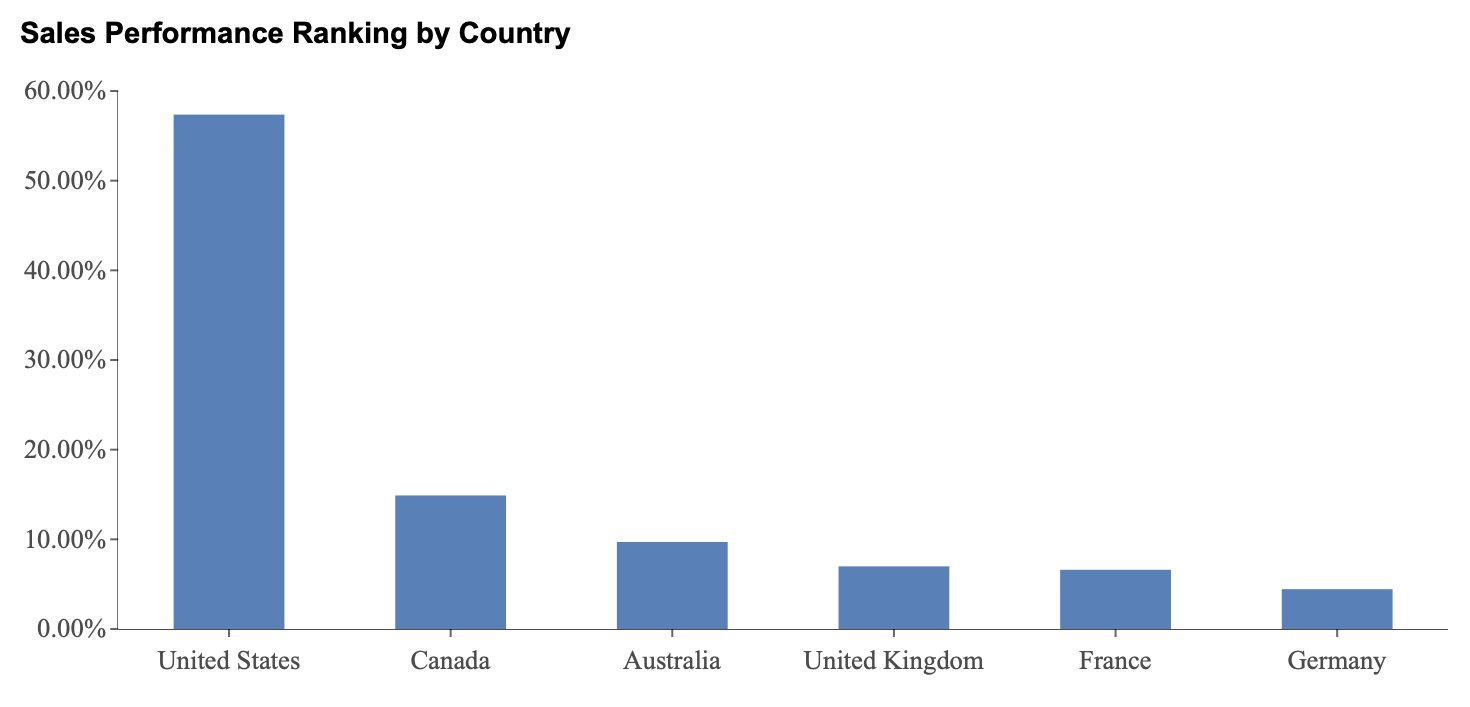
Percentile calculations transform numeric values into their relative standing within a dataset by expressing them as a percentile rank. Rather than showing raw sales amounts, the chart displays how each value compares to the rest of the dataset on a scale from 0 to 100.
Percentiles are useful when you want to understand how strongly a value performs relative to others, rather than simply identifying first place, second place, and so on. For example, a country in the 90th percentile performs better than 90 percent of the other countries in the dataset.
In this section, percentile calculations are demonstrated using a column chart titled Sales Performance Ranking by Country. This example illustrates how percentile calculations can be used to evaluate the relative performance of each country compared to the entire dataset.
Applying a percentile calculation fundamentally changes how the chart is interpreted. The value axis no longer represents the original numeric measure, such as sales amount. Instead, it represents percentile positions, showing how each value ranks relative to all other values. As a result, column heights reflect relative standing rather than raw totals.
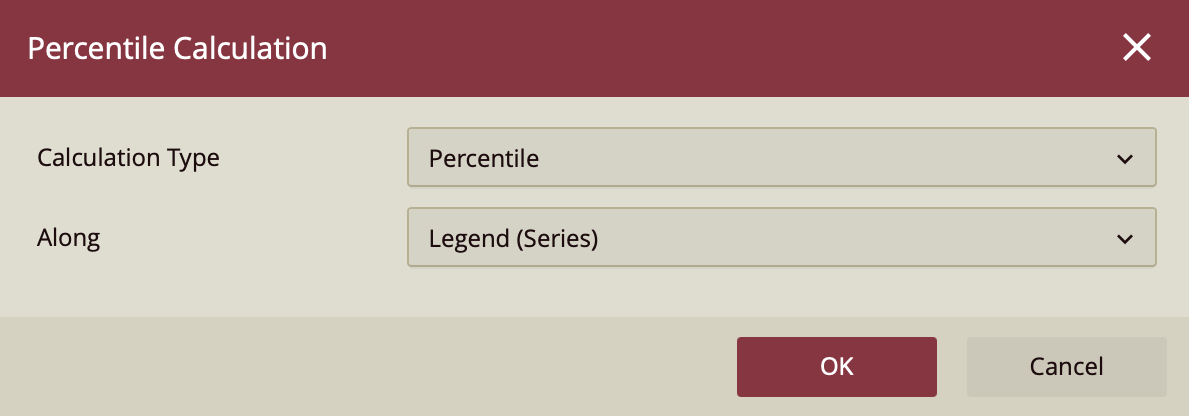
Understanding Percentile Calculation Settings
When you select Percentile Calculation from the Quick Functions menu, a configuration panel appears with settings that determine how the percentile is calculated.
Calculation Type
The Calculation Type is set to Percentile. Another available calculation type, Ranking, is covered in the previous section.

Along
The Along setting determines the grouping context in which the percentile calculation is applied.
In a simple column chart, all values belong to a single implicit series. Setting Along to Legend (Series) applies the percentile calculation across the entire dataset, allowing all categories to be compared together.
Setting Along to Axis (Category) in a simple chart evaluates each category independently. Since each category contains only a single value, the percentile becomes meaningless and may result in uniform or distorted outputs.
In grouped charts, each category contains multiple series values. Setting Along to Axis (Category) applies the percentile calculation within each category group, allowing the values in that group to be compared independently.
Trellis Columns and Trellis Rows apply percentile calculations independently within each trellis panel when the chart is split into multiple small charts.
Percentile Calculations on a Column Chart
In this example, percentile is applied across the entire dataset to show how each country performs relative to all others.
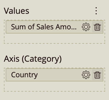
Create a column chart and bind Sales Amount to the Values data binding slot and Country to the Axis (Category).
Open the Quick Functions menu for Sales Amount (gear icon) and select Percentile Calculation. Use the default settings:
Calculation Type: Percentile
Along: Legend (Series)
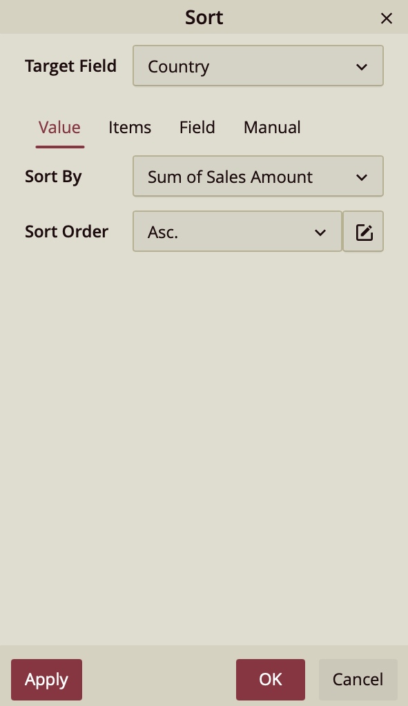
Apply sorting to improve readability. With the chart selected, open the sort options and sort by Sum of Sales Amount in ascending order.
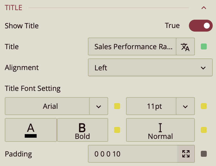
In the Inspector panel, expand the Title section and set the title to Sales Performance Ranking by Country.
In this configuration, percentile is applied globally across all countries. Each column represents the percentile position of a country relative to all other countries in the dataset. Countries with taller columns are positioned higher in the overall distribution, while shorter columns represent lower percentile positions.