- Getting Started
- Administration Guide
-
User Guide
- An Introduction to Wyn Enterprise
- Document Portal for End Users
- Data Governance and Modeling
- View and Manage Documents
- Working with Resources
- Working with Reports
- Working with Dashboards
- Working with Notebooks
- Wyn Analytical Expressions
- Section 508 Compliance
- Subscribe to RSS Feed for Wyn Builds Site
- Developer Guide
Bar Chart
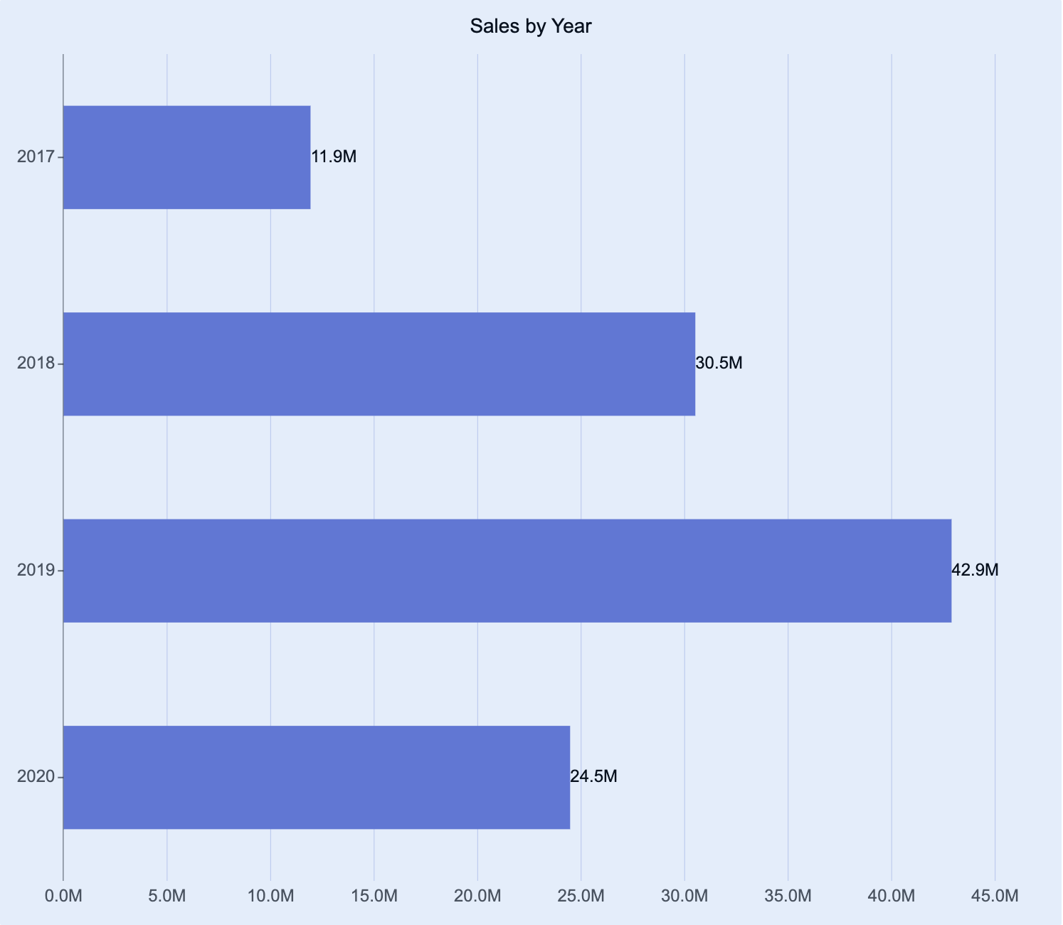
Bar charts are a visualization used to display data values as horizontal bars, making it easy to compare values across categories. The length of each bar represents its corresponding value, providing a clear visual comparison of categorical data.
You can use bar charts to compare categories side by side, highlight rankings, or analyze proportional differences between groups. You can also build grouped bar charts to analyze and compare multiple series within each category — for example, comparing department performance across regions or tracking expenses by cost type and location.
This article explains the requirements for creating bar charts and provides an overview of key properties and configuration options available in Wyn Notebooks.
You can use the bar chart to compare sales performance by product category, show top-performing employees or branches, analyze expense breakdown across departments, or display customer satisfaction scores by service type.
This topic explains how to create and customize bar charts and explains the most frequently used properties. Refer to the reference for all the column chart properties and configuration options.

Create a Bar Chart
To create a bar chart, click on the Plus (+) button, opening the dropdown from which you can select your chart.
Bind Data to Bar Chart
For a basic bar chart, you need to determine:
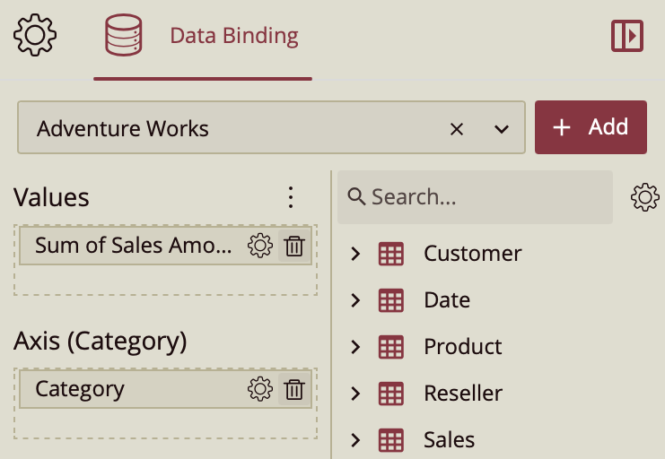
Values (X-Axis): The measure displayed on the x-axis. Typically this is a numeric field, such as Sales, Quantity, or Revenue.
Axis (Category / Y-Axis): The data displayed on the y-axis. Typically this is a categorical field, such as Product, Region, or Department.
Once your data source is selected, all data attributes appear in the Data Binding tab. You can drag the following to the binding slots of the chart:
Data attribute: Drag and drop any field from the data source.
Measure: Hover over the data source table name, click the gear icon (⚙), and select Add measure…. Define a name and an expression, click OK, then drag the measure to a binding slot.
Calculated column: Hover over the data source table name, click the gear icon (⚙), and select Add calculated column…. Define your calculation, click OK, then drag it to a binding slot.

Add Aggregations
You can control how data is aggregated and labeled in the chart:
Aggregation method: Click the gear icon (⚙) next to a bound data attribute, and select an aggregation type (e.g., Sum, Average, Count).
Rename data attribute: Click the gear icon (⚙) next to a bound data attribute and select Rename to modify how it appears in the chart.
Set Chart Title
By default, Wyn generates a chart title based on the selected data attributes.
You can modify this title in the Inspector Panel:
Click the gear icon (⚙) next to the Data Binding tab to open the Inspector Panel.
Under Title, type a custom title for your chart.
Note: Once a custom title is entered, changes to the data attributes will no longer automatically update the chart title.
Add Tooltip
To include more details in the chart’s tooltip, drag one or more data attributes into the Tooltip binding slot. Tooltips appear when hovering over bars, providing contextual details without cluttering the chart area.
Customize Colors
You can adjust the color scheme of your bar chart in Inspector Panel > Chart Style > Palette.
Choose from:
Theme: A seven-color palette based on your dashboard theme.
Standard: A set of predefined seven-color palettes.
Custom: Define your own palette to match brand colors or visualization standards.
Group Data
A grouped bar chart is used to compare multiple data series across common categories. Each group represents a category, while each bar within the group represents a different series. This layout makes it ideal for comparing segmented or layered data — for example, comparing Revenue by Department across Regions.
To create a grouped bar chart, drag the desired comparison field into the Legend (Series) binding slot. This groups the bars by the selected field, enabling side-by-side comparisons within each category.
Build a Bar Chart Trellis
A trellis column layout (also known as a small multiples view) creates a series of individual bar charts arranged horizontally. Each chart represents a subset of the data based on the field you assign.
To create a series of trellis column charts, drag a data attribute into the Trellis Columns binding slot. Each unique value in that field generates a separate chart displayed in columns across the dashboard.
A trellis row layout arranges multiple bar charts vertically, with each chart displaying a subset of the data for a particular category or group.
To create a series of trellis row charts, drag a data attribute into the Trellis Rows binding slot. Each unique value generates an individual chart displayed in rows down the dashboard.


