- Getting Started
- Administration Guide
-
User Guide
- An Introduction to Wyn Enterprise
- Document Portal for End Users
- Data Governance and Modeling
- View and Manage Documents
- Working with Resources
- Working with Reports
- Working with Dashboards
- Working with Notebooks
- Wyn Analytical Expressions
- Section 508 Compliance
- Subscribe to RSS Feed for Wyn Builds Site
- Developer Guide
Scatter Chart
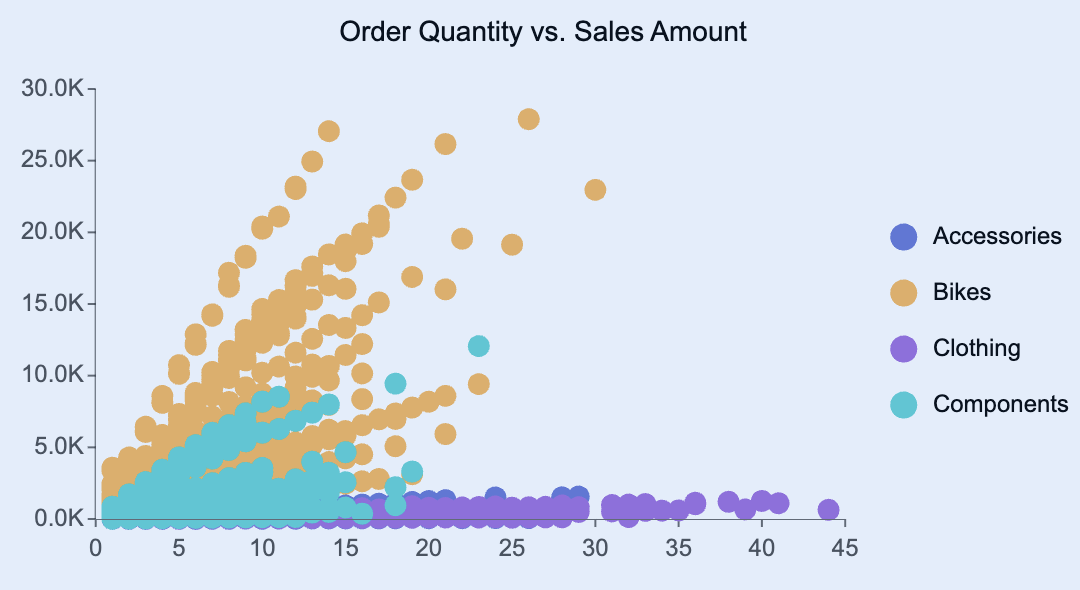
Scatter plots are a visualization used to display the relationship between two numerical variables. Each point on the chart represents an observation with coordinates determined by its values on the x-axis and y-axis. This allows you to identify correlations, clusters, and outliers within your data.
You can use scatter plots to visualize how one measure changes in relation to another — for example, exploring the relationship between product cost and sales amount, customer spending and number of purchases, or order quantity and profit.
This article explains the requirements for creating scatter plots and provides an overview of key properties and configuration options available in Wyn Notebooks.
You can use scatter plots to display relationships such as the correlation between Sales Amount and Order Quantity by Product Category, the relationship between Standard Cost and List Price across different Product Subcategories, or customer segmentation patterns showing Number of Orders vs. Total Purchases by Region.
This topic explains how to create and customize data tables and explains the most frequently used properties. Refer to the reference for all the column chart properties and configuration options.

Create a Scatter Plot
To create a scatter plot, click on the Plus (+) button, opening the dropdown from which you can select your chart.
Bind Data to Scatter Plot
For a basic scatter plot, you need to determine the following bindings:
X-Axis: The numeric field displayed along the x-axis. This typically represents a quantitative measure such as Sales Amount, Standard Cost, or Order Quantity.
Y-Axis: The numeric field displayed along the y-axis. This typically represents another measure such as Profit, List Price, or Revenue.
Legend (Series): The categorical dimension that defines the grouping or color of points. Each unique value in this field appears as a separate color in the chart, helping distinguish patterns by categories such as Product Category, Region, or Customer Segment.
Once your data source is selected, all data attributes appear in the Data Binding tab. You can drag the following to the binding slots of the chart:
Data attribute: Drag and drop any field from the data source.
Measure: Hover over the data source table name, click the gear icon (⚙), and select Add measure…. Define a name and an expression, click OK, then drag the measure to a binding slot.
Calculated column: Hover over the data source table name, click the gear icon (⚙), and select Add calculated column…. Define your calculation, click OK, then drag it to a binding slot.
Add Aggregations
You can control how data is aggregated and labeled in the chart:
Aggregation method: Click the gear icon (⚙) next to a bound data attribute, and select an aggregation type (e.g., Sum, Average, Count).
Rename data attribute: Click the gear icon (⚙) next to a bound data attribute and select Rename to modify how it appears in the chart.
Set Chart Title
By default, Wyn generates a chart title based on the selected data attributes.
You can modify this title in the Inspector Panel:
Click the gear icon (⚙) next to the Data Binding tab to open the Inspector Panel.
Under Title, type a custom title for your chart.
Note: Once a custom title is entered, changes to the data attributes will no longer automatically update the chart title.
Add Tooltip
To include more details in the chart’s tooltip, drag one or more data attributes into the Tooltip binding slot.
Tooltips appear when hovering over chart elements, providing contextual details without cluttering the chart area.
Customize Colors
You can adjust the color scheme of your scatter plot in Inspector Panel > Chart Style > Palette.
Choose from:
Theme: A seven-color palette based on a theme.
Standard: A set of predefined seven-color palettes.
Custom: Define your own palette to match brand colors or visualization standards.
Build a Chart Trellis
A trellis column layout (also known as a small multiples view) creates a set of individual charts arranged horizontally. Each chart represents a subset of the data, determined by the field you assign.
To create a series of trellis column charts, drag a data attribute into the Trellis Columns binding slot. Each unique value in that field generates a separate chart displayed in columns across the dashboard.
A trellis row layout arranges multiple charts vertically, each showing a subset of data for a particular category or group.
To create a series of trellis row charts, drag a data attribute into the Trellis Rows binding slot. Each unique value generates an individual chart displayed in rows down the dashboard.


