- Getting Started
- Administration Guide
-
User Guide
- An Introduction to Wyn Enterprise
- Document Portal for End Users
- Data Governance and Modeling
- View and Manage Documents
- Working with Resources
- Working with Reports
- Working with Dashboards
- Working with Notebooks
- Wyn Analytical Expressions
- Section 508 Compliance
- Subscribe to RSS Feed for Wyn Builds Site
- Developer Guide
Pie Chart
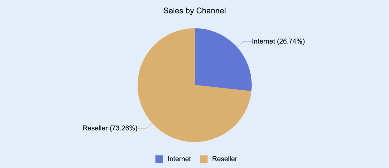
Pie charts are a visualization used to display data values as proportional slices of a whole. Each slice represents a category’s contribution to the total, making it easy to visualize relative proportions and compare parts to the overall dataset. The entire pie represents 100% of the data.
You can use pie charts to highlight how different categories contribute to a single total, identify dominant segments, or communicate part-to-whole relationships at a glance.
This article explains the requirements for creating pie charts and provides an overview of key properties and configuration options available in Wyn Notebooks.
You can use pie charts to show the percentage contribution of each sales channel to total revenue, visualize the distribution of expenses by department or category, compare customer segments based on population or usage share, or illustrate how different product types contribute to total profit.
This topic explains how to create and customize data tables and explains the most frequently used properties. Refer to the reference for all the column chart properties and configuration options.

Create a Pie Chart
To create a pie chart:
Click the Plus (+) button to open the chart selection dropdown.
Select Pie Chart from the available visualization types.
Bind Data to Pie Chart
For a basic pie chart, bind the following fields:
Values: The numerical measure that represents the size or proportion of each slice. The measure is automatically converted into a percentage of the total.
Legend (Series): The categorical field that defines how the data is divided into slices (for example, Product Category, Region, or Department).
Once your data source is selected, all data attributes appear in the Data Binding tab. You can drag the following elements into the binding slots of the chart:
Data Attribute: Drag and drop any field from the data source directly into the binding slot.
Measure: Hover over the data source table name, click the gear icon (⚙), and select Add measure…. Define a name and expression, click OK, then drag the measure to a binding slot.
Calculated Column: Hover over the data source table name, click the gear icon (⚙), and select Add calculated column…. Define your calculation, click OK, then drag it to a binding slot.
Add Aggregations
You can control how data is aggregated and labeled in the chart:
Aggregation Method: Click the gear icon (⚙) next to a bound data attribute and select an aggregation type (e.g., Average, Count).
Rename Data Attribute: Click the gear icon (⚙) next to a bound data attribute and select Rename to modify how it appears in the chart.
Set Chart Title
By default, Wyn generates a chart title based on the selected data attributes.
You can modify this title in the Inspector Panel:
Click the gear icon (⚙) next to the Data Binding tab to open the Inspector Panel.
Under Title, enter a custom title for your chart.
Note: Once a custom title is entered, changes to the data attributes will no longer automatically update the chart title.
Add Tooltip
To display more detailed information when hovering over each slice, drag one or more data attributes into the Tooltipbinding slot.
Tooltips provide contextual information—such as category names, values, and percentages—without cluttering the main chart area.
Customize Colors
You can customize the color scheme of your pie chart in Inspector Panel > Chart Style > Palette. Choose from:
Theme: A default seven-color palette based on the selected dashboard theme.
Standard: A set of predefined color palettes.
Custom: Define your own palette to match brand colors or visualization standards.


