- Getting Started
- Administration Guide
-
User Guide
- An Introduction to Wyn Enterprise
- Document Portal for End Users
- Data Governance and Modeling
- View and Manage Documents
- Working with Resources
- Working with Reports
- Working with Dashboards
- Working with Notebooks
- Wyn Analytical Expressions
- Section 508 Compliance
- Subscribe to RSS Feed for Wyn Builds Site
- Developer Guide
Line Chart
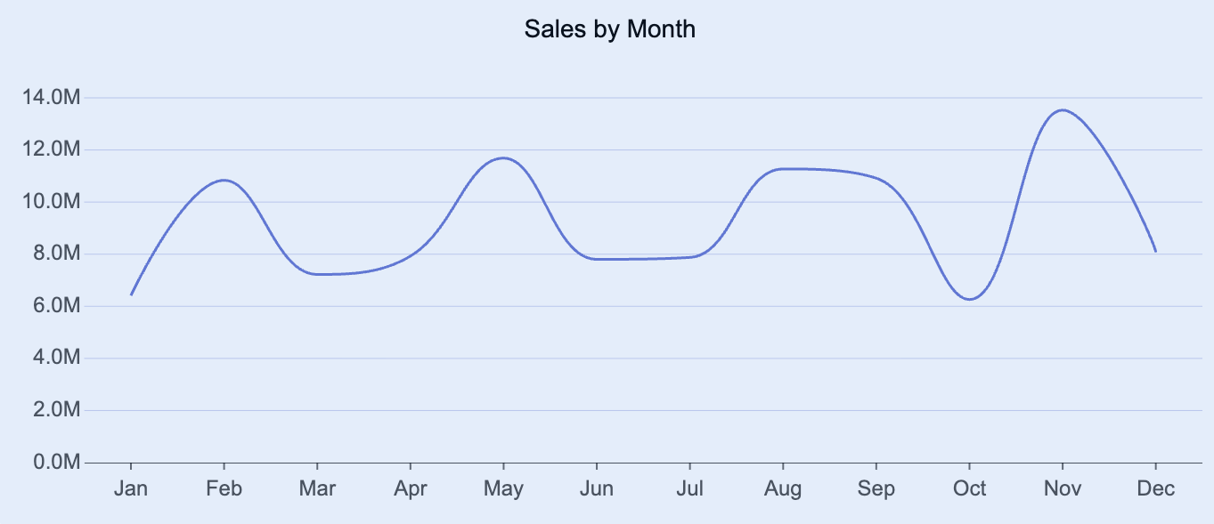
Line charts are a visualization used to display trends, patterns, or changes in data over continuous intervals such as time, quantity, or sequence. Each point on the line represents a data value, and the connection between points highlights how values progress or fluctuate across the chosen dimension. Line charts are especially effective for identifying trends, correlations, or seasonal variations in datasets.
You can use line charts to visualize how a measure evolves over time, compare multiple trends across categories, or track changes in performance indicators. This article explains the requirements for creating line charts and provides an overview of key properties and configuration options available in Wyn Notebooks.
You can use line charts to display time-based data such as sales trends per month, stock prices across quarters, temperature changes over days, or performance metrics across product categories.
This topic explains how to create and customize data tables and explains the most frequently used properties. Refer to the reference for all the column chart properties and configuration options.

Create a Line Chart
To create a line chart, click on the Plus (+) button, opening the dropdown from which you can select your chart.
Bind Data to Line Chart
For a line chart, you need to determine the following bindings:
Values (Y-Axis): The quantitative data displayed on the y-axis. Typically, this represents numeric measures such as Sales, Profit, or Quantity.
Axis (Category / X-Axis): The categorical or continuous data displayed on the x-axis. Typically, this represents grouped or sequential categories such as Month, Year, Region, or Product.
Legend (Series): The dimension that defines separate lines within the chart. Each unique value in this field generates a distinct line, allowing comparison between categories such as Departments, Regions, or Channels.
Once your data source is selected, all data attributes appear in the Data Binding tab. You can drag the following to the binding slots of the chart:
Data attribute: Drag and drop any field from the data source.
Measure: Hover over the data source table name, click the gear icon (⚙), and select Add measure…. Define a name and an expression, click OK, then drag the measure to a binding slot.
Calculated column: Hover over the data source table name, click the gear icon (⚙), and select Add calculated column…. Define your calculation, click OK, then drag it to a binding slot.
Add Aggregations
You can control how data is aggregated and labeled in the chart:
Aggregation method: Click the gear icon (⚙) next to a bound data attribute, and select an aggregation type (e.g., Sum, Average, Count).
Rename data attribute: Click the gear icon (⚙) next to a bound data attribute and select Rename to modify how it appears in the chart.
Set Chart Title
By default, Wyn generates a chart title based on the selected data attributes.
You can modify this title in the Inspector Panel:
Click the gear icon (⚙) next to the Data Binding tab to open the Inspector Panel.
Under Title, type a custom title for your chart.
Note: Once a custom title is entered, changes to the data attributes will no longer automatically update the chart title.
Add Tooltip
To include more details in the chart’s tooltip, drag one or more data attributes into the Tooltip binding slot.
Tooltips appear when hovering over chart elements, providing contextual details without cluttering the chart area.
Customize Colors
You can adjust the color scheme of your line chart in Inspector Panel > Chart Style > Palette.
Choose from:
Theme: A seven-color palette based on a theme.
Standard: A set of predefined seven-color palettes.
Custom: Define your own palette to match brand colors or visualization standards.
Build a Chart Trellis
A trellis column layout (also known as a small multiples view) creates a set of individual charts arranged horizontally. Each chart represents a subset of the data, determined by the field you assign.
To create a series of trellis column charts, drag a data attribute into the Trellis Columns binding slot. Each unique value in that field generates a separate chart displayed in columns across the dashboard.
A trellis row layout arranges multiple charts vertically, each showing a subset of data for a particular category or group.
To create a series of trellis row charts, drag a data attribute into the Trellis Rows binding slot. Each unique value generates an individual chart displayed in rows down the dashboard.


