-
Interactive DashboardsCreate interactive BI dashboards with dynamic visuals.
-
End-User BI ReportsCreate and deploy enterprise BI reports for use in any vertical.
-
Wyn AlertsSet up always-on threshold notifications and alerts.
-
Localization SupportChange titles, labels, text explanations, and more.
-
Wyn ArchitectureA lightweight server offers flexible deployment.
-
 Wyn Enterprise 7.1 is ReleasedThis release emphasizes Wyn document embedding and enhanced analytical express...
 -
 Choosing an Embedded BI Solution for SaaS ProvidersAdding BI features to your applications will improve your products, better serve your customers, and more. But where to start? In this guide, we discuss the many options.
-
Visual GalleryInteractive sample dashboards and reports.
-
BlogExplore Wyn, BI trends, and more.
-
WebinarsDiscover live and on-demand webinars.
-
Customer SuccessVisualize operational efficiency and streamline manufacturing processes.
-
Knowledge BaseGet quick answers with articles and guides.
-
VideosVideo tutorials, trends and best practices.
-
WhitepapersDetailed reports on the latest trends in BI.
-
 Choosing an Embedded BI Solution for SaaS ProvidersAdding BI features to your applications will impr...
 -

- Getting Started
- Administration Guide
-
User Guide
- An Introduction to Wyn Enterprise
- Document Portal for End Users
- Data Governance and Modeling
- View and Manage Documents
- Working with Resources
- Working with Reports
- Working with Dashboards
- Working with Notebooks
- Wyn Analytical Expressions
- Section 508 Compliance
- Subscribe to RSS Feed for Wyn Builds Site
- Developer Guide
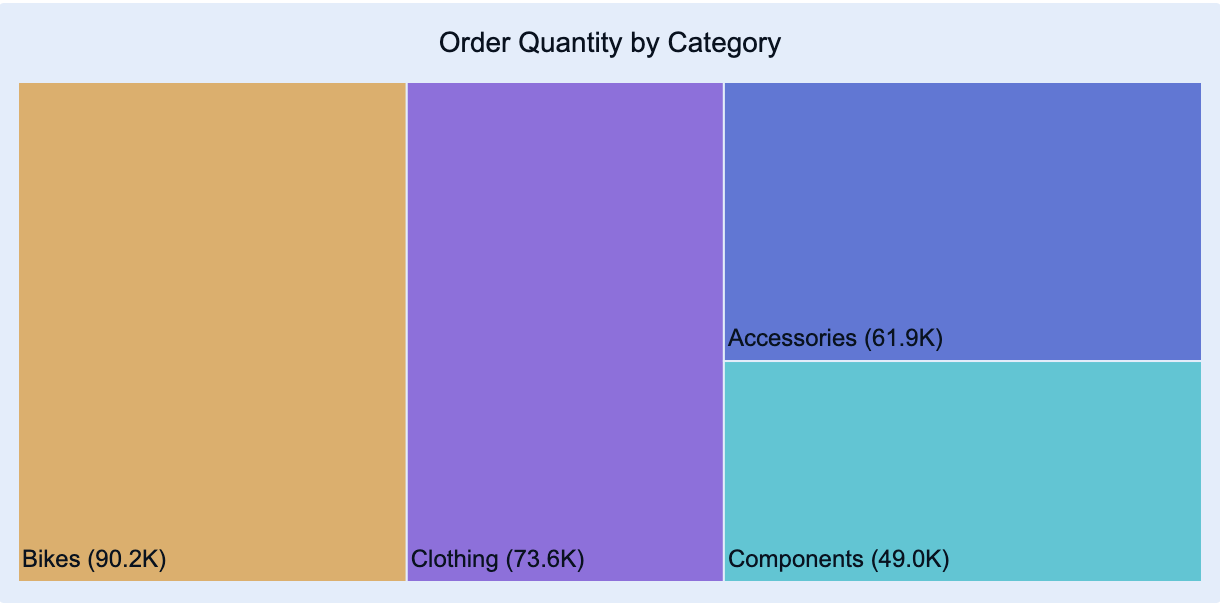
Treemap Chart
Treemap charts are a visualization used to display hierarchical data using nested rectangles. Each rectangle represents a category or subcategory, and its size corresponds to a specific data value. This allows you to visualize proportions within a hierarchy and compare parts to the whole in a compact, space-efficient way.
You can use treemap charts to identify patterns, relationships, and size differences among categories at multiple levels. They are especially useful when you want to show how individual elements contribute to a total, while maintaining a clear view of the hierarchy.
This article explains the requirements for creating treemap charts and provides an overview of key properties and configuration options available in Wyn Notebooks.
You can use treemap charts to visualize sales by Product Category and Subcategory — visualize which product groups contribute most to total sales, revenue by Region and Country — identify which geographic areas drive performance, and expenses by Department and Cost Type — analyze how costs are distributed across business units.
This topic explains how to create and customize charts and explains the most frequently used properties. Refer to the reference for all the column chart properties and configuration options.
Create a Treemap Chart
To create a treemap chart, click the Plus (+) button to open the dropdown from which you can select your chart.
Bind Data to Treemap Chart
For a basic treemap chart, you need to determine the following bindings:
Values: The measure that determines the size of each rectangle, such as Sales Amount, Revenue, or Quantity Sold.
Details: The categorical fields that define the hierarchy of the treemap. The order of fields in this binding slot determines how data is grouped and nested — for example, Region → Country → City.
To display categorical fields on the treemap:
Click the gear icon (⚙) next to the Data Binding panel to open the Inspector Panel.
Under Data Labels, set the Details toggle item to True to display the categorical fields on the treemap.
Once your data source is selected, all data attributes appear in the Data Binding tab. You can drag the following to the binding slots of the chart:
Data attribute: Drag and drop any field from the data source.
Measure: Hover over the data source table name, click the gear icon (⚙), and select Add measure…. Define a name and an expression, click OK, then drag the measure to a binding slot.
Calculated column: Hover over the data source table name, click the gear icon (⚙), and select Add calculated column…. Define your calculation, click OK, then drag it to a binding slot.
Add Aggregations
You can control how data is aggregated and labeled in the chart:
Aggregation method: Click the gear icon (⚙) next to a bound data attribute, and select an aggregation type (e.g., Sum, Average, Count).
Rename data attribute: Click the gear icon (⚙) next to a bound data attribute and select Rename to modify how it appears in the chart.
Set Chart Title
By default, Wyn generates a chart title based on the selected data attributes.
You can modify this title in the Inspector Panel:
Click the gear icon (⚙) next to the Data Binding tab to open the Inspector Panel.
Under Title, type a custom title for your chart.
Note: Once a custom title is entered, changes to the data attributes will no longer automatically update the chart title.
Add Tooltip
To include more details in the chart’s tooltip, drag one or more data attributes into the Tooltip binding slot.
Tooltips appear when hovering over rectangles, showing detailed information such as category name, value, and percentage contribution.
Customize Colors
You can adjust the color scheme of your treemap chart in Inspector Panel > Chart Style > Palette.
Choose from:
Theme: A color palette derived from a theme.
Standard: A set of predefined color palettes.
Custom: Define your own color palette to match branding or visualization standards.
Layout and Label Options
In Inspector Panel > Chart Style, you can further refine how your treemap is displayed:
Layout Mode: Choose how rectangles are arranged — typically Squarified (default) or< Slice-and-Dice.
Show Labels: Toggle on to display category names directly inside the rectangles.
Label Overflow: Determine how labels behave when text exceeds available space.
Border Visibility: Control whether borders between rectangles are shown for clearer segmentation.