-
Interactive DashboardsCreate interactive BI dashboards with dynamic visuals.
-
End-User BI ReportsCreate and deploy enterprise BI reports for use in any vertical.
-
Wyn AlertsSet up always-on threshold notifications and alerts.
-
Localization SupportChange titles, labels, text explanations, and more.
-
Wyn ArchitectureA lightweight server offers flexible deployment.
-
 Wyn Enterprise 7.1 is ReleasedThis release emphasizes Wyn document embedding and enhanced analytical express...
 -
 Choosing an Embedded BI Solution for SaaS ProvidersAdding BI features to your applications will improve your products, better serve your customers, and more. But where to start? In this guide, we discuss the many options.
-
Embedded BIEmbed reporting & analytics within your own custom apps.
-
Self-ServiceEnable users to create custom ad hoc reports and dashboards.
-
MultitenancyEnhance your SaaS apps with a multitenant BI platform.
-
Data Governance and ModelingTransform raw data into insights quickly to reveal trends.
-
Scheduled DistributionSend data insights via scheduled email and chat notifications.
-
Extensible SecurityWyn delivers extensible security for your access control needs.
-
Visual GalleryInteractive sample dashboards and reports.
-
BlogExplore Wyn, BI trends, and more.
-
WebinarsDiscover live and on-demand webinars.
-
Customer SuccessVisualize operational efficiency and streamline manufacturing processes.
-
Knowledge BaseGet quick answers with articles and guides.
-
VideosVideo tutorials, trends and best practices.
-
WhitepapersDetailed reports on the latest trends in BI.
-
 Choosing an Embedded BI Solution for SaaS ProvidersAdding BI features to your applications will impr...
 -

- Getting Started
- Administration Guide
-
User Guide
- An Introduction to Wyn Enterprise
- Document Portal for End Users
- Data Governance and Modeling
- View and Manage Documents
- Working with Resources
- Working with Reports
-
Working with Dashboards
- Tour the Dashboard Designer
- Create a Dashboard
- Configure Dashboard
- Dashboard Data Binding
- Scenarios
- Appearance
- Component Management
- Parameters
- Interactions
- Finalize Your Dashboard
- Using AI in Wyn
- Working with Notebooks
- Wyn Analytical Expressions
- Section 508 Compliance
- Subscribe to RSS Feed for Wyn Builds Site
- Developer Guide
Composite Slicer
The Composite Slicer in Wyn Enterprise allows you to filter a visualization based on multiple data attributes using logical operators like AND and OR. This makes it more powerful than a basic label slicer.
When to Use
Use a Composite Slicer when:
You want end-users to apply multiple filter conditions on the fly.
The filters need to be applied across multiple attributes.
The filtering experience should be more flexible and interactive.
Customization Options
Slicers can be extensively styled and configured using the Inspector panel. Below are key settings you can modify:
Filter Content Style

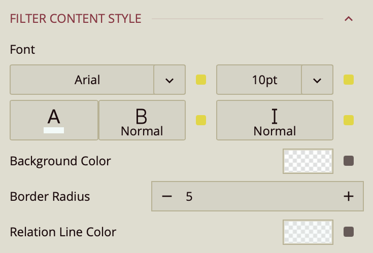
The Filter Content Style group controls the appearance of the individual conditions displayed within the composite slicer. This style is especially useful when using the composite slicer in its tree map-like layout, where conditions are visually grouped and linked by logical relationships such as AND or OR.
Available Properties
Font
Controls the appearance of the text within each condition box:
Font Family – The typeface used for condition labels (e.g., Segoe UI, Arial)
Font Size – The size of the text in pixels
Font Weight – e.g., Normal, Bold
Font Style – e.g., Regular, Italic
Font Color – Choose a custom or theme-based text color
Background Color
Sets the background color for each condition block.
Helps differentiate active conditions visually.
Border Radius
Defines the curvature of the condition box corners.
Higher values create more rounded buttons, while lower values keep the corners sharp.
Relation Line Color
Controls the color of the lines that connect conditions, visually indicating the logic (AND / OR) that links them.
Useful for maintaining readability and visual consistency, especially when multiple nested conditions are present.
Operator Button Style

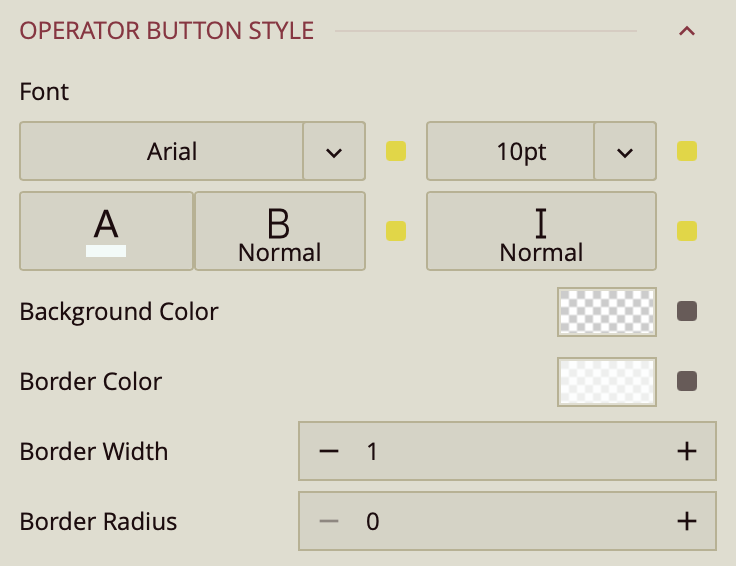
The operator button in a composite slicer allows users to define the logical relationship between conditions, such as AND or OR. The Operator Button Style properties control the appearance of this button to ensure it aligns with the overall visual theme of the slicer.
Available Properties
Font
Controls the styling of the text on the operator button:
Font Family – Sets the typeface (e.g., Segoe UI, Roboto)
Font Size – Defines the size of the operator text in pixels
Font Weight – e.g., Normal, Bold
Font Style – e.g., Regular, Italic
Font Color – Sets the color of the operator text (e.g., black, gray, custom)
Background Color
Sets the fill color of the operator button.
Useful for distinguishing the logical operator from the condition boxes.
Border Color
Defines the color of the operator button’s border.
Border Width
Sets the thickness of the operator button border in pixels.
Border Radius
Controls how rounded the corners of the operator button are.
Higher values produce softer, more rounded edges.