


- Getting Started
- Administration Guide
-
User Guide
- An Introduction to Wyn Enterprise
- Document Portal for End Users
- Data Governance and Modeling
- Working with Resources
- Working with Reports
-
Working with Dashboards
- Dashboard Designer
- Selecting a Dataset
- Data Attributes
- Dashboard Scenarios
- Dashboard Templates
- Component Templates
- 3D Scene
- Explorer
- Visualization Wizard
- Data Analysis and Interactivity
- Dashboard Appearance
- Preview Dashboard
- Export Dashboard
- Dashboard Lite Viewer
- Using Dashboard Designer
- Animating Dashboard Components
- Document Binder
- Dashboard Insights
- View and Manage Documents
- Understanding Wyn Analytical Expressions
- Section 508 Compliance
- Subscribe to RSS Feed for Wyn Builds Site
- Developer Guide
Data Range Slicers
The Data Range Slicer filters the dashboard data based on values in the bound field. It filters out data below a minimum or greater than a maximum or between a range of values.
Data Binding
Columns
Bind a numeric field containing the values you want the user to be able to filter by. This field defines the minimum, maximum or range limits available for selection in the slicer.
Customization Options
Slicers can be extensively styled and configured using the Inspector panel. Below are key settings you can modify:
Slicer Style
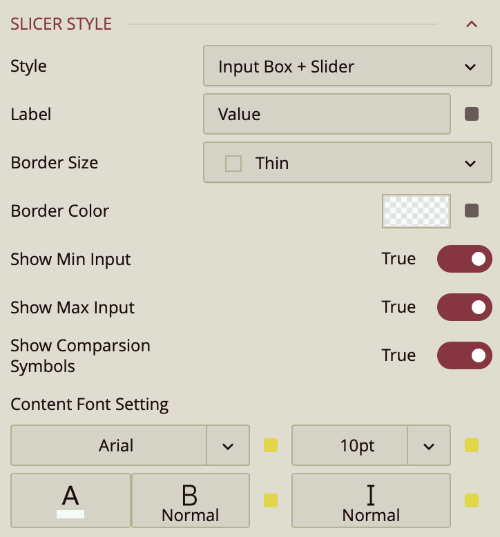
The Data Range Slicer allows you to filter numerical or date-based values using a slider, an input box, or both. The Slicer Style property defines the visual and interactive format users will see.
Slicer Style Options
There are three slicer styles to choose from:
Slider (default): A simple draggable slider for selecting a range.
Input Box: One or two input fields for the user to enter a minimum and maximum values directly.
Input Box + Slider: Combines both the slider and the input fields for more flexibility.
Style: Input Box or Input Box + Slider
When the slicer style is set to Input Box or Input Box + Slider, the following properties are available:
Label
Displays text outside the input box.
By default, shows the word
"value".Can be customized to show any descriptive label (e.g., "Enter Range" or "Select Date").
Border Size
Sets the thickness of the input box border in pixels.
Border Color
Defines the color of the input box border.
Show Min Input (Toggle)
When set to
True, displays the minimum value input box.If set to
False, only the maximum input may be shown (if enabled).
Show Max Input (Toggle)
When set to
True, displays the maximum value input box.You can choose to show only one input field or both.
Show Comparison Symbols (Toggle)
Controls whether comparison symbols (e.g., ≥ or ≤) are displayed next to the input boxes.
Helps clarify how the entered values will filter the data.
Content Font
Controls the appearance of text in the input boxes:
Font Family
Font Size
Font Weight
Font Style
Font Color
Style: Slider Only
When the slicer style is set to Slider, only the Font properties are available for customization. These control the labels and tick marks on the slider:
Font Family
Font Size
Font Weight
Font Style
Font Color
Note: The advanced input box settings (label, border, min/max toggles, comparison symbols) are not displayed when using the Slider-only style.
Common Properties
Refer to the refer to the common properties article to configure the other properties: Title, Layout, Appearance, Animation, Interaction.