- Getting Started
- Administration Guide
-
User Guide
- An Introduction to Wyn Enterprise
- Document Portal for End Users
- Data Governance and Modeling
- Working with Resources
- Working with Reports
-
Working with Dashboards
- Dashboard Designer
- Selecting a Dataset
- Data Attributes
- Dashboard Scenarios
- Dashboard Templates
- Component Templates
- 3D Scene
- Explorer
- Visualization Wizard
- Data Analysis and Interactivity
- Dashboard Appearance
- Preview Dashboard
- Export Dashboard
- Dashboard Lite Viewer
- Using Dashboard Designer
- Animating Dashboard Components
- Document Binder
- Dashboard Insights
- View and Manage Documents
- Understanding Wyn Analytical Expressions
- Section 508 Compliance
- Subscribe to RSS Feed for Wyn Builds Site
- Developer Guide
Label Slicers
The Label Slicer is the most commonly used slicer in Wyn Enterprise dashboards. It allows users to filter data by selecting one or more values from a specific attribute in a dataset—such as category, region, or product names.
Data Binding
The label slicer can be bound to a categorical field. Dashboard users select from the distinct values to filter the dashboard data.
Customization Options
After you position and size the scenario on the dashboard, the most common properties that are changed for a label slicer are the Orientation (vertical or horizontal) under the Slicer Style property group and the Selection Mode to control if the user can select one or many item at a time to filter the dashboard. Slicers can be further styled and configured using the property groups in the Inspector panel. Below are label slicer specific settings you can modify:
Slicer Style
The Slicer Style property group controls the appearance and layout of the label slicer. These settings allow you to customize how slicer values are displayed and aligned on the screen.
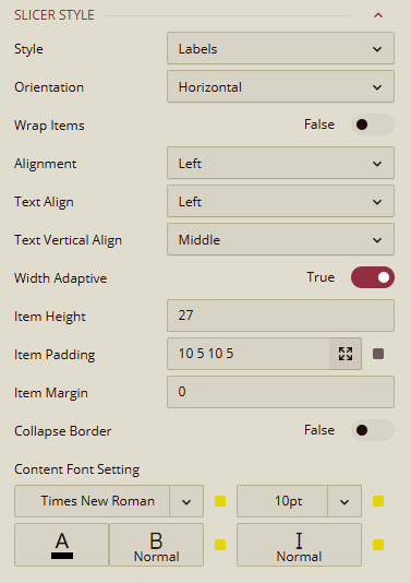
Style: Controls the visual style of the slicer. You can choose one of the different styles which offers different look and feel from minimal labels to gradient and button layouts. You can change the default Labels style to one of the following: List, Button Group, Underline, Gradient1, Gradient2, Gradient3, Cool1, Cool2, Cool3.
Orientation: Sets the direction of the slicer items. By default, items are laid out horizontally but can be changed to Vertical.
Alignment: By default, the entire group of items in the label slicer are left-aligned but can be set to Center or Right
Wrap Items: If you set the slicer to be directed horizontally, the slicer items text will wrap when the text of the item exceeds the specified text. You can disable this behaviour by toggling this property off.
Text Align: This property sets the horizontal alignment of the text within each slicer item. By default, the text of the items is left-aligned but can be changed to Center, Right.
Text Vertical Align: Controls the vertical positioning of text within each slicer item. The options are Top, Middle, Bottom. By default, text is vertically aligned in the Middle.
Width Adaptive: If you set the slicer to be directed horizontally, the slicer items text will expand to distribute the space between the items. You can disable this behaviour by toggling this property off.
Item Width: Allows you to set a custom width for each slicer item. Enter a numeric value (in pixels).
Item Height: Allows you to set a custom height for each slicer item. Enter a numeric value (in pixels).
Item Padding & Margin: Fine-tunes the spacing inside (padding) and around (margin) each slicer item. Values can be set individually for top, right, bottom, and left or one value for all of the sides.
Content Font: Controls all text styling inside the slicer:
Font Family – Choose the typeface
Font Size – Set text size (in pixels)
Font Color – Choose a hex or theme-based color
Font Weight – e.g. Normal, Bold
Font Style – e.g. Regular, Italic
Group Style
The Group Style properties affect the overall appearance of the slicer group container and the background visuals for individual slicer items. These settings help you create a more polished, branded, or visually distinctive slicer layout.
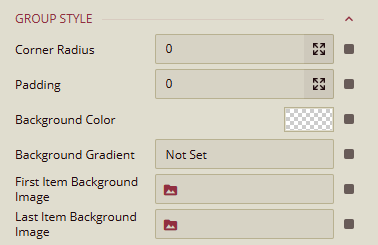
Corner Radius: Sets the curvature of the slicer corners where higher values result in more rounded edges. Rounded corners softens the slicer’s visual appearance or matching a dashboard theme.
Padding: Defines the inner spacing between the slicer items and the edges of the slicer container. You can specify values individually for each side (top, right, bottom, left) or have on single value for all sides.
Background Color: Sets the solid background color for the slicer group. You can select from theme colors or define a custom color using a hex code.
Background Gradient: Adds a gradient overlay to the slicer background. It can be used alongside or instead of a solid background color for a more dynamic look.
First Item Background Image: Allows you to set a background image specifically to highlight the first slicer item.
Last Item Background Image: Similar to the first slicer item but to highlight the last item.
State-Based Styles:
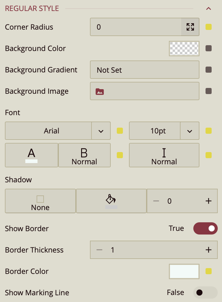
You can further style the label slicer items based on the stated: unselected items have the style as configured in the Regular Style. When the user hovers over an item, it will be styled as configured in the Hover Style group and selected items are styled as configured in the Selected Style group. All groups have the following same properties:
Corner Radius: Adjusts the curvature of the button’s corners.
Background Color: Sets the fill color of the selected button.
Background Gradient: Applies a gradient overlay to the background for visual depth.
Background Image: Allows you to set an image as the background of the selected button.
Font: Customize the text inside the selected button, including:
Font Family
Font Size
Font Weight
Font Style
Font Color
Shadow: Add shadow effects to the selected button:
Shadow Type: Choose from none, inner, outer, or both
Shadow Color
Shadow Size (increase or decrease intensity)
Show Border (toggle): When enabled, reveals:
Border Thickness
Border Color
Show Marking Line (toggle): When enabled, displays a marking line with the following options:
Position: Top, Bottom, Left, or Right
Length
Thickness
Offset
Color
This style is particularly useful for helping users clearly identify which slicer value is currently selected, especially when multiple slicer options are displayed at once.
Common Properties
Refer to the refer to the common properties article to configure the other properties: Title, Layout, Appearance, Animation, Interaction.
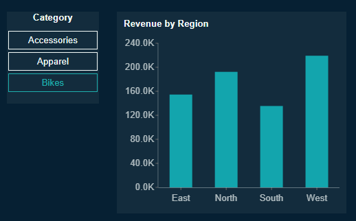
Example using a Label Slicer
In this example, we have a label slicer bound to the categories field and column chart that show sales by region. In the Inspector Panel, we have set the following properties for the label slicer.
Slicer Style: Having the slicer selected, in the Inspector Tab, open the menu next to Style to reveal a variety of slicer styles. Select the List style.
Slicer Orientation: Change the slicer orientation from horizontal (default) to vertical. Drag the sides of the slicer on the canvas to lengthen or narrow it appropriately.
Text Align: Set the Text Align to Center and Text Vertical Align to Middle.
Interaction: In the Interaction property group, set the Selection to Single.
Title Alignment: In the Title property group, set the Alignment to Center.
When you preview the dashboard, you get something similar to following results depending on the theme you chose for you dashboard: