-
Interactive DashboardsCreate interactive BI dashboards with dynamic visuals.
-
End-User BI ReportsCreate and deploy enterprise BI reports for use in any vertical.
-
Wyn AlertsSet up always-on threshold notifications and alerts.
-
Localization SupportChange titles, labels, text explanations, and more.
-
Wyn ArchitectureA lightweight server offers flexible deployment.
-
 Wyn Enterprise 7.1 is ReleasedThis release emphasizes Wyn document embedding and enhanced analytical express...
 -
 Choosing an Embedded BI Solution for SaaS ProvidersAdding BI features to your applications will improve your products, better serve your customers, and more. But where to start? In this guide, we discuss the many options.
-
Visual GalleryInteractive sample dashboards and reports.
-
BlogExplore Wyn, BI trends, and more.
-
WebinarsDiscover live and on-demand webinars.
-
Customer SuccessVisualize operational efficiency and streamline manufacturing processes.
-
Knowledge BaseGet quick answers with articles and guides.
-
VideosVideo tutorials, trends and best practices.
-
WhitepapersDetailed reports on the latest trends in BI.
-
 Choosing an Embedded BI Solution for SaaS ProvidersAdding BI features to your applications will impr...
 -

- Getting Started
- Administration Guide
-
User Guide
- An Introduction to Wyn Enterprise
- Document Portal for End Users
- Data Governance and Modeling
- View and Manage Documents
- Working with Resources
- Working with Reports
- Working with Dashboards
- Working with Notebooks
- Wyn Analytical Expressions
- Section 508 Compliance
- Subscribe to RSS Feed for Wyn Builds Site
- Developer Guide
Gauge
The Gauge scenario offers a visually engaging way to monitor single-value metrics with context. It resembles a speedometer and displays actual values along a scale to indicate progress or performance. With customizable range colors, start/stop angles, and radial styling, gauges help users quickly determine whether a value is low, high, or within an acceptable range.
Use this scenario when you want to represent performance, capacity, or progress indicators with clear visual thresholds.
Data Binding
The Data Binding tab allows you to connect data fields to the gauge chart and configure how values are displayed. It supports trellis layouts for displaying multiple gauges in a grid.
Actual Value – Drag a numeric field here to define the main value displayed on the gauge.
Ellipsis menu:
Data Format – Opens the data format dialog to customize number formatting.
Display Unit – Choose how values are scaled: Auto (default), None, Thousands, Millions, Billions, or Trillions.
Target Value – Drag a numeric field here to define the benchmark or target value for comparison against the actual value.
Trellis Columns – Defines the number of gauges arranged horizontally.
Trellis Rows – Defines the number of gauges arranged vertically.
Value Setting
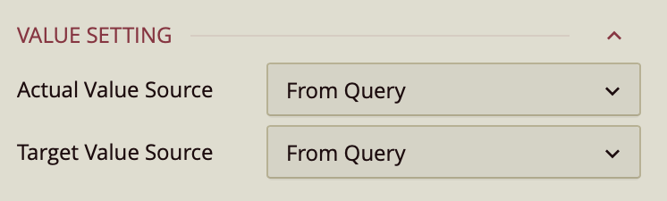
Value Settings
Actual Value Source – Dropdown:
From Query – Uses a field from the dataset.
Custom Input – Allows manual entry.
Value – Enter a numerical value.
Target Value Source – Same options as Actual Value Source.
Chart Style
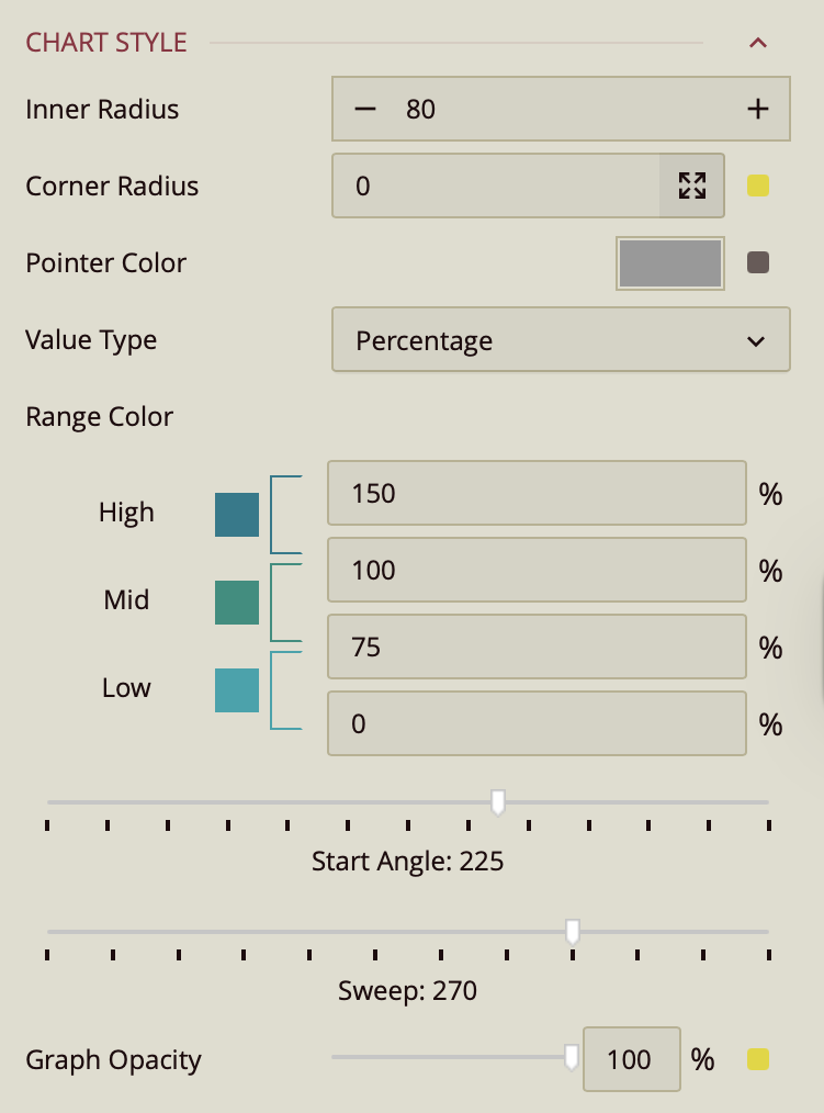
Inner Radius – Enter a numerical value to define the size of the gauge’s hollow center. Smaller values make the gauge ring thicker, while larger values create a thinner ring.
Corner Radius – Defaults to
0. Controls the roundness of the gauge’s corners.Enter a single value to apply the same radius to all four corners.
Click the arrow to specify different values for each corner individually.
Pointer Color – Sets the color of the gauge pointer, which indicates the current actual value on the dial.
Value Type – Determines how the gauge interprets values:
Percentage (default) – Values are displayed relative to the range as a percentage.
Constant – Values are displayed as raw numbers on a fixed numeric scale.
Range Colors – Assigns colors to ranges within the gauge for visual context:
High: 100–150%
Mid: 75–100%
Low: 0–75%
(Thresholds are fully editable to match your data.)
Start Angle – Slider, default
225. Sets the starting position of the gauge arc in degrees. For example:0°starts at the rightmost point.90°starts at the top.225°starts in the lower-left quadrant by default.
Sweep – Slider, default
270. Determines the total angular span of the gauge dial in degrees.360°creates a full circle.Smaller values create a partial arc.
Graph Opacity – Slider, default
100%. Adjusts the transparency of the gauge’s dial and pointer:100%is fully opaque.Lower percentages make the chart increasingly transparent.
Sub Title
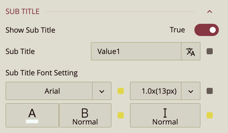
Show Subtitle – Toggle (Off by default).
When enabled:
Subtitle Text – Enter custom text.
Font Settings – Font family, size, color, weight, style.
Data Label
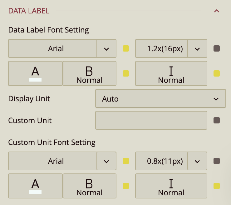
Font Settings – Font family, size, color, weight, style.
Display Unit – Auto (default), None, Thousands, Millions, Billions, Trillions.
Custom Unit – Enter a custom label (e.g., "kg").
Custom Unit Font Settings – Font family, size, color, weight, style.
Comparison Label
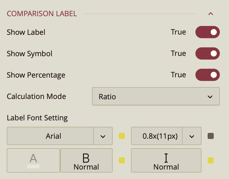
The Comparison Label displays additional information comparing the actual and target values on the gauge.
Show Label – Toggles visibility of the comparison label. Default is True.
Show Symbol – Toggles display of a symbol alongside the comparison label. Default is True.
Show Percentage – Toggles display of percentage information relative to the target value. Default is True.
Calculation Mode – Determines how the comparison is calculated:
Ratio (default) – Displays the ratio of actual to target value.
Delta – Displays the difference between actual and target value.
Label Font Settings – Configures font family, size, color, weight, and style of the comparison label.
Value Axis
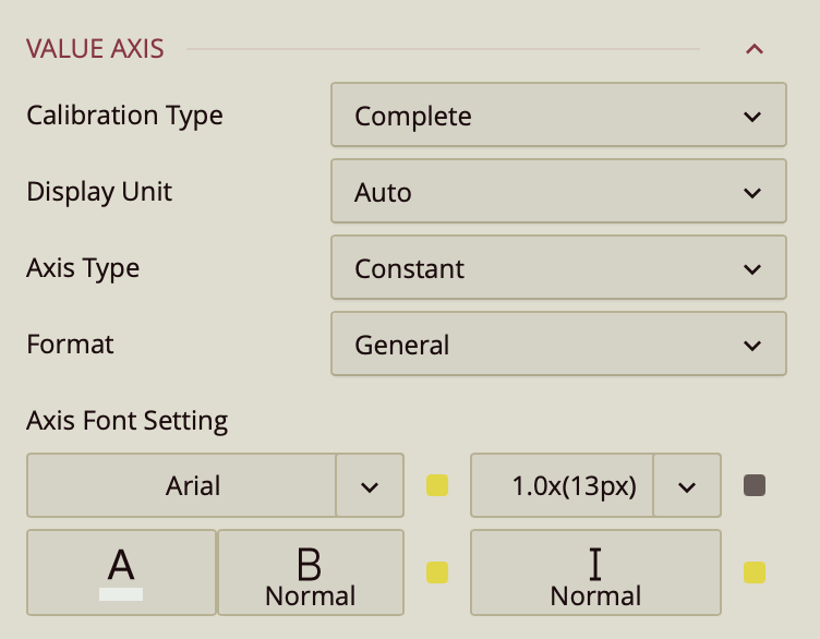
The Value Axis controls how the gauge scale is displayed and formatted.
Calibration Type – Sets the axis scale style:
Complete (default) – Shows the full scale including all ticks.
Boundary – Shows only the minimum and maximum values.
Hide – Hides the axis entirely.
Display Unit – Determines value scaling: Auto (default), None, Thousands, Millions, Billions, Trillions.
Axis Type – Defines the type of scale:
Percentage – Values are displayed as percentages.
Constant (default) – Values are displayed as raw numbers.
Format – Sets the number format: General (default), Number, Currency, Percentage, Custom.
Axis Font Settings – Configures font family, size, color, weight, and style for the axis labels.