-
Interactive DashboardsCreate interactive BI dashboards with dynamic visuals.
-
End-User BI ReportsCreate and deploy enterprise BI reports for use in any vertical.
-
Wyn AlertsSet up always-on threshold notifications and alerts.
-
Localization SupportChange titles, labels, text explanations, and more.
-
Wyn ArchitectureA lightweight server offers flexible deployment.
-
 Wyn Enterprise 7.1 is ReleasedThis release emphasizes Wyn document embedding and enhanced analytical express...
 -
 Choosing an Embedded BI Solution for SaaS ProvidersAdding BI features to your applications will improve your products, better serve your customers, and more. But where to start? In this guide, we discuss the many options.
-
Visual GalleryInteractive sample dashboards and reports.
-
BlogExplore Wyn, BI trends, and more.
-
WebinarsDiscover live and on-demand webinars.
-
Customer SuccessVisualize operational efficiency and streamline manufacturing processes.
-
Knowledge BaseGet quick answers with articles and guides.
-
VideosVideo tutorials, trends and best practices.
-
WhitepapersDetailed reports on the latest trends in BI.
-
 Choosing an Embedded BI Solution for SaaS ProvidersAdding BI features to your applications will impr...
 -

- Getting Started
- Administration Guide
-
User Guide
- An Introduction to Wyn Enterprise
- Document Portal for End Users
- Data Governance and Modeling
- View and Manage Documents
- Working with Resources
- Working with Reports
- Working with Dashboards
- Working with Notebooks
- Wyn Analytical Expressions
- Section 508 Compliance
- Subscribe to RSS Feed for Wyn Builds Site
- Developer Guide
KPI Kanban
Data Binding
Values – The main numeric or measurable data displayed in each KPI card (e.g., sales amount, total orders, or performance score).
Category – Groups KPI cards based on a shared field (e.g., region, product category, or department). Each unique category value creates a separate KPI card.
Tooltip – Displays additional details when hovering over a KPI card. Bind to fields that give context, such as exact numbers, percentages, or descriptions.
Customization
Chart Style
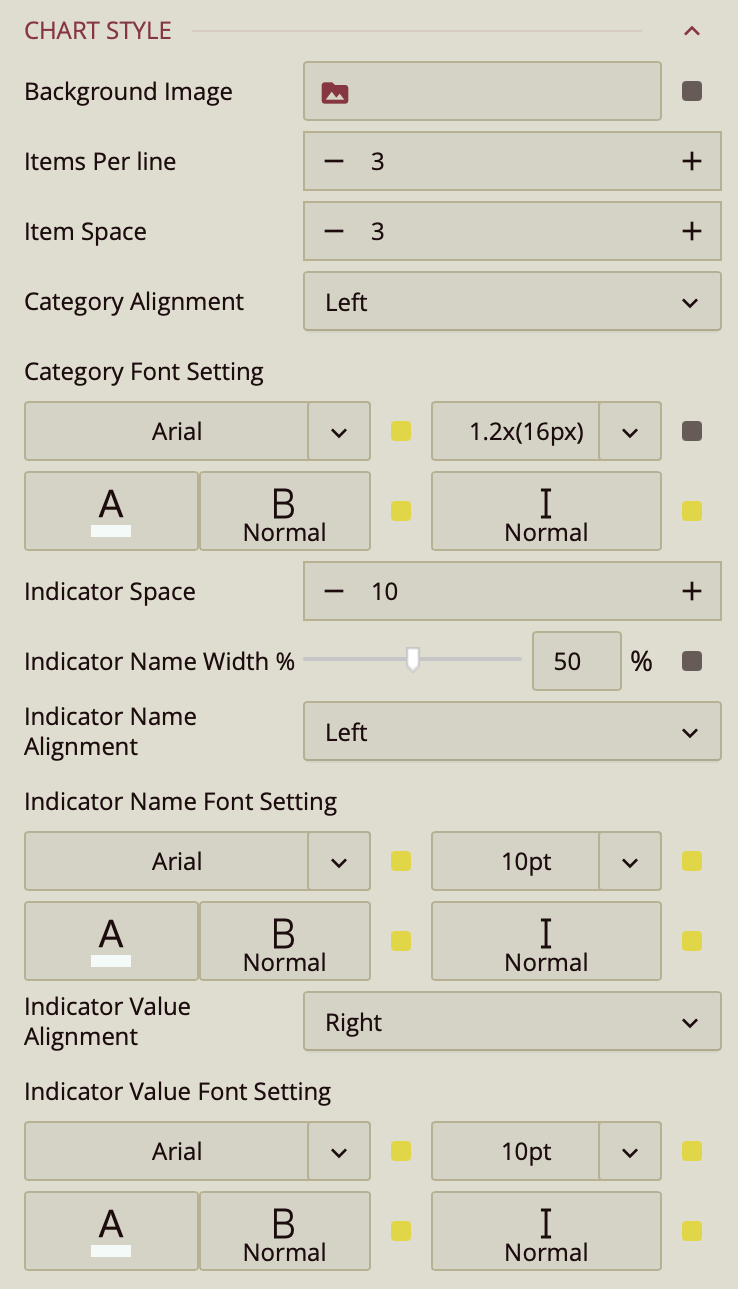
The KPI Kanban properties control the layout, spacing, and appearance of cards in a Kanban-style KPI display.
Background Image
Background Image – Upload an image to serve as the background for the Kanban board. Click the value slot to open the Upload Image window and select a file from your local system.
Item Layout
Items Per Line – Enter a numeric value to specify how many KPI cards appear per row.
Item Space – Enter a numeric value to adjust the spacing between cards.
Category Settings
Category Alignment – Choose the alignment of category labels: Left (default), Center, or Right.
Category Font Setting – Customize the appearance of category labels, including font family, size, color, weight, and style.
Indicator Settings
Indicator Space – Enter a numeric value to adjust the space between indicators within each card.
Indicator Name Width – Use the slider (default 50%) to adjust the width allocated to indicator names.
Indicator Name Alignment – Choose the alignment of indicator names: Left (default) or Right.
Indicator Name Font Setting – Customize the font, size, color, weight, and style for indicator names.
Indicator Value Alignment – Set the alignment of indicator values: Right (default) or Left.
Indicator Value Font Setting – Customize the font, size, color, weight, and style for indicator values.
Item Style
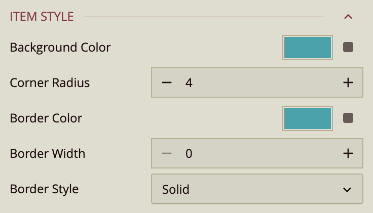
Background Color – Enter a color value or select a default from the palette to set the item’s background.
Corner Radius – Enter a numeric value to adjust the roundness of the item’s corners.
Border Color – Enter a color value or select a default from the palette to define the item’s border color.
Border Width – Enter a numeric value to set the border thickness. The default value is
0, which hides the border; increasing this value displays the border.Border Style – Choose the border’s appearance. The default is Solid, but you can also select Dashed from the dropdown.
Tooltip
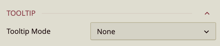
Tooltip Mode – Determines how tooltips are displayed when hovering over the chart:
None – Disables tooltips.
Data Point (default) – Shows a tooltip for the specific data point under the pointer.
Category – Shows a tooltip for all data points that share the same category value.