-
Interactive DashboardsCreate interactive BI dashboards with dynamic visuals.
-
End-User BI ReportsCreate and deploy enterprise BI reports for use in any vertical.
-
Wyn AlertsSet up always-on threshold notifications and alerts.
-
Localization SupportChange titles, labels, text explanations, and more.
-
Wyn ArchitectureA lightweight server offers flexible deployment.
-
 Wyn Enterprise 7.1 is ReleasedThis release emphasizes Wyn document embedding and enhanced analytical express...
 -
 Choosing an Embedded BI Solution for SaaS ProvidersAdding BI features to your applications will improve your products, better serve your customers, and more. But where to start? In this guide, we discuss the many options.
-
Visual GalleryInteractive sample dashboards and reports.
-
BlogExplore Wyn, BI trends, and more.
-
WebinarsDiscover live and on-demand webinars.
-
Customer SuccessVisualize operational efficiency and streamline manufacturing processes.
-
Knowledge BaseGet quick answers with articles and guides.
-
VideosVideo tutorials, trends and best practices.
-
WhitepapersDetailed reports on the latest trends in BI.
-
 Choosing an Embedded BI Solution for SaaS ProvidersAdding BI features to your applications will impr...
 -

- Getting Started
- Administration Guide
-
User Guide
- An Introduction to Wyn Enterprise
- Document Portal for End Users
- Data Governance and Modeling
- View and Manage Documents
- Working with Resources
- Working with Reports
- Working with Dashboards
- Working with Notebooks
- Wyn Analytical Expressions
- Section 508 Compliance
- Subscribe to RSS Feed for Wyn Builds Site
- Developer Guide
Indicator
Data Binding
The Data Binding tab allows you to connect data fields to the gauge chart and configure how values are displayed. It supports trellis layouts for displaying multiple indicators in a grid.
Actual Value – Drag a numeric field here to define the main value displayed on the indicator.
Ellipsis menu:
Data Format – Opens the data format dialog to customize number formatting.
Display Unit – Choose how values are scaled: Auto (default), None, Thousands, Millions, Billions, or Trillions.
Target Value – Drag a numeric field here to define the benchmark or target value for comparison against the actual value.
Trellis Columns – Defines the number of indicators arranged horizontally.
Trellis Rows – Defines the number of indicators arranged vertically.
Value Setting
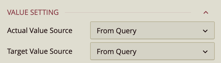
Value Settings
Actual Value Source – Dropdown:
From Query – Uses a field from the dataset.
Custom Input – Allows manual entry.
Value – Enter a numerical value.
Target Value Source – Same options as Actual Value Source.
Chart Style
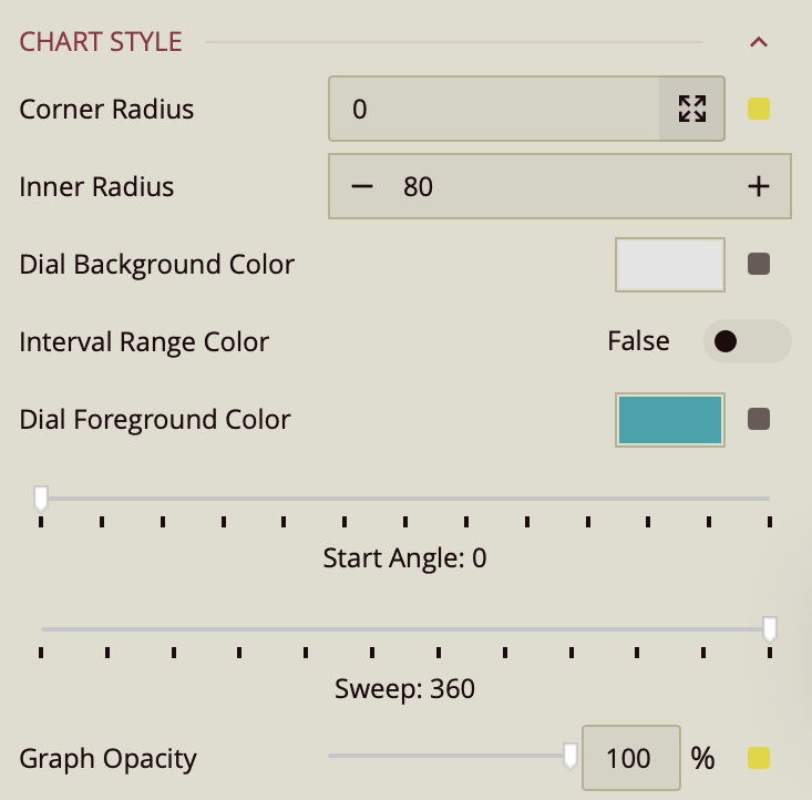
Corner Radius – Defaults to
0.Enter a value for all four corners at once, or click the arrow to set each corner individually.
Inner Radius – Enter a numeric value to define the size of the hollow center of the indicator dial. A smaller value makes the dial thicker, while a larger value creates a thinner dial ring.
Dial Background Color – Sets the background color of the indicator dial.
Interval Range Color – Toggle (Off by default).
When enabled, additional properties appear:
Value Type – Choose whether the range is displayed as a Percentage (default) or Constant (fixed number scale).
Range Colors (default thresholds):
High: 100–150%
Mid: 75–100%
Low: 0–75%
(Threshold values can be edited to fit your data.)
Start Angle – Slider, default
0. Sets the starting position of the indicator dial in degrees. For example,0degrees places the start at the rightmost point of the circle, while90degrees starts from the top.Sweep – Slider, default
360. Defines the total angular span of the indicator dial in degrees. A full circle uses360°, while smaller values create a partial arc.Graph Opacity – Slider, default
100%. Controls the transparency of the dial and pointer elements. Lower values make the indicator more transparent, while100%renders it fully opaque.
Sub Title
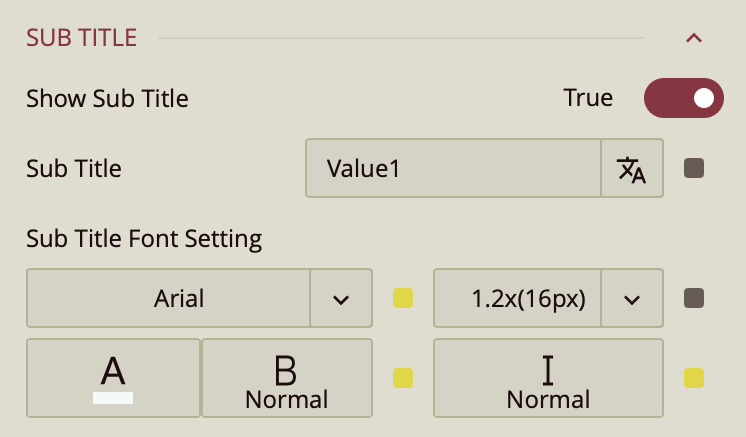
Show Subtitle – Toggle.
When enabled:
Subtitle Text – Enter custom text.
Font Settings – Font family, size, color, weight, style.
Data Label
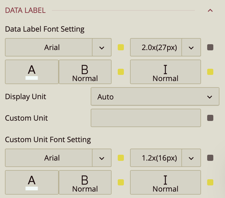
Font Settings – Font family, size, color, weight, style.
Display Unit – Auto (default), None, Thousands, Millions, Billions, Trillions.
Custom Unit – Enter a custom label (e.g., "kg").
Custom Unit Font Settings – Font family, size, color, weight, style.
Percentage Label Style
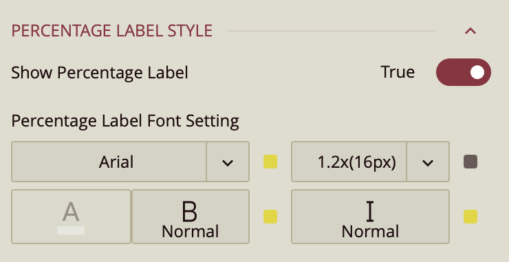
The Percentage Label displays the current value of the indicator as a percentage on the chart.
Show Percentage Label – Toggle (On by default). Determines whether the percentage label is visible on the indicator.
Percentage Label Font Setting – Configures the font of the percentage label, including:
Font Family – Select the typeface.
Font Size – Enter a numeric value for the text size.
Color – Choose a text color.
Weight – Set text weight (e.g., normal, bold).
Style – Apply italic or normal style.