-
Interactive DashboardsCreate interactive BI dashboards with dynamic visuals.
-
End-User BI ReportsCreate and deploy enterprise BI reports for use in any vertical.
-
Wyn AlertsSet up always-on threshold notifications and alerts.
-
Localization SupportChange titles, labels, text explanations, and more.
-
Wyn ArchitectureA lightweight server offers flexible deployment.
-
 Wyn Enterprise 7.1 is ReleasedThis release emphasizes Wyn document embedding and enhanced analytical express...
 -
 Choosing an Embedded BI Solution for SaaS ProvidersAdding BI features to your applications will improve your products, better serve your customers, and more. But where to start? In this guide, we discuss the many options.
-
Visual GalleryInteractive sample dashboards and reports.
-
BlogExplore Wyn, BI trends, and more.
-
WebinarsDiscover live and on-demand webinars.
-
Customer SuccessVisualize operational efficiency and streamline manufacturing processes.
-
Knowledge BaseGet quick answers with articles and guides.
-
VideosVideo tutorials, trends and best practices.
-
WhitepapersDetailed reports on the latest trends in BI.
-
 Choosing an Embedded BI Solution for SaaS ProvidersAdding BI features to your applications will impr...
 -

- Getting Started
- Administration Guide
-
User Guide
- An Introduction to Wyn Enterprise
- Document Portal for End Users
- Data Governance and Modeling
- View and Manage Documents
- Working with Resources
- Working with Reports
- Working with Dashboards
- Working with Notebooks
- Wyn Analytical Expressions
- Section 508 Compliance
- Subscribe to RSS Feed for Wyn Builds Site
- Developer Guide
Liquid Fill Gauge
The Liquid Fill Gauge is a visual indicator that combines numeric performance values with a dynamic fill animation to represent percentage completion. This scenario is ideal for tracking KPIs such as goal progress, capacity usage, or satisfaction scores. Its wave animation and shape customization make it a unique option for dashboards requiring high visual impact.
Use this scenario when you want to display progress or ratio metrics in a visually dynamic format.
Data Binding
The Data Binding tab allows you to connect data fields to the liquid fill gauge elements.
Actual Value – Drag a numeric field here to define the primary measure displayed in the gauge.
Ellipsis menu:
Data Format – Opens the data format dialog to customize number formatting.
Display Unit – Choose how values are scaled: Auto (default), None, Thousands, Millions, Billions, or Trillions.
Target Value – Drag a numeric field here to define the target or reference value for comparison against the actual value.
Properties
Chart Style
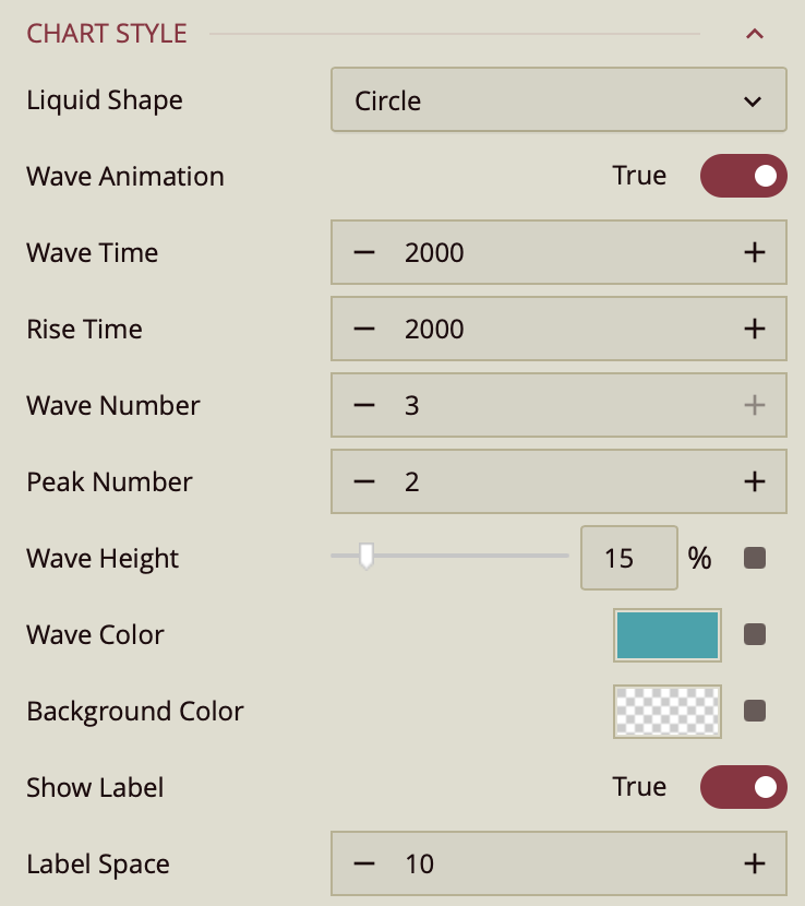
Liquid Shape – Defines the overall shape of the gauge. Options: Circle, Ellipse, Square, Diamond, Rectangle.
Wave Animation – Toggles whether the liquid fill wave animates. Default is True.
Wave Time – Controls the animation duration of one wave cycle in milliseconds. Default is
2000.Rise Time – Controls the duration for the liquid level to rise to its value in milliseconds. Default is
2000.Wave Number – Sets the number of waves displayed across the shape. Default is
3.Peak Number – Sets the number of wave peaks visible in the animation. Default is
2.Wave Height – Percentage slider controlling wave amplitude. Default is
15%. You can adjust by sliding or reset using the grey adorner.Wave Color – Defines the fill color of the liquid wave. Default is from the palette; can be customized.
Background Color – Sets the background color of the gauge.
Show Label – Toggles whether the main value label is displayed. Default is True.
Label Space – Sets the space between the wave and the label text in pixels. Default is
10.
Border Style
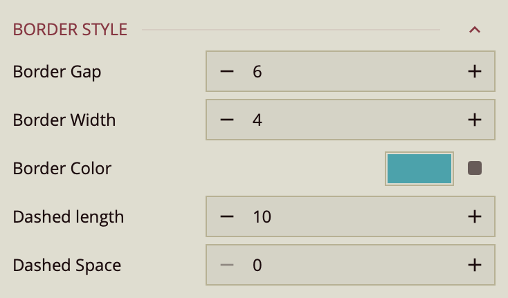
Border Gap – Sets the space between the gauge shape and its border in pixels. Default is
6.Border Width – Defines the thickness of the border in pixels. Default is
4.Border Color – Sets the border color. Default is from the palette.
Dashed Length – Sets the length of each dash in a dashed border.
Dashed Space – Sets the space between dashes in a dashed border.
Subtitle Properties
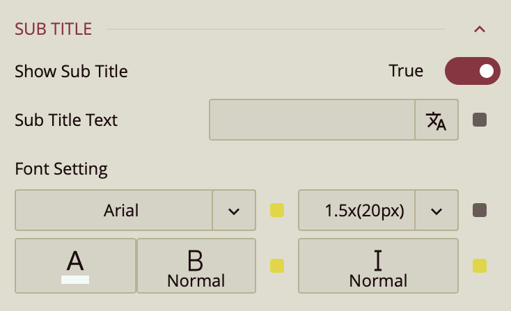
Show Subtitle – Toggles whether a subtitle is displayed. Default is False.
When True, the following properties appear:
Subtitle Text – Enter the text for the subtitle.
Font Setting – Set the subtitle’s font family, size, color, weight, and style.
Data Label Settings
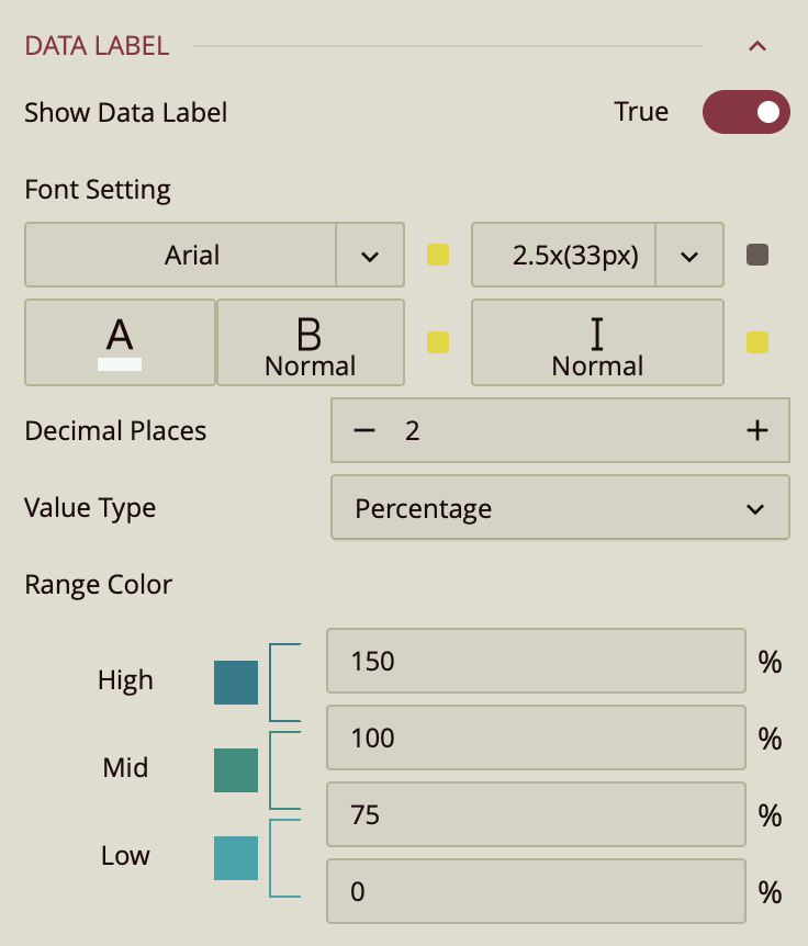
Show Data Label – Toggles whether the data label is displayed. Default is True.
Font Setting – Sets the data label’s font family, size, color, weight, and style.
Decimal Places – Sets the number of decimal places displayed.
Value Type – Determines how the value is expressed. Options: Percentage (default), Number.
Range Color – Defines colors for value ranges:
High:
100–150%Mid:
75–100%Low:
0–75%Ranges can be customized.
Comparison Label Settings
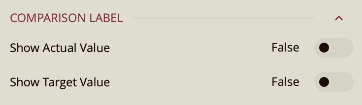
Show Actual Value – Toggles display of the actual value. Default is False.
Show Target Value – Toggles display of the target value. Default is False.
When either is True, the following property appears:
Font Setting – Sets the font family, size, color, weight, and style for the comparison label.
Special Data Settings
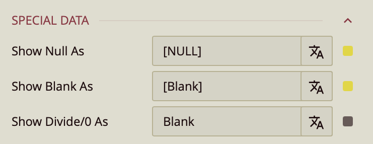
Show Null As – Defines the placeholder text for null values. Default is
[NULL].Show Blank As – Defines the placeholder text for blank values. Default is
[Blank].Show Divide/0 As – Defines the placeholder text when division by zero occurs. Default is
Blank.