-
Interactive DashboardsCreate interactive BI dashboards with dynamic visuals.
-
End-User BI ReportsCreate and deploy enterprise BI reports for use in any vertical.
-
Wyn AlertsSet up always-on threshold notifications and alerts.
-
Localization SupportChange titles, labels, text explanations, and more.
-
Wyn ArchitectureA lightweight server offers flexible deployment.
-
 Wyn Enterprise 7.1 is ReleasedThis release emphasizes Wyn document embedding and enhanced analytical express...
 -
 Choosing an Embedded BI Solution for SaaS ProvidersAdding BI features to your applications will improve your products, better serve your customers, and more. But where to start? In this guide, we discuss the many options.
-
Visual GalleryInteractive sample dashboards and reports.
-
BlogExplore Wyn, BI trends, and more.
-
WebinarsDiscover live and on-demand webinars.
-
Customer SuccessVisualize operational efficiency and streamline manufacturing processes.
-
Knowledge BaseGet quick answers with articles and guides.
-
VideosVideo tutorials, trends and best practices.
-
WhitepapersDetailed reports on the latest trends in BI.
-
 Choosing an Embedded BI Solution for SaaS ProvidersAdding BI features to your applications will impr...
 -

- Getting Started
- Administration Guide
-
User Guide
- An Introduction to Wyn Enterprise
- Document Portal for End Users
- Data Governance and Modeling
- View and Manage Documents
- Working with Resources
- Working with Reports
- Working with Dashboards
- Working with Notebooks
- Wyn Analytical Expressions
- Section 508 Compliance
- Subscribe to RSS Feed for Wyn Builds Site
- Developer Guide
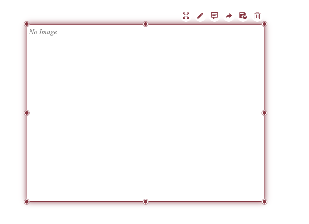
Image
The Image scenario allows you to display images within a dashboard. You can configure its behavior and appearance in the Inspector tab.
Example
Images can be added to your dashboard using the image component from your dashboard toolbox. Follow the steps below to add an image to your dashboard.
1. Add Image Component
From the dashboard toolbox,  drag the image component onto the canvas.
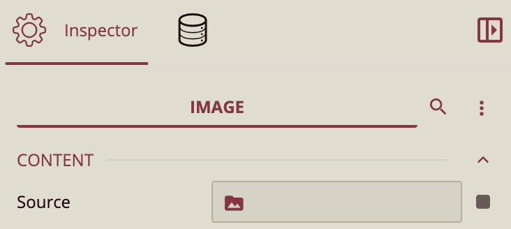
2. Upload Image
In the Inspector Panel, under the Content property group, select Source to upload your image.
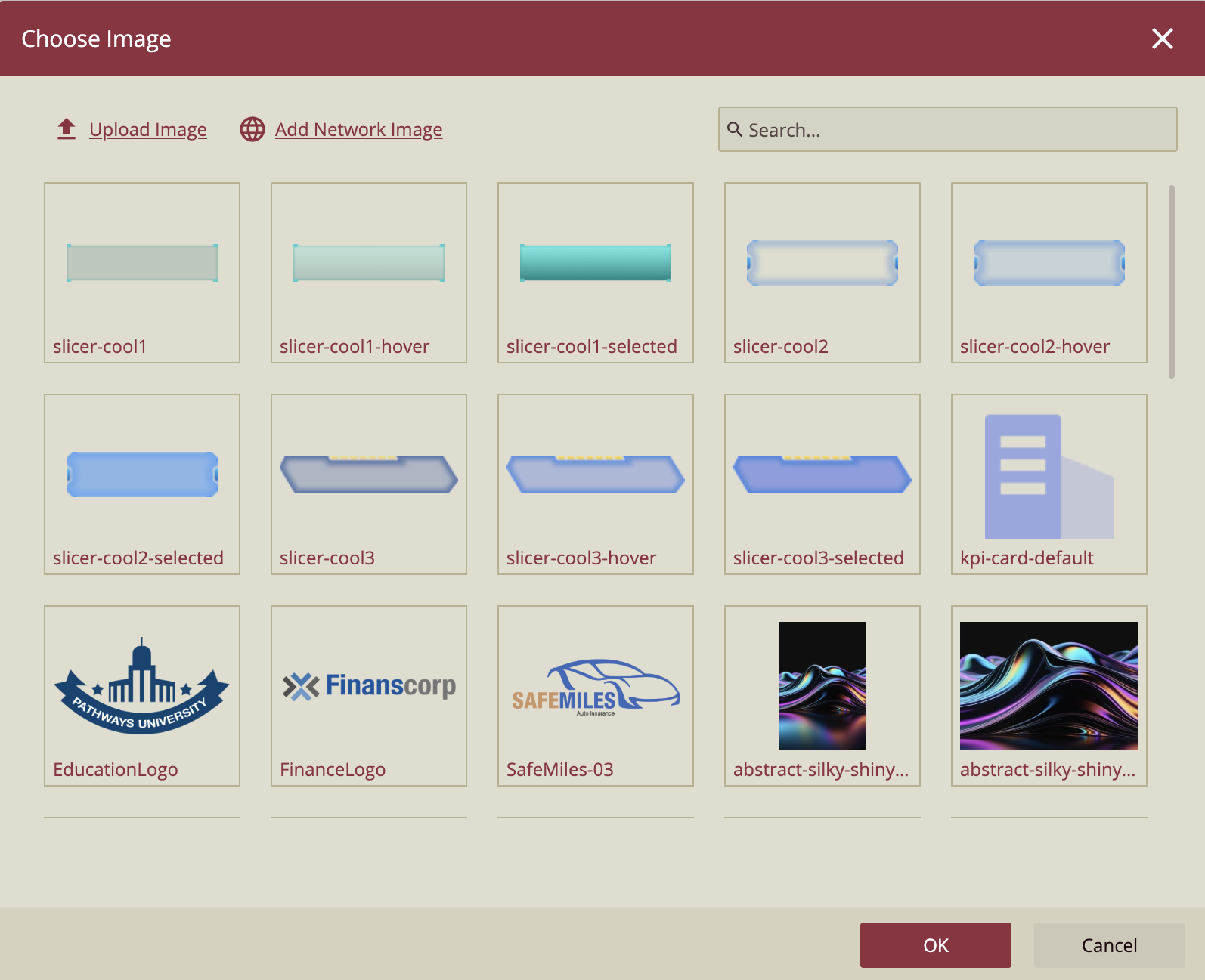
3. Select Image
In the dialogue window, you will see all the images available to you. Select the one you wish to use and click Ok.
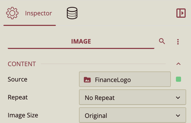
4. Resize Image
You can resize the image to improve its appearance in the Inspector Panel. Look at the Content property group, specifically Image Size.
5. Finish Editing
You can further edit your image by dragging the component edges to resize to fit your dashboard.
Inspector Panel Properties
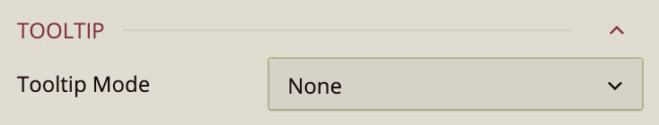
Tooltip
Tooltip Mode - Set to Data Point to display the tooltip.
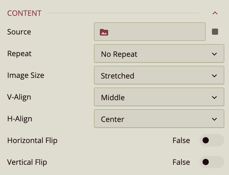
Content
Source
Select the image to display. Click the data slot next to Source to view available images that have been uploaded to Wyn through the Resource Portal.
Note: If you do not have access to the Resource Portal and need to upload an image, contact your administrator.
Repeat
Determines how the image is repeated within its container. Available options include:
No Repeat – Displays the image once without tiling.
Repeat – Tiles the image both horizontally and vertically.
RepeatX – Repeats the image horizontally.
RepeatY – Repeats the image vertically.
Space – Repeats the image with extra spacing between tiles.
Round – Repeats the image and scales it so tiles fit evenly.
Depending on the image size and the container dimensions, some repeat options may not produce visible changes. For example, if the image already fills the container, repeating it may appear to have no effect.
Image Size
Defines how the image fits within its container.
Original – Displays the image at its native resolution.
Contain – Scales the image to fit within the container while preserving aspect ratio.
Cover – Scales the image to completely cover the container while preserving aspect ratio (may crop edges).
Stretched – Stretches the image to fill the container, ignoring aspect ratio.
Vertical Align (V-Align)
Positions the image vertically within its container: Top, Middle (default), or Bottom.
Horizontal Align (H-Align)
Positions the image horizontally within its container: Left, Center (default), or Right.
Horizontal Flip
When enabled, flips the image horizontally (mirrors it left to right).
Vertical Flip
When enabled, flips the image vertically (mirrors it top to bottom).
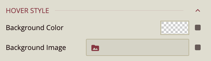
Hover Style
Configure the appearance of the image when users hover over it. Options include:
Background Color – Apply a background color on hover.
Background Image – Display an alternate background image on hover.