-
Interactive DashboardsCreate interactive BI dashboards with dynamic visuals.
-
End-User BI ReportsCreate and deploy enterprise BI reports for use in any vertical.
-
Wyn AlertsSet up always-on threshold notifications and alerts.
-
Localization SupportChange titles, labels, text explanations, and more.
-
Wyn ArchitectureA lightweight server offers flexible deployment.
-
 Wyn Enterprise 7.1 is ReleasedThis release emphasizes Wyn document embedding and enhanced analytical express...
 -
 Choosing an Embedded BI Solution for SaaS ProvidersAdding BI features to your applications will improve your products, better serve your customers, and more. But where to start? In this guide, we discuss the many options.
-
Visual GalleryInteractive sample dashboards and reports.
-
BlogExplore Wyn, BI trends, and more.
-
WebinarsDiscover live and on-demand webinars.
-
Customer SuccessVisualize operational efficiency and streamline manufacturing processes.
-
Knowledge BaseGet quick answers with articles and guides.
-
VideosVideo tutorials, trends and best practices.
-
WhitepapersDetailed reports on the latest trends in BI.
-
 Choosing an Embedded BI Solution for SaaS ProvidersAdding BI features to your applications will impr...
 -

- Getting Started
- Administration Guide
-
User Guide
- An Introduction to Wyn Enterprise
- Document Portal for End Users
- Data Governance and Modeling
- View and Manage Documents
- Working with Resources
- Working with Reports
- Working with Dashboards
- Working with Notebooks
- Wyn Analytical Expressions
- Section 508 Compliance
- Subscribe to RSS Feed for Wyn Builds Site
- Developer Guide
Tab Container
Tab Container Properties
The Tab Container scenario allows you to organize content into multiple tabs. You can configure the appearance and behavior of the tabs in the Inspector Panel.
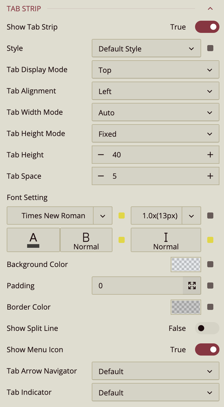
Tab Strip
Show Tab Strip – Toggle the tab strip at the top of the container on or off.
Style – Choose the visual style of the tabs. Options include: Labels, List, Button Group, Under Line, Gradient1, Gradient2, Gradient3, Cool1, Cool2, Cool3.
Tab Display Mode – Set the position of the tab strip: Top or Bottom.
Tab Alignment – Align the tabs: Left, Center, or Right.
Tab Width Mode – Controls how the tab width is calculated: Auto (default), Fixed, or Distribute.
Tab Height Mode – Controls the tab height calculation: Auto (default) or Fixed.
Tab Height – Set the numeric height of the tab using the input box or the
-and+buttons.Tab Space – Adjust the spacing between tabs using the input box or the
-and+buttons.Font Setting – Configure the font family, size, color, weight, and style of tab text.
Background Color – Set the background color of the tab strip.
Padding – Add padding around the tab strip.
Border Color – Define the border color of the tab container.
Show Split Line – Toggle a line around the tab strip. Default is False.
Show Menu Icon – Display an ellipsis menu icon for tab management. Default is True.
Tab Arrow Navigator – Toggle the navigation arrows for the tabs. Default is visible; can also be hidden.
Tab Indicator – Controls the visibility of the indicator line below the selected tab. Default is visible; can also be hidden.
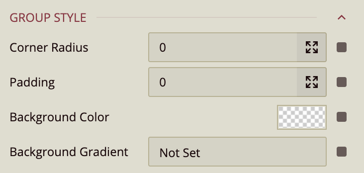
Group Style
Controls the overall style of the tab container.
Corner Radius – Adjust the curvature of the line that visually connects the tab to the container.
Padding – Add padding inside the tab container.
Background Color – Set a solid background color for the container.
Background Gradient – Apply a gradient fill using colors from the theme or a custom palette.
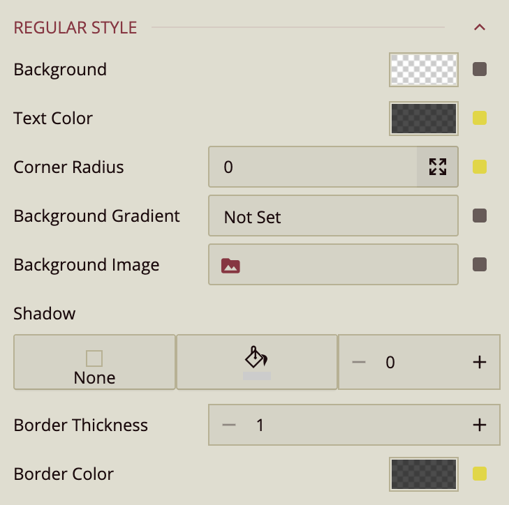
Regular Style
Defines the default style of the tabs.
Background – Set the solid background color.
Text Color – Configure the color of tab labels.
Corner Radius – Adjust the curvature of the line underneath the tab label.
Background Gradient – Apply a gradient fill for the tab.
Background Image – Use an image as the tab background.
Shadow – Add shadows to the tab: Inner, Outer, Both, or None. Configure color and thickness.
Border Thickness – Set the thickness of the tab border.
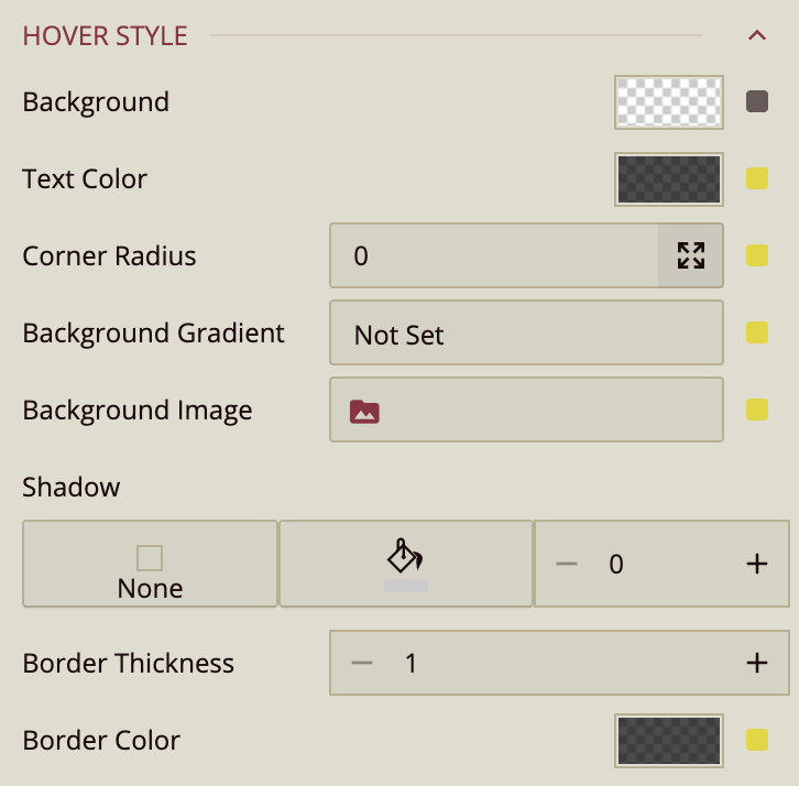
Hover Style
Controls the appearance of tabs when hovered.
Background – Change the background color on hover.
Text Color – Change the tab text color on hover.
Corner Radius – Adjust the curvature of the line under the tab label on hover.
Background Gradient – Apply a gradient color on hover.
Background Image – Display a background image on hover.
Shadow – Configure shadows for hovered tabs, including type, color, and thickness.
Border Thickness – Set the border thickness while hovered.
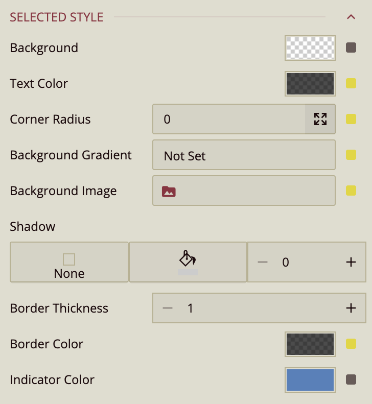
Selected Style
Controls the appearance of the currently selected tab.
Background – Set the background color for the selected tab.
Text Color – Set the text color for the selected tab.
Corner Radius – Adjust the curvature of the line under the selected tab.
Background Gradient – Apply a gradient fill for the selected tab.
Background Image – Use a background image for the selected tab.
Shadow – Configure shadows for the selected tab, including type, color, and thickness.
Border Thickness – Set the border thickness for the selected tab.