- Getting Started
- Administration Guide
-
User Guide
- An Introduction to Wyn Enterprise
- Document Portal for End Users
- Data Governance and Modeling
- View and Manage Documents
- Working with Resources
- Working with Reports
- Working with Dashboards
-
Working with Notebooks
- Notebook Designer
- Connect to Data
-
Blocks
- Content Blocks
- List Blocks
- Quote Blocks
- Structure Blocks
- Table Blocks
- Chart Blocks
- KPI
- Label Slicer
- Map
-
Property Reference
- Common Properties
- Stacked Column Chart Properties
- Percent Stacked Column Chart Properties
- Bar Chart Properties
- Stacked Bar Chart Properties
- Percent Stacked Bar Chart Properties
- Line Chart Properties
- Area Chart Properties
- Stacked Area Chart Properties
- Percent Stacked Area Properties
- Combined Chart Properties
- Pie Chart Properties
- Donut Chart Properties
- Scatter Chart Properties
- Bubble Chart Properties
- Funnel Chart Properties
- Treemap Chart Properties
- KPI Chart Properties
- Pivot Table Properties
- Data Table Properties
- KPI Matrix Properties
- Label Slicer Properties
- Map Properties
- Wyn Analytical Expressions
- Section 508 Compliance
- Subscribe to RSS Feed for Wyn Builds Site
- Developer Guide
Data Table Properties
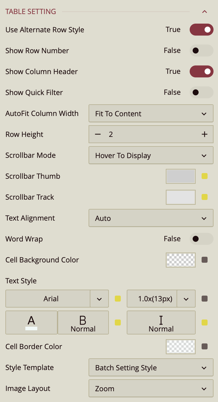
Table Setting
Use Alternate Row Style – Toggles alternating background colors for rows to improve readability. Enabled (True) by default.
Show Row Number – Toggles a row number column on the left side of the table. Disabled (False) by default.
Show Column Header – Toggles the display of column headers. Enabled (True) by default.
Show Quick Filter – Toggles a quick filter control for filtering visible data without adjusting main filters. Disabled (False) by default.
AutoFit Column Width – Determines how columns adjust their width.
Fit to Content (default) – Adjusts each column to fit its cell contents.
Fit to Header – Adjusts columns to fit the header text.
None – Keeps columns at a fixed width.
Row Height – Sets the height of table rows. Enter a numeric value in pixels.
Scrollbar Mode – Controls when scrollbars appear.
Hover to Display (default) – Shows scrollbars only when hovering over the table.
Auto – Displays scrollbars when content exceeds the table bounds.
Hidden – Hides scrollbars entirely.
Visible – Always shows scrollbars.
Scrollbar Thumb – Sets the color of the draggable portion of the scrollbar.
Scrollbar Track – Sets the color of the scrollbar track background.
Text Alignment – Aligns text within cells. Options are Auto (default), Left, Center, or Right.
Word Wrap – Toggles wrapping text within cells so long content appears on multiple lines. Disabled (False) by default.
Cell Background Color – Sets the background color for table cells.
Text Style – Configures font family, size, color, weight, and style (normal or italic) for table text.
Cell Border Color – Sets the color of cell borders.
Style Template – Applies a predefined style template to the table. Options include “Batch Setting Style,” built-in Excel-style templates, or Add New Style… to create a custom style.
Image Layout – Controls how images are displayed in table cells.
Zoom (default) – Scales the image proportionally to fill the cell as much as possible without cropping.
Origin – Displays the image at its original size and position.
Fill – Stretches the image to completely fill the cell, which may change its aspect ratio.
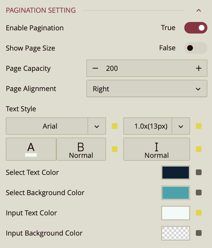
Pagination Setting

Enable Pagination – Toggles pagination for the table. When enabled, data is divided into pages. Enabled (True) by default.
Show Page Size – Toggles the display of the page size selector. Disabled (False) by default.
Page Capacity – Sets the maximum number of rows displayed per page. The default is 200.
Page Alignment – Aligns the pagination controls within the table footer. Options are Right (default), Left, or Center.
Text Style – Configures font family, size, color, weight, and style (normal or italic) for pagination text.
Select Text Color – Sets the text color for the active page number. Defaults to the palette color.
Select Background Color – Sets the background color for the active page number. Defaults to the palette color.
Input Text Color – Sets the text color for page number input fields. Defaults to the palette color.
Input Background Color – Sets the background color for page number input fields. Defaults to the palette color.
Tooltip

Tooltip Mode – Determines how tooltips are displayed when hovering over the chart:
None – Disables tooltips.
Data Point (default) – Shows a tooltip for the specific data point under the pointer.
Category – Shows a tooltip for all data points that share the same category value.
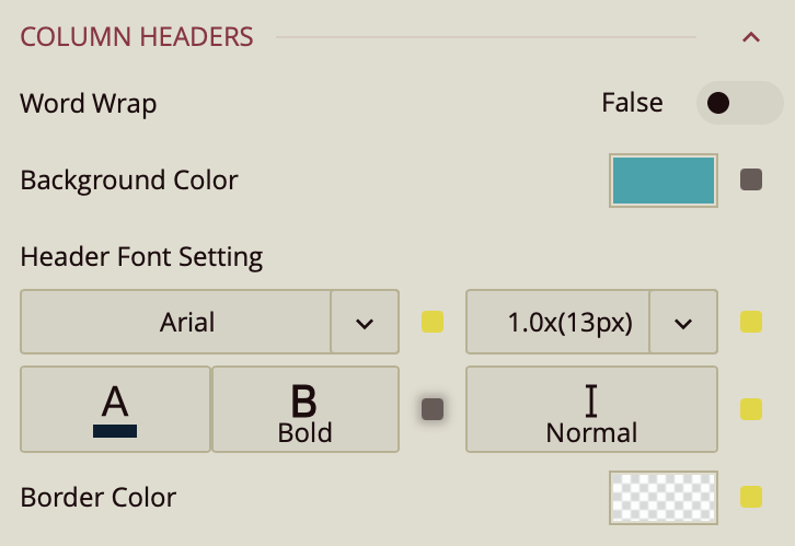
Column Headers

Word Wrap – Toggles wrapping of header text (False by default).
Background Color – Sets the background color for the header area.
Header Font Setting – Configures font family, size, color, weight, and style for header text.
Border Color – Sets the border color for the header area.


