- Getting Started
- Administration Guide
-
User Guide
- An Introduction to Wyn Enterprise
- Document Portal for End Users
- Data Governance and Modeling
- View and Manage Documents
- Working with Resources
- Working with Reports
- Working with Dashboards
-
Working with Notebooks
- Notebook Designer
- Connect to Data
-
Blocks
- Content Blocks
- List Blocks
- Quote Blocks
- Structure Blocks
- Table Blocks
- Chart Blocks
- KPI
- Label Slicer
- Map
-
Property Reference
- Common Properties
- Stacked Column Chart Properties
- Percent Stacked Column Chart Properties
- Bar Chart Properties
- Stacked Bar Chart Properties
- Percent Stacked Bar Chart Properties
- Line Chart Properties
- Area Chart Properties
- Stacked Area Chart Properties
- Percent Stacked Area Properties
- Combined Chart Properties
- Pie Chart Properties
- Donut Chart Properties
- Scatter Chart Properties
- Bubble Chart Properties
- Funnel Chart Properties
- Treemap Chart Properties
- KPI Chart Properties
- Pivot Table Properties
- Data Table Properties
- KPI Matrix Properties
- Label Slicer Properties
- Map Properties
- Wyn Analytical Expressions
- Section 508 Compliance
- Subscribe to RSS Feed for Wyn Builds Site
- Developer Guide
Funnel Chart Properties
Data Binding
The Data Binding tab allows you to assign data fields to the funnel chart elements and configure how the data is displayed.
Values – Drag a numeric field here to define the size of each funnel segment.
Ellipsis menu:
Data Format – Opens the data format dialog to customize number formatting.
Display Unit – Choose how values are scaled: Auto (default), None, Thousands, Millions, Billions, or Trillions.
Legend (Series) – Drag a categorical field here to group funnel segments into series, which are distinguished by color.
Trellis Columns – Drag a categorical field here to create a column-based small multiple layout. Each column displays a subset of the data based on the field value.
Trellis Rows – Drag a categorical field here to create a row-based small multiple layout. Each row displays a subset of the data based on the field value.
Tooltip – Drag one or more fields here to display additional information when a user hovers over a funnel segment.
Ellipsis menu: Same as Values.
Drill Down – Enables hierarchical exploration of funnel segments.
Mode – Determines the drill-down method. Default is Default.
Dropdown options:
Pre-set Targets – When selected, opens a data binding slot to specify Drill Down Targets.
Pre-set Path – When selected, opens a data binding slot to specify Drill Down Paths.
Chart Style
Funnel charts in Wyn can be extensively styled and configured using the Inspector panel. Below are key settings you can modify:
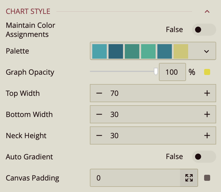
Maintain Color Assignments: Toggle this to True if you want to manually assign specific colors to individual data values instead of using automatic color mapping.
Palette: Lets you customize the color scheme applied to the chart. Use the dropdown to choose from available color palettes based on the current Theme.
Graph Opacity: Controls the transparency of the chart. Set to 0% for fully transparent or 100%for fully opaque.
Top Width – Specifies the width of the funnel’s top section. Accepts a numerical value, which can be an absolute measurement or a percentage of the chart’s total width.
Bottom Width – Defines the width of the funnel’s bottom section. Accepts a numerical value, which can be an absolute measurement or a percentage of the chart’s total width.
Neck Height – Sets the height of the funnel’s neck section (the vertical part before the bottom). Accepts a numerical value, which can be an absolute measurement or a percentage of the total funnel height.
Auto Gradient – A toggle option that, when enabled, automatically applies a gradient color effect to the plotted symbols. Default is false.
Canvas Padding – Controls the amount of blank space between the plotted data area and the edges of the chart canvas. Accepts a numerical value.
Data Visualization

Top N Grouping – When enabled, limits the displayed data to the top N items based on a chosen measure (e.g., top 10 categories by sales). This is useful for focusing on the most significant data points.
Additional Option: When this setting is turned on, a Showproperty appears, allowing you to enter a numeric value for N (the number of top items to display).
Default: Off.
Include All Dimensions – When enabled, ensures that all available dimension values are included in the visualization, even if they have no corresponding measure values. This can help maintain consistent category representation across views. Default: Off.
Data Labels
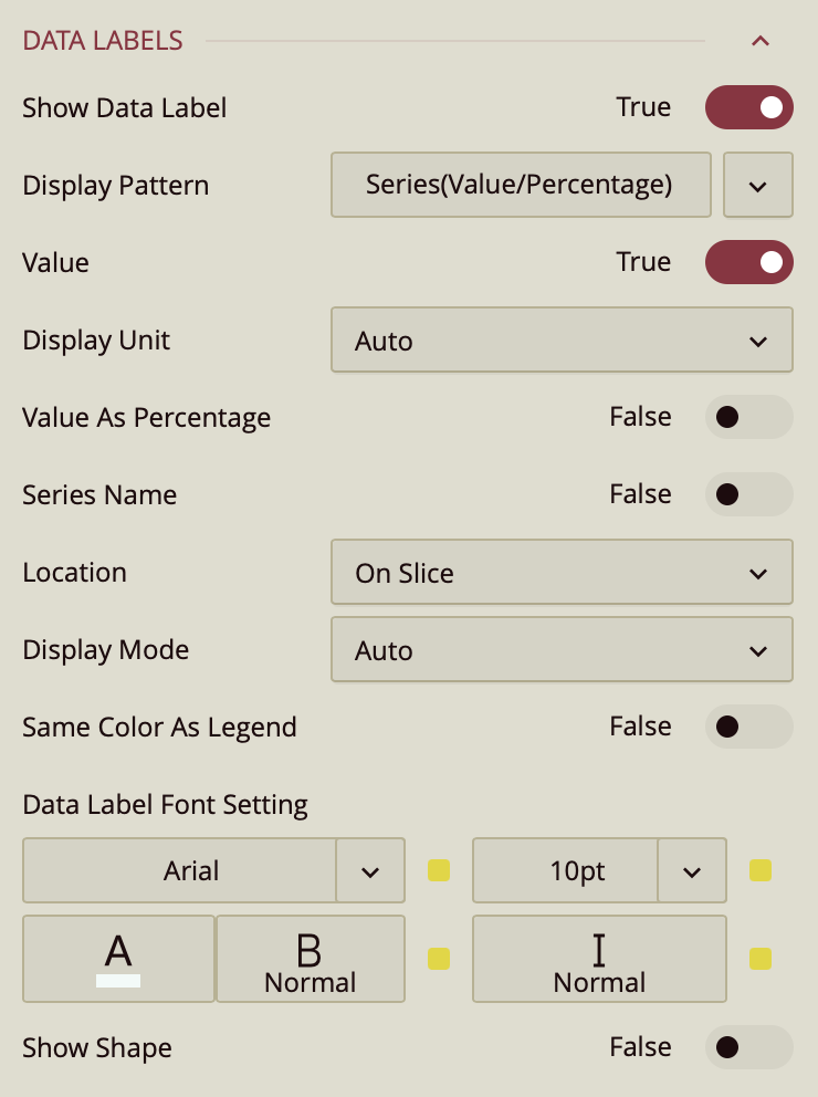
Show Data Label: Toggle this on to enable data labels on the chart.
Display Pattern: Choose a label structure from:
Series (Value/Percentage)
Series Value/Percentage
Note: This controls the format, but not which elements are shown.
Toggle Visibility for Each Element:
Value – must be set to true to display values.
Value As Percentage – toggle on to display the value as a percentage.
Decimal Places – set the number of decimal places on the percentage value.
Series Name: Set to True to show the series name.
Location: Choose between On Slice or Around.
Line Width: Set the line width of the data label.
Connecting Line Color: Set the color of the connecting line on the data label.
Display Mode: ???
Same Color As Legend: ???
Data Label Font Setting:
Font family, size (pt), color, weight, and italic styling.
Show Shape: Toggle on to add a background shape to the label.
Upload a Shape Image.
Adjust placement and size with:
Shape X Center
Shape Y Center
Shape X Scale
Shape Y Scale
Tooltip

Tooltip Mode – Determines how tooltips are displayed when hovering over the chart:
None – Disables tooltips.
Data Point (default) – Shows a tooltip for the specific data point under the pointer.
Category – Shows a tooltip for all data points that share the same category value.
Legend
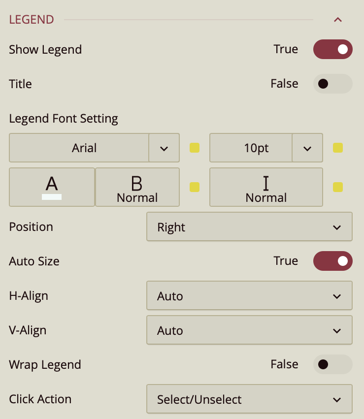
By default, the Show Legend toggle is set to False. To include a title for the legend, enable the Title toggle as well. You can customize the title by setting the Font Family (e.g., Arial), Font Size, Text Color, Font Weight (such as bold), and applying Italic styling if desired.
The Position property allows you to position the legend title to the left, center, or right of the chart area.
The legend is set to Auto Size by default. To manually define the legend size, disable this setting by setting Auto Sizeto False. You can also control the Horizontal and Vertical Alignment, which are both set to Auto by default but can be changed using dropdown options. To allow legend labels to wrap across lines, set the Wrap Legend option to True.
Click Action ??
Trellis
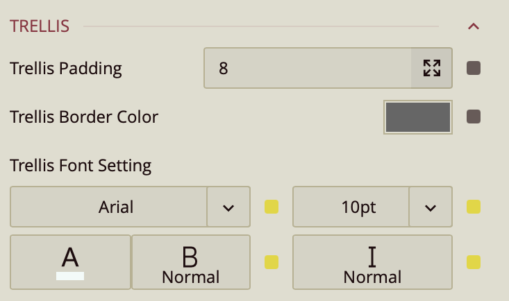
Use the Trellis properties when you create a Trellis Chart. This can be done in the Data Binding Tab. Drag and drop the attribute to Trellis.
You can set the Padding around the Trellis Chart to control the spacing between the chart content and its edges. You can also define a Trellis Border Color to outline each panel of the trellis. Additionally, the Trellis Font Settings allow you to customize the font family, size, color, weight, and style of the text used in the trellis layout.
Drill Down Setting
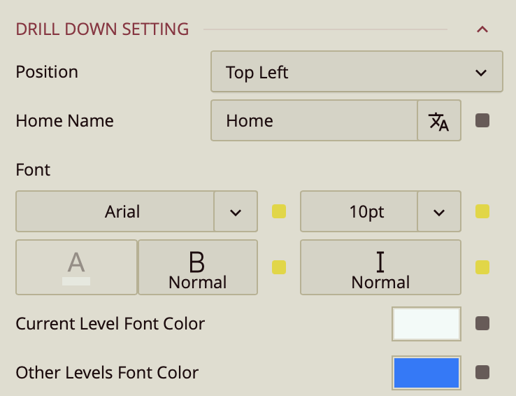
Position – Determines where the drill-down navigation bar is displayed on the chart. Options include:
Top left (default)
Top center
Top right
Bottom left
Bottom center
Bottom right
Home Name – Specifies the text label for the top-level view in the drill-down hierarchy. The default label is Home, but you can change it to something more descriptive, such as All Regions or Main Category.
Font – Configures the font family, size, color, weight (e.g., bold), and style (e.g., italic) for all drill-down navigation text.
Current Level Font Color – Sets the color for the label of the currently active drill-down level, helping it stand out from other levels.
Other Levels Font Color – Sets the color for labels representing all non-active drill-down levels, allowing users to visually distinguish between the active and inactive levels in the navigation path.


