- Getting Started
- Administration Guide
-
User Guide
- An Introduction to Wyn Enterprise
- Document Portal for End Users
- Data Governance and Modeling
- Working-with-Resources
- Working with Reports
- Working with Dashboards
- View and Manage Documents
- Understanding Wyn Analytical Expressions
- Section 508 Compliance
- Developer Guide
Funnel Chart
A Funnel chart helps in visualizing sequential stages in a linear process such as order fulfillment. In such processes, each stage represents a proportion (percentage) of the total. Therefore, the chart takes the funnel shape with the first stage being the largest and each subsequent stage smaller than the predecessor. The funnel charts can be used to represent stages in a sales process and represent the amount of potential revenue for each stage. This type of chart is useful in finding potential problem areas in an organization's sales processes. For instance, with funnel charts, you can plot the order fulfillment process that tracks the number of orders getting across a stage.
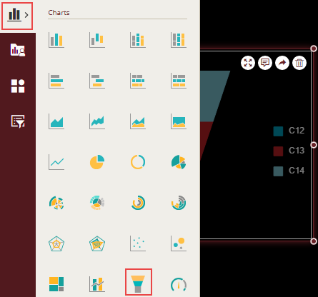
Design a Funnel Chart in Wyn Enterprise
From the Dashboard Toolbox, open the Data Visualization node and drag-drop the Funnel Chart scenario onto the design area.
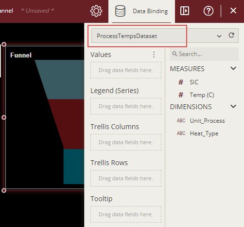
Bind Dataset to Chart Scenario
With the scenario selected, from the Data Binding tab, select the dataset. Once the dataset is successfully loaded in the designer, the data binding panel automatically expands and displays the data attributes available in the dataset.
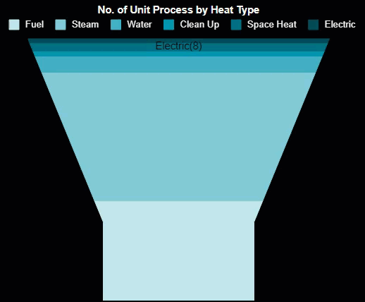
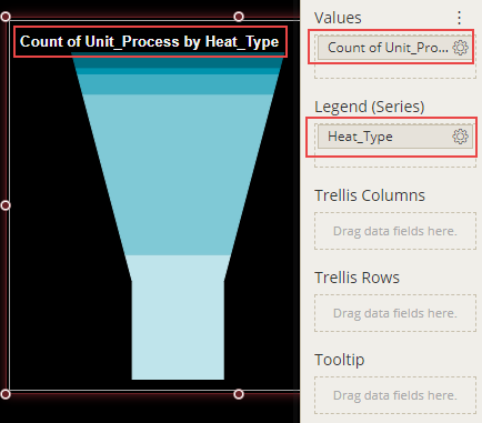
The following image shows the chart scenario bound to the 'ProcessTempsDataset' dataset.
On dragging and dropping the data attributes to the data binding area of the scenario, the chart is plotted accordingly, with a default chart title on the design area.
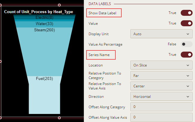
Initially, the data in the chart scenario is difficult to understand because of the hidden data labels. You can display the data labels and series names in a chart scenario by using the Show Data Label and Series Name properties.
Format Data Attributes
You can format the data attributes and control the display of data by performing a variety of operations such as renaming, modifying data format and display unit, creating a hierarchy field, applying an aggregation method, etc. Using these operations, you can control the display of data attributes in a scenario.
For more information about these operations, see Data Attributes.
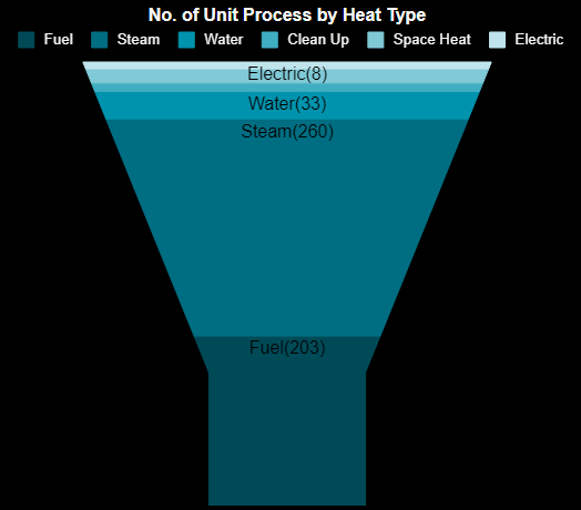
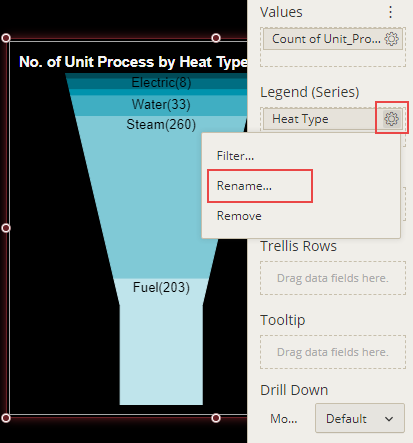
In the following image, the data attribute is renamed to remove the underscore from its original name, that is, 'Heat_Type'.
Analyze Data
Wyn Dashboards scenarios support rich data analysis and exploration capabilities that can help analyze massive amounts of information and make data-driven decisions. For example, adding filters to scenarios, sorting data, applying conditional formatting, etc. Note that you can apply all these operations using the Action Bar corresponding to each scenario in the designer.
For more information, see Data Analysis and Interactivity in Dashboards.
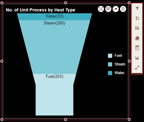
In the following chart scenario, the filter is applied to show data only for the selected heat types, that is, fuel, steam, and water.
Customize Chart Appearance
You can customize the default chart appearance by setting properties in the Inspector tab of the scenario such as adding a border, modifying data labels, setting chart style, renaming chart title, etc.
Set Chart Style
Change the chart colors in the scenario by using the Palette property in the Inspector tab. Set the property to a suitable color palette from the list.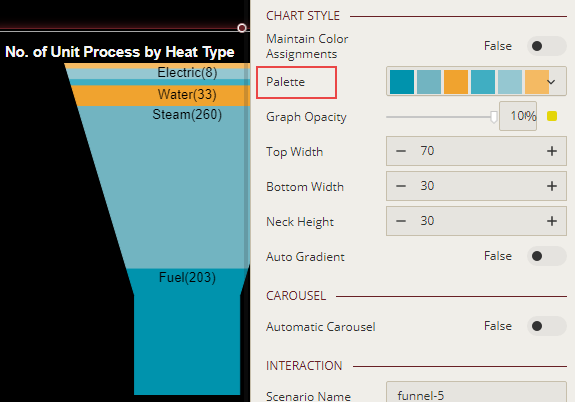
Modify Height and Width
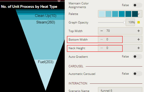
To customize the height and width for a funnel chart scenario, use the Top Width, Bottom Width, and Neck Height properties.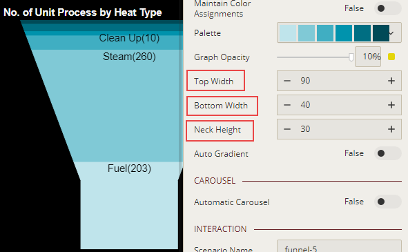
You can make a funnel chart look like an inverted pyramid by setting the Bottom Width and Neck Height properties to '0' (zero).
Enable Automatic Carousel
Enable the automatic carousel effect in the scenario by using the Automatic Carousel property to create a highly interactive and effective dashboard. The automatic carousel effect when enabled will highlight the information for each funnel part in the chart scenario one by one. You can specify the time interval for the automatic carousel by using the Interval (seconds) property.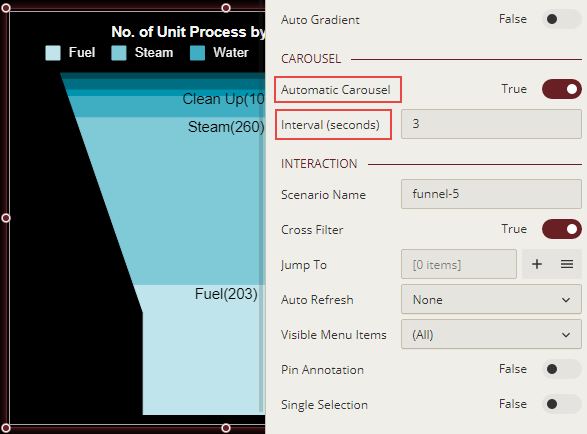
You can see this effect when previewing the dashboard in the Dashboard Viewer.