


- Getting Started
- Administration Guide
-
User Guide
- An Introduction to Wyn Enterprise
- Document Portal for End Users
- Data Governance and Modeling
- Working with Resources
- Working with Reports
-
Working with Dashboards
- Dashboard Designer
- Dashboard Templates
- Selecting a Dataset
- Data Attributes
- Dashboard Scenarios
- Component Templates
- 3D Scene
- Explorer
- Visualization Wizard
- Data Analysis and Interactivity
- Dashboard Appearance
- Preview Dashboard
- Export Dashboard
- Dashboard Lite Viewer
- Using Dashboard Designer
- Animating Dashboard Components
- View and Manage Documents
- Understanding Wyn Analytical Expressions
- Section 508 Compliance
- Subscribe to RSS Feed for Wyn Builds Site
- Developer Guide
Bubble E-Chart
Bubble E-Charts are dynamically engaging visualization tools designed to encapsulate multi-dimensional data in a single graphical representation. Bubble e-Chart represents a canvas of colorful, circular markers positioned along two axes corresponding to different variables and dimensions. The size of each bubble indicates a quantitative measure associated with the data point. Learn more about creating, using, and customizing a Bubble e-Chart in Wyn Enterprise below.
In this help article, you will find the following information,
Create a Bubble E-Chart
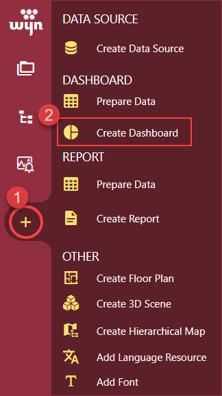
To create a Bubble E-Chart, navigate to the Resource or Document Portal and follow the below instructions,
Click the + Create button and then click the Create Dashboard option.
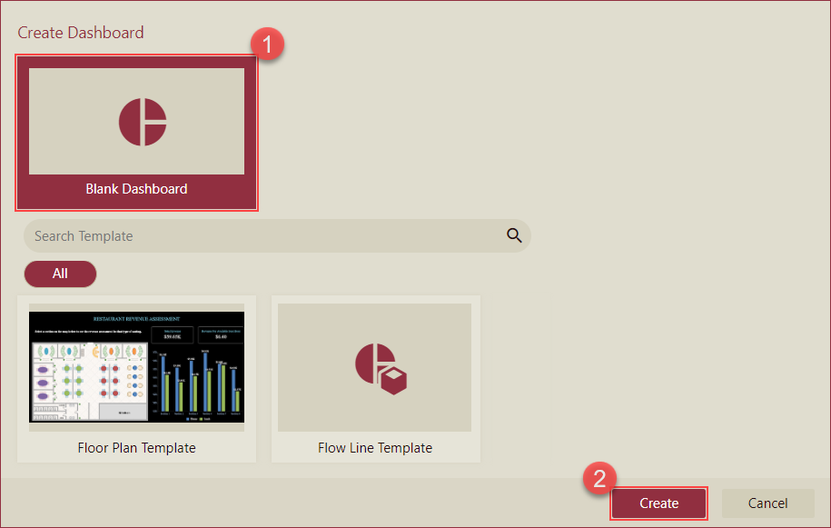
Select the Blank Dashboard option or select a template and click the Create button.
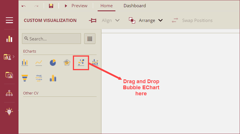
Navigate to the Custom Visualization tab from the Designer Toolbox and drag and drop the Bubble Chart(Echarts) onto the design area.
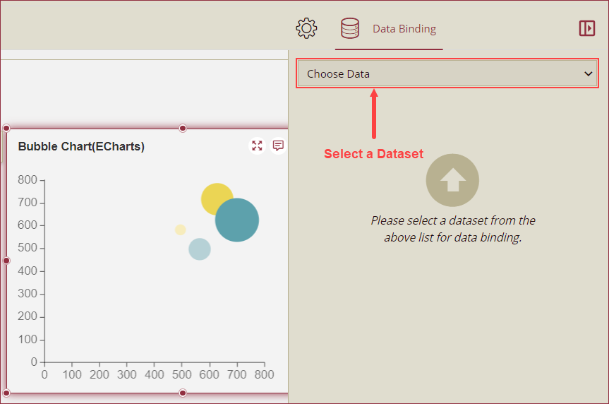
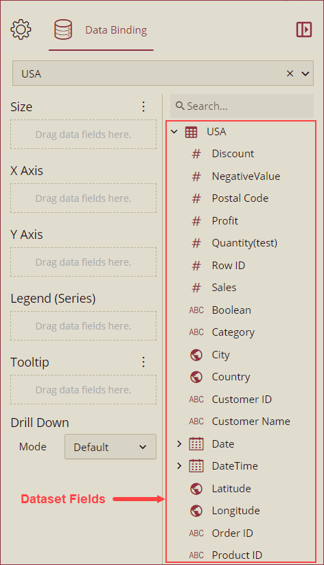
Bind Dataset to Bubble E-Chart
With the Bubble E-Chart selected, choose a dataset from the Choose Data dropdown in the Data Binding panel.
Now, drag and drop the applicable dataset fields in the Size, X Axis, Y Axis, Legend (Series), and Tooltip data containers. You can also select a drill-down mode (Default, Pre-set Targets, or Pre-set Path) from the Mode dropdown under the Drill Down option. See the Drill Down help article for more information on drilling down in Wyn Enterprise.
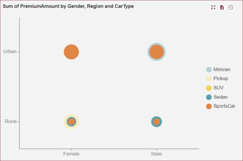
The below image shows a bubble E-chart with the PremiumAmount field bound to the Size data role, Gender field bound to X Axis, Region bound to Y Axis, and CarType field bound to the Legend (Series) data role.
Format Data Attributes
You can perform various operations in a Bubble E-Chart to format the data attributes and control the data display. Use the settings icon in the Data Field containers to format data attributes. The following operations are included in the Bubble E-Chart scenario;
Aggregation Method: Use the Aggregation Method option to display a summarized value by aggregating multiple values of a data attribute. Aggregation Method supports Sum, Average, Max, Min, Count, and Distinct Count methods. See the Aggregation Method help article for more information.
Filter: Use the Filter option to display relevant data in your chart scenario. See the Filter Data help article for more information.
Rename: Use the Rename option to change the name of a data attribute to make it comprehensible and meaningful. See the Rename a Data Attribute help article for more information.
Remove: Use the Remove option to remove a data attribute from the chart scenario.
Tooltip Setting: Use the tooltip setting to customize the tooltips. You can customize the background image, color, and font style, add new data fields, modify the data fields, and modify expressions for data binding.
Analyze Data
Wyn dashboard scenarios support rich data analysis and exploration capabilities to help you analyze massive amounts of information and make data-driven decisions. The following analysis operations are available in the Action Bar corresponding to each scenario in the designer;
Filter: To filter out relevant data in your chart scenario. See the Filter Data help article, for information on using the filter options in a dashboard scenario.
Sort: To arrange the chart data in a more meaningful order. See the Sort help article for information on using the sort options in a dashboard scenario.
Focus: To expand the chart scenario to full-screen size, use the Focus option.
Customize Appearance
Navigate to the Inspector Panel and modify the settings as per your requirements. The properties of the Bubble E-Chart are listed and described below.
CHART STYLE
Property | Description |
|---|---|
Maintain Color Assignments | To change the color assignments of the column bars, turn the flag to True and change the color of the data items from the Assign Colors popup using the Color Assignment property. To use the default color palettes for the column bars, turn the flag to False and select a default color palette from the Palette property. By default, the value of the Main Color Assignment property is set as False. |
Palette | Palette property is visible only when the Maintain Color Assignment property is set to False. A palette is used to select the group of colors for the bubbles. |
Graph Opacity | Use the Graph Opacity property to set the opacity level of the e-chart. The value of the Graph Opacity property ranges from 0% to 100%. |
Auto Gradient | To set an automatic color gradient in the chart, set the Auto Gradient property to True. By default, the value of this property is set as False. |
Canvas Padding | Set the Left, Right, Top, and Bottom positions of the chart canvas using the this property. |
Custom Echarts Option | Use the Custom Echarts Option to customize the chart using JavaScript code. |
ANIMATION
Property | Description |
|---|---|
Entrance Animation | Select an option from the dropdown to set the animation style of the appearance of the chart scenario. After selecting an option (SlideInDown, SlideInLeft, SlideInRight, SlideInUp, SlideInDown, BackInDown, BackInLeft, or BackInRight) from the dropdown, set the delay and duration of the animation using the Delay(s) and Duration(s) properties respectively. |
DATA VISUALIZATION
Property | Description |
|---|---|
Automatic Carousel | To highlight the columns one at a time and display the tooltip, set the Automatic Carousel property to True. By default, this property is set to False. |
Interval (seconds) | Sets the interval (in seconds) at which the columns are highlighted in the automatic carousel mode. |
Include All Dimensions | To include the labels with Null values in the chart scenario, set this property to True. |
Show Zoom Axis | To display the Zoom Axis on the chart scenario set the Show Zoom Axis property to True. |
Zoom Axis Size | Set the size of the zoom axis ranging between 10 to 30 using the Zoom Axis Size property. |
Zoom Axis Default Length | Set the default length of the zoom axis using the Zoom Axis Default Length property. |
Zoom Axis Color | Select the color of the zoom axis using the Zoom Axis Color property. |
DATA LABELS
Property | Description |
|---|---|
Show Data Labels | To display data labels set the Show Data Label property to True. By default, the value of the Show Data Label property is set to False. |
Value | To disable the display of the data label values set the Value property to True. By default, the value of the Value property is set to False. |
Display Unit | Select a display unit option from the dropdown. The available options are Auto, None, Thousands, Millions, Billions, and Trillions. |
Series Name | play the name of the data label series set the Series Name property to True. By default, the property is set to False. |
Location | Select the Inside or Outside option from the dropdown to display the data lables inside or outside the column bars. |
Display Mode | Select an option from the dropdown to set the display mode of the data labels. The available options are Auto and All. |
Data Label Font Setting | Set the font family, font size, font color, font weight, and font style of the data labels using this property. |
X AXIS
Property | Description |
|---|---|
Show Axis | To hide the Category (X) Axis, set this property to False. By default, this property is set as True. |
Max Value | Set the maximum value of the X Axis labels using the Max Value property. Set the maximum value of the X Axis labels using the Max Value property. |
Min Value | Set the minimum value of the X Axis labels using the Min Value property. |
Interval | Set the interval between two labels of the X Axis using the Interval property. |
Axis Position | Select the Left or Right option from the dropdown to set the position of the X Axis. |
Show Axis Line | To hide the X Axis line, set this property to False. By default, this property is set as True. |
Axis Line Type | Select the Solid or Dashed line type from the dropdown for the X Axis line. |
Axis Line Color | Set the color of the X Axis line using this property. |
Axis Line Width | Set the X Axis line width using this property. |
Show Grid Lines | To show the X Axis grid line, set this property to True. By default, this property is set as False. |
Grid Line Type | Select the Solid or Dashed type of grid lines for the X Axis from the dropdown. |
Grid Line Color | Set the color of the grid lines of the X Axis. |
Grid Line Width | Set the width of the grid lines of the X Axis. |
Show Split Area | To highlight the split area on the chart, set the Show Split Area property to True. By default, the property is set to False. |
Odd Area Color | Select a color to highlight the odd area. |
Even Area Color | Select a color to highlight the even area. |
Show Tick Labels | To hide the tick labels of the Category (X) Axis, set this property to False. By default, this property is set as True. |
Format | Set a general, number, currency, percentage, or custom format for the labels of the X Axis. |
Display Unit | Select the Auto, None, Thousands, Millions, Billions, or Trillions option from the dropdown to set the display units of the X Axis labels. |
Label Direction | Select the Auto, Horizontal, Vertical, or Diagonal option from the dropdown to set the direction of the X Axis labels. |
Label Overflow Setting | Select Hide, Ellipsis, or Wrap option from the dropdown for the overflowing text of the labels. |
Show Tick Marks | To hide the tick marks of the Category (X) Axis, set this property to False. By default, this property is set as True. |
Show Title | To show the title of the Category (X) Axis, set this property to True. By default, this property is set as False. |
Axis Font Setting | Set the font family, size, color, weight, and style of the Category (X) Axis labels using the Axis Font Setting options. |
Y AXIS
Property | Description |
|---|---|
Show Axis | To hide the Y Axis, set this property to False. By default, this property is set as True. |
Max Value | Set the maximum value of the Y Axis labels using the Max Value property. Set the maximum value of the Y Axis labels using the Max Value property. |
Min Value | Set the minimum value of the Y Axis labels using the Min Value property. |
Interval | Set the interval between two labels of the Y Axis using the Interval property. |
Reversed | To reverse the appearance of the chart scenario, set this property to True. By default, this property is set as False. |
Axis Position | Select the Left or Right option from the dropdown to set the position of the Y Axis. |
Show Axis Line | To hide the Y Axis line, set this property to False. By default, this property is set as True. |
Axis Line Type | Select the Solid or Dashed line type from the dropdown for the Y Axis line. |
Axis Line Color | Set the color of the Y Axis line using this property. |
Axis Line Width | Set the Y Axis line width using this property. |
Show Grid Lines | To show the Y Axis grid line, set this property to True. By default, this property is set as False. |
Grid Line Type | Select Solid or Dashed type of grid lines for the Y Axis from the dropdown. |
Grid Line Color | Set the color of the grid lines of the Y Axis. |
Grid Line Width | Set the width of the grid lines of the Y Axis. |
Show Split Area | To highlight the split area on the chart, set the Show Split Area property to True. By default, the property is set to False. |
Odd Area Color | Select a color to highlight the odd area. |
Even Area Color | Select a color to highlight the even area. |
Show Tick Labels | To hide the tick labels of the Y Axis, set this property to False. By default, this property is set as True. |
Format | Set a general, number, currency, percentage, or a custom format for the labels of the Y Axis. |
Display Unit | Select Auto, None, Thousands, Millions, Billions, or Trillions option from the dropdown to set the display units of the Y Axis labels. |
Label Direction | Select the Horizontal, Vertical, or Diagonal option from the dropdown to set the direction of the Y Axis labels. |
Label Overflow Setting | Select Hide, Ellipsis, or Wrap option from the dropdown for the overflowing text of the labels. |
Show Tick Marks | To hide the tick marks of the Y Axis, set this property to False. By default, this property is set as True. |
Show Title | To show the title of the Y Axis, set this property to True. By default, this property is set as False. |
Show unit's label | To display the unit of measurement label alongside the axis values, set this property to True. By default, this property is set as False. |
Title Offset | Set the offset distance of the title from the Value Axis using this property. |
Axis Font Setting | Set the font family, size, color, weight, and style of the Value (Y) Axis labels using the Axis Font Setting options. |