-
Interactive DashboardsCreate interactive BI dashboards with dynamic visuals.
-
End-User BI ReportsCreate and deploy enterprise BI reports for use in any vertical.
-
Wyn AlertsSet up always-on threshold notifications and alerts.
-
Localization SupportChange titles, labels, text explanations, and more.
-
Wyn ArchitectureA lightweight server offers flexible deployment.
-
 Wyn Enterprise 7.1 is ReleasedThis release emphasizes Wyn document embedding and enhanced analytical express...
 -
 Choosing an Embedded BI Solution for SaaS ProvidersAdding BI features to your applications will improve your products, better serve your customers, and more. But where to start? In this guide, we discuss the many options.
-
Visual GalleryInteractive sample dashboards and reports.
-
BlogExplore Wyn, BI trends, and more.
-
WebinarsDiscover live and on-demand webinars.
-
Customer SuccessVisualize operational efficiency and streamline manufacturing processes.
-
Knowledge BaseGet quick answers with articles and guides.
-
VideosVideo tutorials, trends and best practices.
-
WhitepapersDetailed reports on the latest trends in BI.
-
 Choosing an Embedded BI Solution for SaaS ProvidersAdding BI features to your applications will impr...
 -

- Getting Started
- Administration Guide
-
User Guide
- An Introduction to Wyn Enterprise
- Document Portal for End Users
- Data Governance and Modeling
- View and Manage Documents
- Working with Resources
-
Working with Reports
- Report Designer
- Data Binding in Reports
- Master Reports
- Report Controls
- Data Analysis and Interactivity
- Expression Editor
- Page Layout
- Styles and Themes
- Preview Report
- Export Report
- Report Templates
- Using Report Designer
- Report Render Mode
- Time Zone Setting
- Working with Dashboards
- Working with Notebooks
- Wyn Analytical Expressions
- Section 508 Compliance
- Subscribe to RSS Feed for Wyn Builds Site
- Developer Guide
Chart Element Propeties
Common
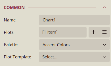
Name
Default display name of the chart (e.g., Chart1).
Helps identify the chart when working with multiple charts.
Can be renamed to a meaningful label.
Plots
Defines the data series and visual elements inside the chart.
Add Items (+): Insert new plots (bar, line, area, pie, etc.).
Three-line menu: Edit, duplicate, or delete a plot.
Each plot has its own data binding, style, and formatting options.
Palette
Custom Palette
Allows manually assigning specific colors to individual data values.
Overrides the theme or standard palette for full customization.
Theme Palette
Inherits colors from the report theme.
Ensures consistent colors across report items.
Updates automatically when the theme changes.
Standard Palette
Provides fixed, built-in color sets.
Colors remain the same regardless of the theme.
Useful when charts should always follow a specific look.
Plot Template
Applies a predefined plot style for different chart types.
Let's you switch between visualization styles without rebuilding plots.
Data
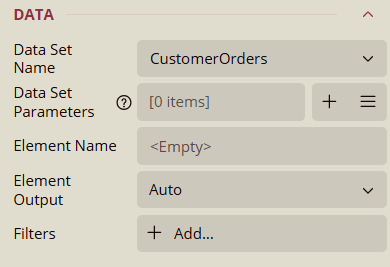
Data Set Name
Selects the dataset that provides data for the chart.
The dropdown lists all available datasets defined in the report.
Data Set Parameters
Displays the parameters defined in the selected dataset.
Each parameter can be mapped to a constant value, an expression, or a report parameter.
Add Items (+): To add a parameter.
Three-line menu: To show items.
Element Name
Defines the logical name of the chart element within the dataset context.
Default is
<Empty>, but you can assign a meaningful name if multiple chart elements use the same dataset.
Element Output
Controls whether the chart outputs its data element to consumers, such as other report items or export formats.
Auto: Automatically decides based on usage.
Output: Always outputs the element data.
NoOutput: Suppresses the element from being included in the output.
Filters
Allows filtering of dataset records at the chart level.
Use + Add Filter to define one or more filter conditions.
Background
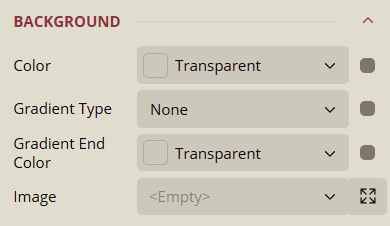
Color
Sets the color of the chart element.
Options:
Shared: Uses a shared color resource.
Embedded: Stores a custom color within the report.
Database: Retrieves color dynamically from a dataset field.
Data Binding: Allows mapping the color to a dataset value or expression.
Gradient Type
Defines the gradient style for the chart element.
Options:
None: No gradient applied.
LeftRight: Gradient from left to right.
TopBottom: Gradient from top to bottom.
Center: Gradient radiates from the center outward.
DiagonalLeft: Gradient from top-left to bottom-right.
DiagonalRight: Gradient from top-right to bottom-left.
HorizontalCenter: Gradient horizontally from the center outward.
VerticalCenter: Gradient vertically from the center outward.
Data Binding: Allows dynamically controlling the gradient based on dataset values.
Gradient End Color
Specifies the ending color for the gradient.
Options:
Palettes: Pre-defined color palettes.
Other Colors: Custom color picker.
Web Colors: Standard web-safe colors.
Image
Adds an image to the chart element, either as background or decorative content.
Options:
Shared: Uses an image shared across reports.
Embedded: Stores the image inside the report.
Database: Retrieves the image from a dataset field.
Expanded Properties (visible when clicking the expand button):
Source: Defines the image source type (Shared, Embedded, Database).
Value: The image file, expression, or dataset field.
MIME Type: Specifies the format of the image (e.g.,
image/png,image/jpeg).Repeat: Determines how the image repeats:
NoRepeat: Image is shown once.
RepeatX: Repeats horizontally.
RepeatY: Repeats vertically.
Border
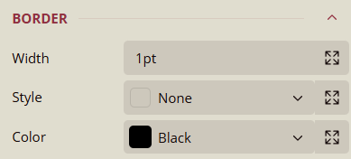
Border Properties
Width
Sets the thickness of the chart element border.
Default value: 1pt.
Expanded Properties: Clicking the expand button displays the default value (1pt) and allows for adjustment per side.
Data Binding: Allows mapping the width dynamically from a dataset value or expression.
Left
Specifies the border style or value for the left side of the element.
Default:
<Empty>.Data Binding: Allows dynamically setting the left border from a dataset value or expression.
Up (Top)
Specifies the border style or value for the top side of the element.
Default:
<Empty>.Data Binding: Allows dynamically setting the top border from a dataset value or expression.
Right
Specifies the border style or value for the right side of the element.
Default:
<Empty>.Data Binding: Allows dynamically setting the right border from a dataset value or expression.
Down (Bottom)
Specifies the border style or value for the bottom side of the element.
Default:
<Empty>.Data Binding: Allows dynamically setting the bottom border from a dataset value or expression.
Style
Defines the border style for the chart element.
Options: None, Dotted, Dashed, Solid, Double, Groove, Ridge, Inset, WindowInset, Outset, DashDot, DashDotDot.
Expanded Properties: Clicking the expand button shows the default value (None) and allows setting individual sides.
Left
Default:
<Empty>Data Binding: Allows mapping the left border style from a dataset value or expression.
Up (Top)
Default:
<Empty>Data Binding: Allows mapping the top border style from a dataset value or expression.
Right
Default:
<Empty>Data Binding: Allows mapping the right border style from a dataset value or expression.
Down (Bottom)
Default:
<Empty>Data Binding: Allows mapping the bottom border style from a dataset value or expression.
Color
Sets the color of the chart element.
Options:
Shared: Uses a shared color resource.
Embedded: Stores a custom color within the report.
Database: Retrieves color dynamically from a dataset field.
Data Binding: Allows mapping the color to a dataset value or expression.
Dimensions
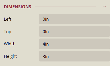
Left
Specifies the horizontal position of the chart element from the left edge of the container.
Default: 0in.
Top
Specifies the vertical position of the chart element from the top edge of the container.
Default: 0in.
Width
Specifies the width of the chart element.
Default: 4in.
Height
Specifies the height of the chart element.
Default: 3in.
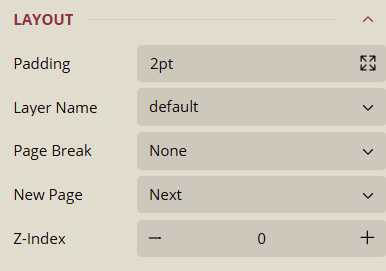
Layout
Layout Properties
Padding
Sets the space between the chart element content and its border.
Default: 2pt.
Expanded Properties: Clicking the expand button allows setting padding individually for each side.
Left
Default: 2pt
Data Binding: Allows mapping from a dataset value or expression.
Up (Top)
Default: 2pt
Data Binding: Allows mapping from a dataset value or expression.
Right
Default: 2pt
Data Binding: Allows mapping from a dataset value or expression.
Down (Bottom)
Default: 2pt
Data Binding: Allows mapping from a dataset value or expression.
Layer Name
Specifies the layer to which the chart element belongs.
Default: default.
Page Break
Determines how the chart element interacts with page breaks.
Options:
None: No page break applied.
Start: Forces a page break before the element.
End: Forces a page break after the element.
StartAndEnd: Forces a page break both before and after the element.
Z-Index
Default: 0.
Use the – button to decrease the Z-Index and send the element backward.
Use the + button to increase the Z-Index and bring the element forward.
No Data
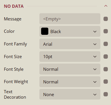
Message
Specifies the text message displayed when no data is available for the chart.
Default:
<Empty>.Data Binding supported.
Color
Sets the text color of the "No Data" message.
Default: Black.
Data Binding supported.
Font Family
Defines the font family of the "No Data" message text.
Default: Arial, Arial Black, Comic Sans MS, Courier New, Etc.
Data Binding supported.
Font Size
Defines the font size of the "No Data" message text.
Default: 10pt.
Data Binding supported.
Font Style
Sets the style of the "No Data" message text.
Options: Normal, Italic.
Data Binding supported.
Font Weight
Sets the thickness of the "No Data" message text.
Options: Normal, Bold.
Data Binding supported.
Text Decoration
Adds decoration to the "No Data" message text.
Options: None, Underline, DoubleUnderline, Overline, LineThrough.
Data Binding supported.
Visibility
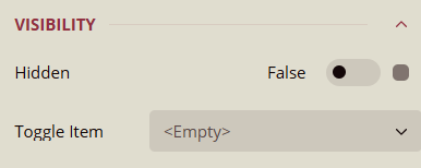
Hidden
Determines whether the chart is visible in the report.
Default: False (chart is visible).
Can be toggled on/off.
Data Binding supported.
Toggle Item
Specifies another report item (such as a textbox) that controls the visibility of this chart.
Default:
<Empty>.
Misc
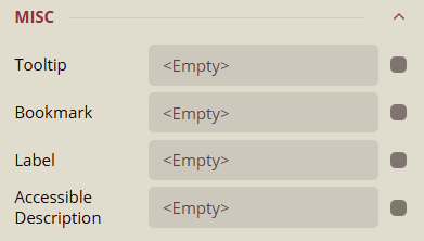
Tooltip
Text displayed when the user hovers the mouse over the chart.
Default:
<Empty>.Data Binding supported.
Bookmark
Assigns a bookmark ID to the chart for navigation within the report.
Default:
<Empty>.Data Binding supported.
Label
Specifies a label for the chart element.
Default:
<Empty>.Data Binding supported.
Accessible Description
Provides an accessibility description for screen readers.
Default:
<Empty>.Data Binding supported.