-
Interactive DashboardsCreate interactive BI dashboards with dynamic visuals.
-
End-User BI ReportsCreate and deploy enterprise BI reports for use in any vertical.
-
Wyn AlertsSet up always-on threshold notifications and alerts.
-
Localization SupportChange titles, labels, text explanations, and more.
-
Wyn ArchitectureA lightweight server offers flexible deployment.
-
 Wyn Enterprise 7.1 is ReleasedThis release emphasizes Wyn document embedding and enhanced analytical express...
 -
 Choosing an Embedded BI Solution for SaaS ProvidersAdding BI features to your applications will improve your products, better serve your customers, and more. But where to start? In this guide, we discuss the many options.
-
Visual GalleryInteractive sample dashboards and reports.
-
BlogExplore Wyn, BI trends, and more.
-
WebinarsDiscover live and on-demand webinars.
-
Customer SuccessVisualize operational efficiency and streamline manufacturing processes.
-
Knowledge BaseGet quick answers with articles and guides.
-
VideosVideo tutorials, trends and best practices.
-
WhitepapersDetailed reports on the latest trends in BI.
-
 Choosing an Embedded BI Solution for SaaS ProvidersAdding BI features to your applications will impr...
 -

- Getting Started
- Administration Guide
-
User Guide
- An Introduction to Wyn Enterprise
- Document Portal for End Users
- Data Governance and Modeling
- View and Manage Documents
- Working with Resources
-
Working with Reports
- Report Designer
- Data Binding in Reports
- Master Reports
- Report Controls
- Data Analysis and Interactivity
- Expression Editor
- Page Layout
- Styles and Themes
- Preview Report
- Export Report
- Report Templates
- Using Report Designer
- Report Render Mode
- Time Zone Setting
- Working with Dashboards
- Working with Notebooks
- Wyn Analytical Expressions
- Section 508 Compliance
- Subscribe to RSS Feed for Wyn Builds Site
- Developer Guide
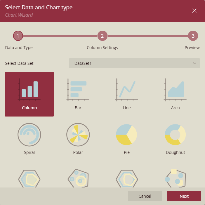
Chart Wizard
The Chart Wizard guides you through the process of creating a chart. When you drag and drop the Chart data region onto the report design surface, the Chart Wizard is displayed.
Note: The Chart Wizard is displayed only if a report is already bound to a data set.
Select Data and Chart type
The first screen of the Chart Wizard asks you to select a data set and a chart type.
Settings
In the second screen of the Chart Wizard, specify the plot properties to configure the data values, category, detail encodings, etc., specific to the chart type.

Data Series
Data Values
Defines the measure or numerical field that will be plotted in the chart (for example, Sales Amount, Quantity, or Revenue).
Multiple measures can be added using the +button,
Use the Show items button next to it to view or manage the added values.
Category Groups
Field: The categorical dimension used for the X-axis (for example, Product Name, Month, or Region).
Sort Direction: Controls the order of categories in the chart. Options: Ascending or Descending.
Series Groups
Field: A secondary dimension used for data binding. This field splits the data series into multiple sub-series (for example, Sales by Year, Gender, or Product Category).
Break-down Method: Determines how multiple series are displayed in the chart:
Cluster – Places each series side by side.
Stack: Stacks the values of each series on top of one another.
Percentage Stack: Stacks the values but normalizes them into percentages, making each stack total 100%.
Sort Direction: Specifies the order in which the series groups are displayed. Options: Ascending or Descending.
Note: Some settings may vary depending on the selected chart type, but the overall purpose remains the same.
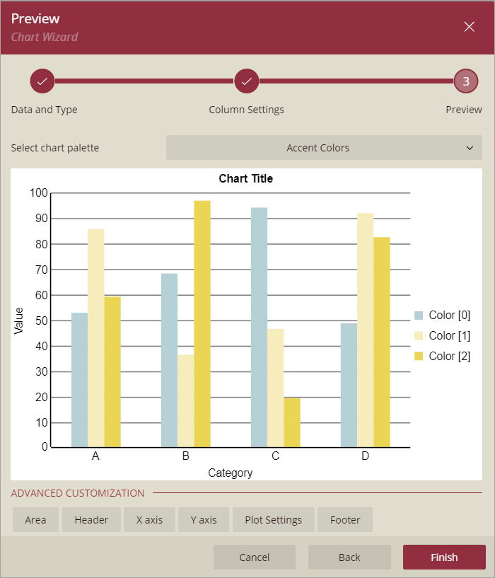
Preview
Select a chart palette from the drop-down list. Click Finish to add the chart to the report or choose any of the advanced customization options.
For information on how to create a chart, see the walkthrough Report with Chart.