-
Interactive DashboardsCreate interactive BI dashboards with dynamic visuals.
-
End-User BI ReportsCreate and deploy enterprise BI reports for use in any vertical.
-
Wyn AlertsSet up always-on threshold notifications and alerts.
-
Localization SupportChange titles, labels, text explanations, and more.
-
Wyn ArchitectureA lightweight server offers flexible deployment.
-
 Wyn Enterprise 7.1 is ReleasedThis release emphasizes Wyn document embedding and enhanced analytical express...
 -
 Choosing an Embedded BI Solution for SaaS ProvidersAdding BI features to your applications will improve your products, better serve your customers, and more. But where to start? In this guide, we discuss the many options.
-
Visual GalleryInteractive sample dashboards and reports.
-
BlogExplore Wyn, BI trends, and more.
-
WebinarsDiscover live and on-demand webinars.
-
Customer SuccessVisualize operational efficiency and streamline manufacturing processes.
-
Knowledge BaseGet quick answers with articles and guides.
-
VideosVideo tutorials, trends and best practices.
-
WhitepapersDetailed reports on the latest trends in BI.
-
 Choosing an Embedded BI Solution for SaaS ProvidersAdding BI features to your applications will impr...
 -

- Getting Started
- Administration Guide
-
User Guide
- An Introduction to Wyn Enterprise
- Document Portal for End Users
- Data Governance and Modeling
- View and Manage Documents
- Working with Resources
- Working with Reports
-
Working with Dashboards
- Tour the Dashboard Designer
- Create a Dashboard
- Configure Dashboard
- Dashboard Data Binding
-
Scenarios
- Common Scenario Properties
-
Charts
- Common Chart Properties
- Column Chart
- Range Column Chart
- Column Chart - Breakdown of Properties
- Stacked Column Chart
- Percent Stacked Column Chart
- Bar Chart
- Range Bar Chart
- Stacked Bar Chart
- Percent Stacked Bar Chart
- Area Chart
- Range Area Chart
- Stacked Area Chart
- Percent Stacked Area Chart
- Line Chart
- Pie Chart
- Donut Chart
- Rose Chart
- Radial Stacked Bar Chart
- Sunburst Chart
- Bar Chart in Polar Coordinates
- Stacked Bar Chart in Polar Coordinates
- Radar Chart
- Filled Radar Chart
- Scatter Chart
- Bubble Chart
- Treemap
- Candlestick Chart
- Funnel Chart
- Card Chart
- Combined Chart
- Decomposition Tree
- Tables
- Indicators
- Maps
- Slicers
- Others
- Topology
- ECharts
- 3D Scenes
- Floorplan
- Component Templates
- Appearance
- Component Management
- Parameters
- Interactions
- Finalize Your Dashboard
- Using AI in Wyn
- Working with Notebooks
- Wyn Analytical Expressions
- Section 508 Compliance
- Subscribe to RSS Feed for Wyn Builds Site
- Developer Guide
Stacked Bar Chart in Polar Coordinates
A stacked bar chart in polar coordinates builds on the polar bar layout by stacking multiple series within each radial bar segment. Each bar begins at the center and extends outward in stacked layers, making it easy to compare how each category is composed while still maintaining the radial, cyclical visual structure. This format works well when you need to show part-to-whole relationships within categories arranged around a circular axis. This article explains the data binding requirements for stacked polar bar charts and provides an overview of the key customization options available in the inspector panel.
Data Binding
The Data Binding tab lets you map your dataset fields to the chart’s visual elements. The available data binding slots determine what data is displayed and how it appears in the chart.
Values – Bind the numeric field or measure that determines the size/length/value of each bar, slice, point, or shape. Larger values produce proportionally larger bars/slices/points.
Axis (Category) – Bind the field whose distinct values define each bar/slice/point category. These values appear along the X-axis, Y-axis, or around the circledepending on the chart type.
Legend (Series) – Bind the field that determines the grouping shown in the chart legend. Use this to categorize and color bars/slices/lines by an additional dimension.
Trellis Columns – Bind a field to create multiple charts arranged in columns, each filtered by a unique value in that field.
Trellis Rows – Bind a field to create multiple charts arranged in rows, each filtered by a unique value in that field.
Tooltip – Bind additional fields to display as contextual information when users hover over a bar, slice, point, or shape.
Drill Down – Configure interactive navigation into more detailed data. You can set Drill Down Mode to:
Pre-set Targets – Specify fields or charts to drill into when an element is clicked.
Pre-set Paths – Define a hierarchical path so users can explore data through multiple levels.
Property Reference
Stacked bar charts in polar coordinates in Wyn can be extensively styled and configured using the Inspector panel. Below are key settings you can modify:
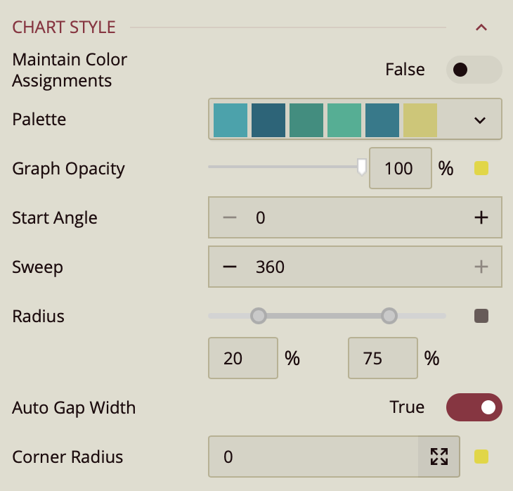
Maintain Color Assignments: Toggle this to True if you want to manually assign specific colors to individual data values instead of using automatic color mapping.
Palette: Lets you customize the color scheme applied to the chart. Use the dropdown to choose from available color palettes based on the current Theme.
Graph Opacity: Controls the transparency of the chart. Set to 0% for fully transparent or 100% for fully opaque.
Start Angle: Defines the position where the first slice of the pie chart begins. The default value is 0, meaning the first slice starts at the top and proceeds clockwise.
Sweep: Controls how much of the circle the rose chart covers, with a default of 360 for a full circle. You can reduce this value to create a partial or semi-circular chart.
Radius: Determines the size of the chart from the center outward. The default range is from 0 to 75, where 0 is the inner radius and 75 is the outer radius. Setting the inner radius to a value greater than 0 creates a donut-style appearance.
Corner Radius: Rounds the outer edges of each slice; by default, it is 0, resulting in sharp edges, but increasing it will soften the slice borders.
Auto Gradient: Enables a gradient color effect on each slice when set to True, adding visual depth to the chart.
Data Visualization
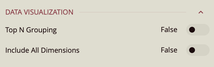
Top N Grouping – When enabled, limits the displayed data to the top N items based on a chosen measure (e.g., top 10 categories by sales). This is useful for focusing on the most significant data points.
Additional Option: When this setting is turned on, a Show property appears, allowing you to enter a numeric value for N (the number of top items to display).
Default: Off.
Include All Dimensions – When enabled, ensures that all available dimension values are included in the visualization, even if they have no corresponding measure values. This can help maintain consistent category representation across views. Default: Off.
Data Labels
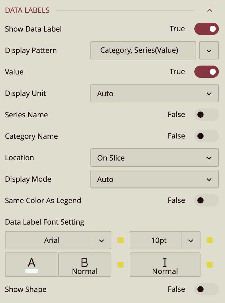
Show Data Label: Toggle this on to enable data labels on the chart.
Display Pattern: Choose a label structure from:
Series (Value/Percentage)
Series Value/Percentage
Note: This controls the format, but not which elements are shown.
Toggle Visibility for Each Element:
Value – must be set to true to display values.
Value As Percentage – toggle on to display the value as a percentage.
Decimal Places – set the number of decimal places on the percentage value.
Series Name: Set to True to show the series name.
Location: Choose between On Slice or Around.
Line Width: Set the line width of the data label.
Connecting Line Color: Set the color of the connecting line on the data label.
Display Mode: Determines how data labels are displayed on the chart. You can choose between:
Auto: The chart automatically decides which data labels to show, based on available space.
All: Forces all data labels to be displayed, regardless of space constraints.
Same Color As Legend: A toggle option that controls the color of data labels.
On/True: Data labels adopt the same color as their corresponding bars in the chart, matching the legend.
Off/False: Data labels use the default color, independent of the bar colors.
Data Label Font Setting:
Font family, size (pt), color, weight, and italic styling.
Show Shape: Toggle on to add a background shape to the label.
Upload a Shape Image.
Adjust placement and size with:
Shape X Center
Shape Y Center
Shape X Scale
Shape Y Scale
Tooltip
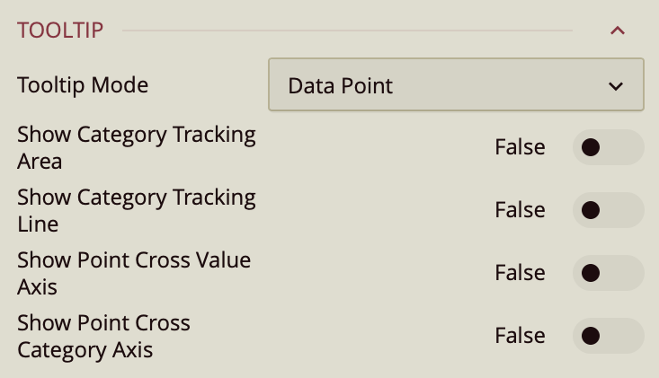
Tooltip Mode – Determines how tooltips are displayed when hovering over the chart:
None – Disables tooltips.
Data Point (default) – Shows a tooltip for the specific data point under the pointer.
Category – Shows a tooltip for all data points that share the same category value.
Show Category Tracking Area – Highlights the entire area of the chart that corresponds to the hovered category, helping visually connect related data points.
Show Category Tracking Line – Draws a vertical or horizontal line (depending on chart orientation) across the chart at the hovered category to make it easier to see alignment across series.
Show Point Cross Value Axis – Draws a line from the hovered point to the value axis, making it easy to identify the exact value.
Show Point Cross Category Axis – Draws a line from the hovered point to the category axis, making it easy to identify the exact category.
Axis (Category)
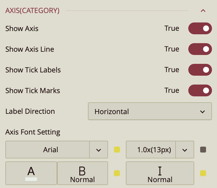
Show Axis – Toggles the display of the axis in the chart. When off, all axis elements, including labels, lines, and ticks, are hidden.
Show Axis Line – Toggles the display of the line that represents the axis.
Show Tick Labels – Toggles the display of the labels along the axis that indicate scale or category values.
Show Tick Marks – Toggles the display of small marks along the axis that indicate value or category positions.
Label Direction – Sets the orientation of axis labels:
Horizontal – Displays labels in a standard, left-to-right orientation.
Vertical – Displays labels rotated 90 degrees.
Diagonal – Displays labels at an angled orientation for better spacing and readability.
Axis Font Setting – Configures the font style for axis labels:
Font Family – Sets the typeface.
Color – Sets the font color.
Weight – Sets the thickness of the text (e.g., normal, bold).
Style – Sets the font style (normal or italic).
Size – Sets the font size in points or pixels.
Value Axis
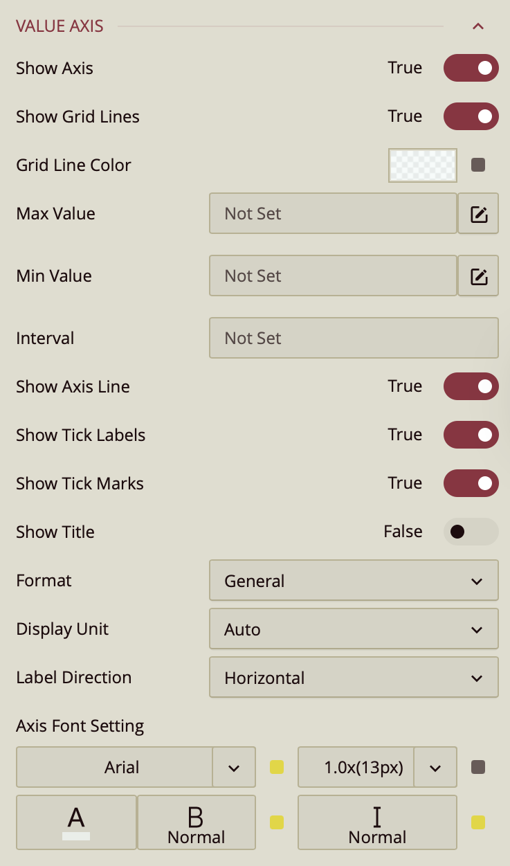
Show Axis – Toggles the display of the value axis. When off, all axis elements, including labels, lines, and ticks, are hidden.
Show Grid Lines – Toggles the display of grid lines that extend from the value axis across the chart for easier comparison of values.
Max Value – Sets the highest value displayed on the axis. If left blank, the value is determined automatically based on the data.
Min Value – Sets the lowest value displayed on the axis. If left blank, the value is determined automatically based on the data.
Interval – Sets the spacing between axis tick marks. If left blank, the interval is determined automatically.
Reversed – Displays the axis values in reverse order, from highest to lowest.
Show Axis Line – Toggles the display of the line that represents the axis.
Show Tick Labels – Toggles the display of the labels along the axis that indicate scale values.
Show Tick Marks – Toggles the display of small marks along the axis that indicate value positions.
Show Title – Toggles the display of a title for the axis.
Format – Sets how the values are formatted:
General – Automatically applies a format based on the value type.
Number – Displays numeric values without a currency symbol or percentage sign.
Currency – Displays values with a currency symbol.
Percentage – Displays values as percentages.
Custom – Applies a custom numeric format.
Display Unit – Sets the unit for displaying large values:
Auto – Chooses the unit automatically.
None – Displays full numeric values.
Thousands, Millions, Billions, Trillions – Scales values to the selected unit.
Label Direction – Sets the orientation of axis labels:
Horizontal – Displays labels left to right.
Vertical – Displays labels rotated 90 degrees.
Diagonal – Displays labels at an angle for better spacing.
Axis Font Setting – Configures the font style for axis labels:
Font Family – Sets the typeface.
Size – Sets the font size in points or pixels.
Color – Sets the font color.
Weight – Sets the thickness of the text (e.g., normal, bold).
Style – Sets the font style (normal or italic).
Legend
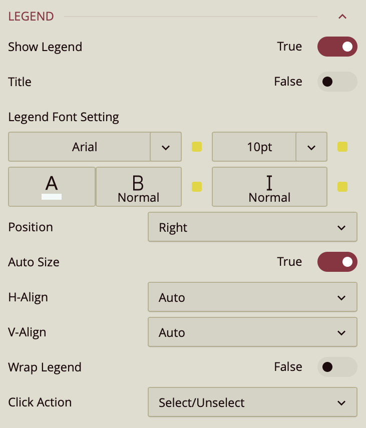
By default, the Show Legend toggle is set to False. To include a title for the legend, enable the Title toggle as well. Once enabled, the legend automatically takes the name of the data attribute it is bound to. To change that, you can enter a title in Custom Title. You can customize the title by setting the Font Family (e.g., Arial), Font Size, Text Color, Font Weight (such as bold), and applying Italic styling if desired.
The Position property allows you to position the legend title to the left, center, or right of the chart area.
The legend is set to Auto Size by default. To manually define the legend size, disable this setting by setting Auto Sizeto False. You can also control the Horizontal and Vertical Alignment, which are both set to Auto by default but can be changed using dropdown options. To allow legend labels to wrap across lines, set the Wrap Legend option to True.
Click Action
The Click Action property defines how interactions with items in the chart legend affect the data displayed in the rose chart.
You can choose from two options in the dropdown menu:
Select/Unselect
When this option is selected, clicking a legend item highlights the corresponding data attribute on the chart and dims the others. This allows you to focus on a single series or category at a time. Clicking the legend item again restores the full view of all data attributes.
Hide/Show
When this option is selected, clicking a legend item temporarily hides the corresponding data attribute from the chart. Clicking it again redisplays the hidden data attribute. This is useful for quickly including or excluding specific data attributes without affecting the rest of the chart configuration.
Series
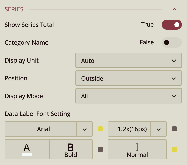
When you add a data attribute to the Legend (Series) data binding slot in a polar bar chart, each category along the circular axis is split into multiple radial bars — one for each series value.
To show the combined total of all series for a category, enable the Show Series Total option. This adds an extra “total” bar for each category, representing the cumulative value of all series.
The following properties control the appearance and behavior of the series total bar:
Show Series Total
Turn this option on to display the total bar, representing the sum of all series for each category.
Category Name
Shows the category name (the value bound to the Axis slot) above the total bar when enabled. This is turned off by default.
Display Unit
Sets the unit used for the total label. Default is Auto.
Position
Determines where the total label appears. Options are inside or outside the bar.
Display Mode
Controls when total labels are displayed. You can set it to Auto (automatic based on space) or All (always show).
Data Label Font Setting
Customize the font style, color, weight, and italics for the total label text.
Trellis
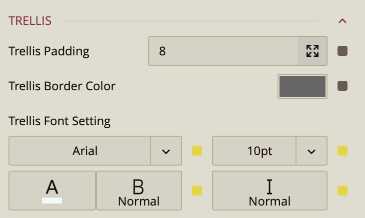
Use the Trellis properties when you create a Trellis Chart. This can be done in the Data Binding Tab. Drag and drop the attribute to Trellis.
You can set the Padding around the Trellis Chart to control the spacing between the chart content and its edges. You can also define a Trellis Border Color to outline each panel of the trellis. Additionally, the Trellis Font Settings allow you to customize the font family, size, color, weight, and style of the text used in the trellis layout.
Drill Down Setting
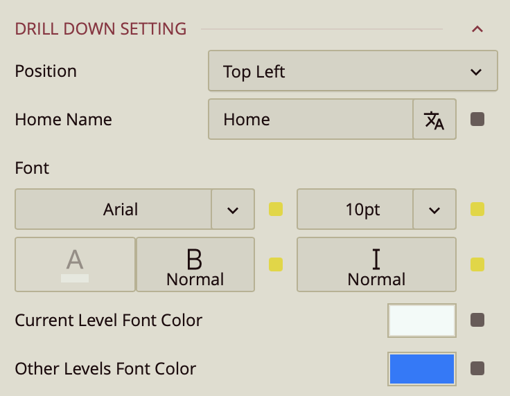
Position – Determines where the drill-down navigation bar is displayed on the chart. Options include:
Top left (default)
Top center
Top right
Bottom left
Bottom center
Bottom right
Home Name – Specifies the text label for the top-level view in the drill-down hierarchy. The default label is Home, but you can change it to something more descriptive, such as All Regions or Main Category.
Font – Configures the font family, size, color, weight (e.g., bold), and style (e.g., italic) for all drill-down navigation text.
Current Level Font Color – Sets the color for the label of the currently active drill-down level, helping it stand out from other levels.
Other Levels Font Color – Sets the color for labels representing all non-active drill-down levels, allowing users to visually distinguish between the active and inactive levels in the navigation path.