-
Interactive DashboardsCreate interactive BI dashboards with dynamic visuals.
-
End-User BI ReportsCreate and deploy enterprise BI reports for use in any vertical.
-
Wyn AlertsSet up always-on threshold notifications and alerts.
-
Localization SupportChange titles, labels, text explanations, and more.
-
Wyn ArchitectureA lightweight server offers flexible deployment.
-
 Wyn Enterprise 7.1 is ReleasedThis release emphasizes Wyn document embedding and enhanced analytical express...
 -
 Choosing an Embedded BI Solution for SaaS ProvidersAdding BI features to your applications will improve your products, better serve your customers, and more. But where to start? In this guide, we discuss the many options.
-
Visual GalleryInteractive sample dashboards and reports.
-
BlogExplore Wyn, BI trends, and more.
-
WebinarsDiscover live and on-demand webinars.
-
Customer SuccessVisualize operational efficiency and streamline manufacturing processes.
-
Knowledge BaseGet quick answers with articles and guides.
-
VideosVideo tutorials, trends and best practices.
-
WhitepapersDetailed reports on the latest trends in BI.
-
 Choosing an Embedded BI Solution for SaaS ProvidersAdding BI features to your applications will impr...
 -

- Getting Started
- Administration Guide
-
User Guide
- An Introduction to Wyn Enterprise
- Document Portal for End Users
- Data Governance and Modeling
- View and Manage Documents
- Working with Resources
- Working with Reports
-
Working with Dashboards
- Tour the Dashboard Designer
- Create a Dashboard
- Configure Dashboard
- Dashboard Data Binding
-
Scenarios
- Common Scenario Properties
-
Charts
- Common Chart Properties
- Column Chart
- Range Column Chart
- Column Chart - Breakdown of Properties
- Stacked Column Chart
- Percent Stacked Column Chart
- Bar Chart
- Range Bar Chart
- Stacked Bar Chart
- Percent Stacked Bar Chart
- Area Chart
- Range Area Chart
- Stacked Area Chart
- Percent Stacked Area Chart
- Line Chart
- Pie Chart
- Donut Chart
- Rose Chart
- Radial Stacked Bar Chart
- Sunburst Chart
- Bar Chart in Polar Coordinates
- Stacked Bar Chart in Polar Coordinates
- Radar Chart
- Filled Radar Chart
- Scatter Chart
- Bubble Chart
- Treemap
- Candlestick Chart
- Funnel Chart
- Card Chart
- Combined Chart
- Decomposition Tree
- Tables
- Indicators
- Maps
- Slicers
- Others
- Topology
- ECharts
- 3D Scenes
- Floorplan
- Component Templates
- Appearance
- Component Management
- Parameters
- Interactions
- Finalize Your Dashboard
- Using AI in Wyn
- Working with Notebooks
- Wyn Analytical Expressions
- Section 508 Compliance
- Subscribe to RSS Feed for Wyn Builds Site
- Developer Guide
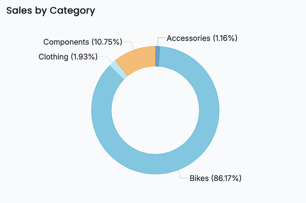
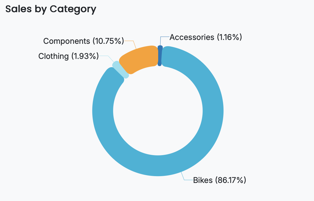
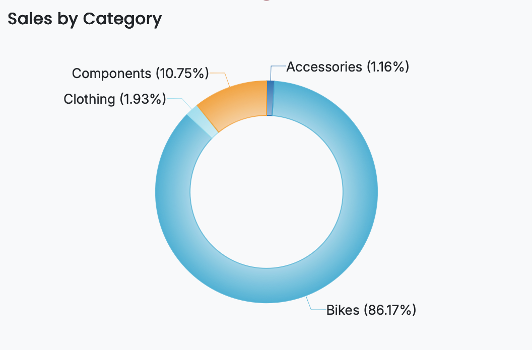
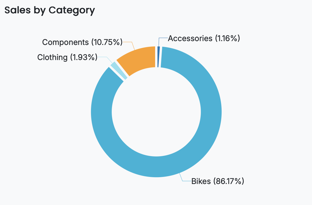
Donut Chart
Overview
A donut chart is a variation of a pie chart used to display the proportional contribution of categories while providing additional space at the center for emphasizing key metrics or labels. The circular ring format helps make comparisons easier and gives more room for annotation or design elements. You can use donut charts to illustrate distribution across categories or to present multiple donut series side-by-side. This article outlines the data requirements for donut charts and describes the main properties you can adjust to format the chart and refine how data is presented.
Example
This is an example of donut chart that displays profit by category using the following Excel dataset:
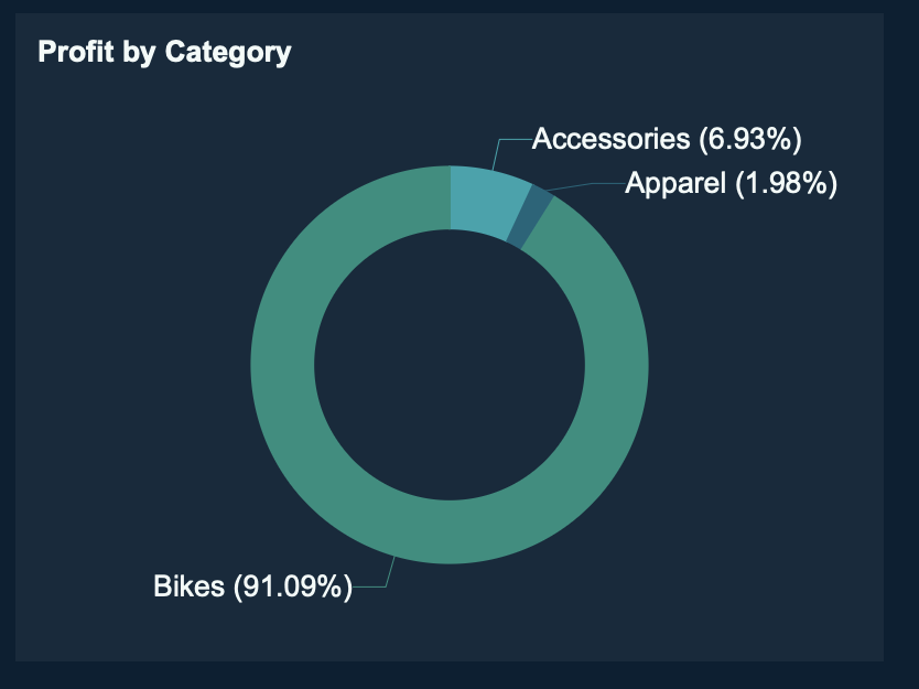
Data is uploaded in the Resource Portal. If you don't have access, contact your administrator.
The Profit measure is bound to the Value data binding slot. The Category measure is bound to the Axis (Category) slot. The title is set to Profit by Category.
Data Binding
The Data Binding tab lets you map your dataset fields to the chart’s visual elements. The available data binding slots determine what data is displayed and how it appears in the chart.
Values – Bind the numeric field or measure that determines the size/length/value of each bar, slice, point, or shape. Larger values produce proportionally larger bars/slices/points.
Axis (Category) – Bind the field whose distinct values define each bar/slice/point category. These values appear along the X-axis, Y-axis, or around the circledepending on the chart type.
Legend (Series) – Bind the field that determines the grouping shown in the chart legend. Use this to categorize and color bars/slices/lines by an additional dimension.
Trellis Columns – Bind a field to create multiple charts arranged in columns, each filtered by a unique value in that field.
Trellis Rows – Bind a field to create multiple charts arranged in rows, each filtered by a unique value in that field.
Tooltip – Bind additional fields to display as contextual information when users hover over a bar, slice, point, or shape.
Drill Down – Configure interactive navigation into more detailed data. You can set Drill Down Mode to:
Pre-set Targets – Specify fields or charts to drill into when an element is clicked.
Pre-set Paths – Define a hierarchical path so users can explore data through multiple levels.
Customize Donut Chart
A donut chart displays the proportional distribution of values within a single category using a hollow center, allowing users to understand how individual parts contribute to a whole while placing greater emphasis on relative proportions. After adding the visualization to the designer and binding your dataset, configure the following fields in the Data Binding tab:
Values – The numeric measure that determines the size of each segment. The values are aggregated and used to calculate each segment’s proportion relative to the total.
Legend (Series) – The categorical field that divides the donut into multiple segments. Each unique legend value is rendered as its own segment, showing how each category contributes to the overall total.
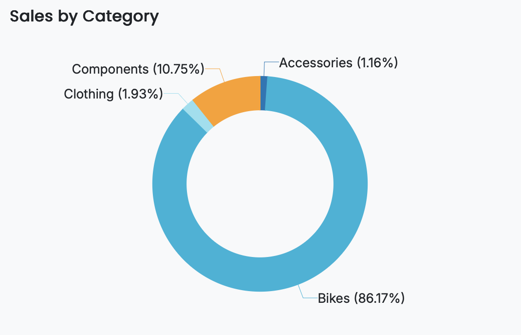
For example, a donut chart may plot Sales in the Values slot and Category in the Legend (Series) slot, producing a clear visualization of how total sales are distributed across product categories while leaving space at the center for labels or additional context.
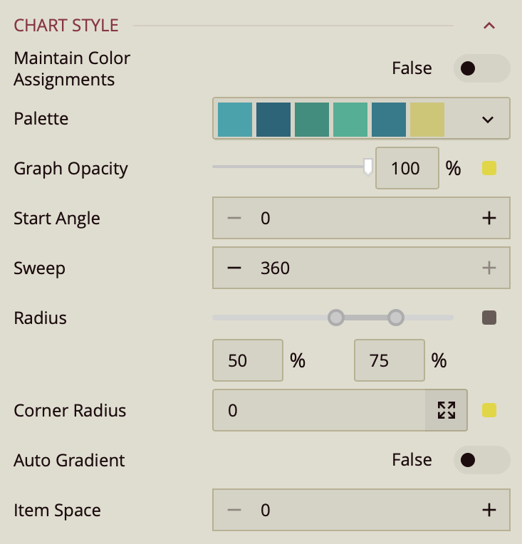
Customize the Chart Style
The Chart Style section contains the visual and formatting settings that define the appearance of your column chart. These options are managed in the Inspector Panel and include layout, spacing, color, and stylistic adjustments that help you tailor the chart to your dashboard’s design requirements.
Scenario Name
The Scenario Name is the label shown in Wyn’s Explorer.
Choose a name that reflects the purpose of the visualization.
For more details, see Explorer documentation.

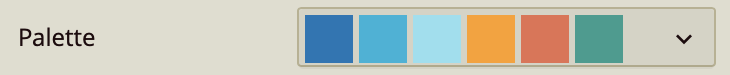
Palette
Controls whether the chart uses theme colors or custom colors.
Off (default): chart uses the dashboard theme.
On: unlocks manual color selection for each column.
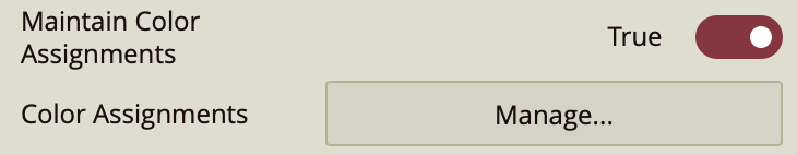
Color Assignments
Defines custom colors when Maintain Color Assignments is enabled.
Assign colors to individual categories or series.
Use when theme colors do not meet your design needs.
Graph Opacity
Adjusts the transparency of the columns.
Default is 100% (fully opaque).
Lower values create translucent columns for layered or subtle visual styles.
Start Angle
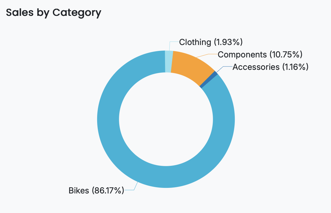
Defines the position where the first slice of the donut chart begins.
The default value is 0, which places the first slice at the top of the chart and draws subsequent slices clockwise.
Adjusting the start angle rotates the entire donut, which can help improve readability or align slices with other visual elements.
Here is an example of a donut chart with a start angle of 45 degrees.
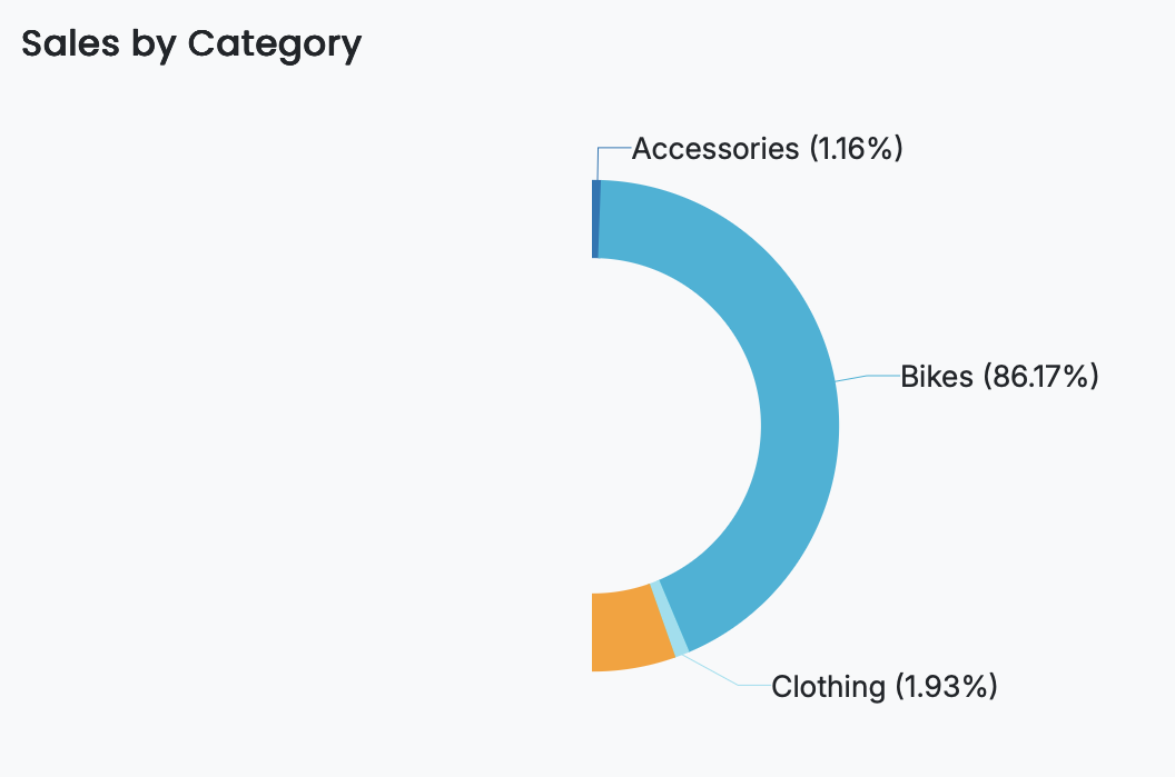
Sweep
Controls how much of the circular shape the donut chart covers.
The default value is 360, rendering a full circular donut chart.
Reducing the sweep value creates a partial donut, such as a semi-circle, which can be useful for compact layouts or gauge-style visualizations.
Here is an example of a half-circle donut chart with the sweep set to 180.
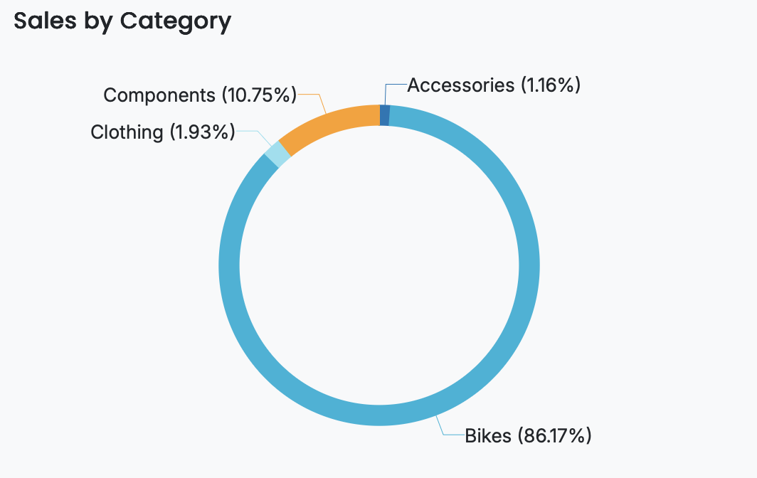
Radius
Determines the size of the donut chart measured from the center outward.
The radius range is from 50 to 75, where 50 represents the inner radius and 75 represents the outer radius.
Setting the inner radius to 0 creates a pie chart by removing the hollow center.
Here is an example of a donut chart with an inner radius set to 65.
Corner Radius
Rounds the outer edges of each pie slice.
The default value is 0, which produces sharp slice edges.
Increasing the corner radius softens slice boundaries, resulting in a smoother and more rounded appearance.
Here is an example where the corner radius is set to 10.
Auto Gradient
Applies a gradient fill to column colors.
On: Wyn auto-generates gradient effects.
Off: columns use flat colors.
Item Space
Controls the spacing between individual pie slices.
The default value is 0, meaning slices are rendered without gaps.
Increasing the value creates visible separation between slices, which can improve distinction between categories.
Here is an example of a pie chart with an item space set to 5.
See Also
Property Reference
Chart Style
Maintain Color Assignments: Toggle this to True if you want to manually assign specific colors to individual data values instead of using automatic color mapping.
Palette: Lets you customize the color scheme applied to the chart. Use the dropdown to choose from available color palettes based on the current Theme.
Graph Opacity: Controls the transparency of the chart. Set to 0% for fully transparent or 100% for fully opaque.
Start Angle: Defines the position where the first slice of the pie chart begins. The default value is 0, meaning the first slice starts at the top and proceeds clockwise.
Sweep: Controls how much of the circle the pie chart covers, with a default of 360 for a full circle. You can reduce this value to create a partial or semi-circular chart.
Radius: Determines the size of the chart from the center outward. The default range is from 50 to 75, where 50 is the inner radius and 75 is the outer radius. Setting the inner radius to a value greater than 0 creates a donut-style appearance.
Corner Radius: Rounds the outer edges of each slice; by default, it is 0, resulting in sharp edges, but increasing it will soften the slice borders.
Auto Gradient: Enables a gradient color effect on each slice when set to True, adding visual depth to the chart.
Item Space: Sets the spacing between pie slices. A value of 0 means no space, while higher values create gaps between the slices.
Data Visualization
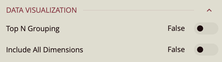
Top N Grouping – When enabled, limits the displayed data to the top N items based on a chosen measure (e.g., top 10 categories by sales). This is useful for focusing on the most significant data points.
Additional Option: When this setting is turned on, a Show property appears, allowing you to enter a numeric value for N (the number of top items to display).
Default: Off.
Include All Dimensions – When enabled, ensures that all available dimension values are included in the visualization, even if they have no corresponding measure values. This can help maintain consistent category representation across views. Default: Off.
Data Labels
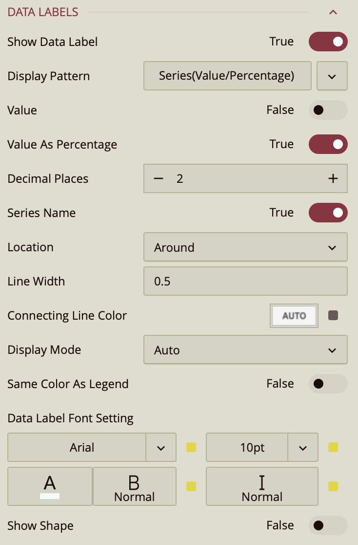
Show Data Label: Toggle this on to enable data labels on the chart.
Display Pattern: Choose a label structure from:
Series (Value/Percentage)
Series Value/Percentage
Note: This controls the format, but not which elements are shown.
Toggle Visibility for Each Element:
Value – must be set to true to display values.
Value As Percentage – toggle on to display the value as a percentage.
Decimal Places – set the number of decimal places on the percentage value.
Series Name: Set to True to show the series name.
Location: Choose between On Slice or Around.
Line Width: Set the line width of the data label.
Connecting Line Color: Set the color of the connecting line on the data label.
Display Mode: Determines how data labels are displayed on the chart. You can choose between:
Auto: The chart automatically decides which data labels to show, based on available space.
All: Forces all data labels to be displayed, regardless of space constraints.
Same Color As Legend: A toggle option that controls the color of data labels.
On/True: Data labels adopt the same color as their corresponding bars in the chart, matching the legend.
Off/False: Data labels use the default color, independent of the bar colors.
Data Label Font Setting:
Font family, size (pt), color, weight, and italic styling.
Show Shape: Toggle on to add a background shape to the label.
Upload a Shape Image.
Adjust placement and size with:
Shape X Center
Shape Y Center
Shape X Scale
Shape Y Scale
Tooltip
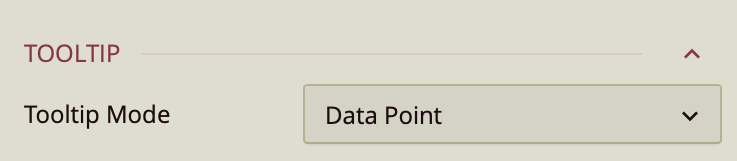
Tooltip Mode – Determines how tooltips are displayed when hovering over the chart:
None – Disables tooltips.
Data Point (default) – Shows a tooltip for the specific data point under the pointer.
Category – Shows a tooltip for all data points that share the same category value.
Legend
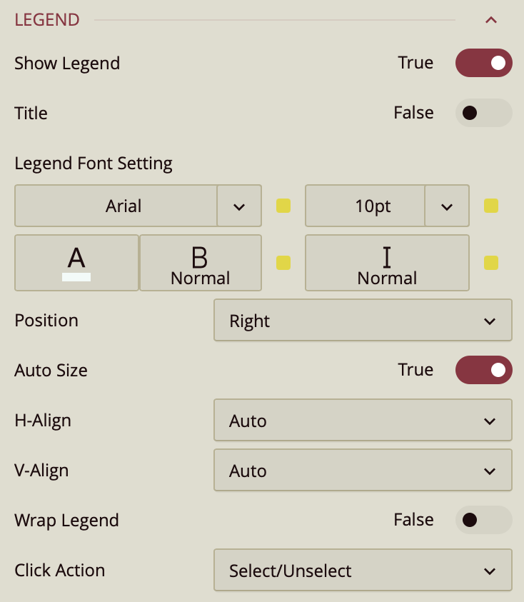
By default, the Show Legend toggle is set to True, which displays the legend on the chart. To include a title for the legend, enable the Title toggle as well. Once enabled, the legend automatically takes the name of the data attribute it is bound to. To change that, you can enter a title in Custom Title. You can customize the title by setting the Font Family (e.g., Arial), Font Size, Text Color, Font Weight (such as bold), and applying Italic styling if desired.
The Title Alignment property allows you to position the legend title to the left, center, or right of the chart area.
The legend is set to Auto Size by default. To manually define the legend size, disable this setting by setting Auto Size to False. You can also control the Horizontal and Vertical Alignment, which are both set to Auto by default but can be changed using dropdown options. To allow legend labels to wrap across lines, set the Wrap Legend option to True.
Trellis
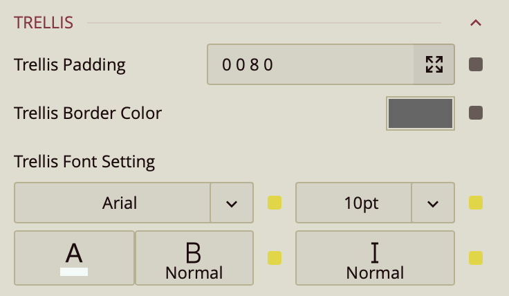
Use the Trellis properties when you create a Trellis Chart. This can be done in the Data Binding Tab. Drag and drop the attribute to Trellis. You can read the Trellis Column Chart article for more information.
You can set the Padding around the Trellis Chart to control the spacing between the chart content and its edges. You can also define a Trellis Border Color to outline each panel of the trellis. Additionally, the Trellis Font Settings allow you to customize the font family, size, color, weight, and style of the text used in the trellis layout.
Drill Down Setting
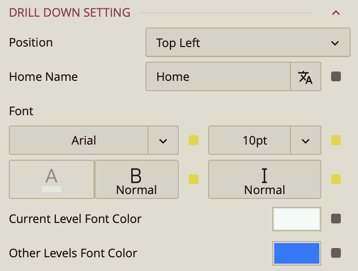
Position – Determines where the drill-down navigation bar is displayed on the chart. Options include:
Top left (default)
Top center
Top right
Bottom left
Bottom center
Bottom right
Home Name – Specifies the text label for the top-level view in the drill-down hierarchy. The default label is Home, but you can change it to something more descriptive, such as All Regions or Main Category.
Font – Configures the font family, size, color, weight (e.g., bold), and style (e.g., italic) for all drill-down navigation text.
Current Level Font Color – Sets the color for the label of the currently active drill-down level, helping it stand out from other levels.
Other Levels Font Color – Sets the color for labels representing all non-active drill-down levels, allowing users to visually distinguish between the active and inactive levels in the navigation path.