-
Interactive DashboardsCreate interactive BI dashboards with dynamic visuals.
-
End-User BI ReportsCreate and deploy enterprise BI reports for use in any vertical.
-
Wyn AlertsSet up always-on threshold notifications and alerts.
-
Localization SupportChange titles, labels, text explanations, and more.
-
Wyn ArchitectureA lightweight server offers flexible deployment.
-
 Wyn Enterprise 7.1 is ReleasedThis release emphasizes Wyn document embedding and enhanced analytical express...
 -
 Choosing an Embedded BI Solution for SaaS ProvidersAdding BI features to your applications will improve your products, better serve your customers, and more. But where to start? In this guide, we discuss the many options.
-
Visual GalleryInteractive sample dashboards and reports.
-
BlogExplore Wyn, BI trends, and more.
-
WebinarsDiscover live and on-demand webinars.
-
Customer SuccessVisualize operational efficiency and streamline manufacturing processes.
-
Knowledge BaseGet quick answers with articles and guides.
-
VideosVideo tutorials, trends and best practices.
-
WhitepapersDetailed reports on the latest trends in BI.
-
 Choosing an Embedded BI Solution for SaaS ProvidersAdding BI features to your applications will impr...
 -

- Getting Started
- Administration Guide
-
User Guide
- An Introduction to Wyn Enterprise
- Document Portal for End Users
- Data Governance and Modeling
- View and Manage Documents
- Working with Resources
- Working with Reports
-
Working with Dashboards
- Tour the Dashboard Designer
- Create a Dashboard
- Configure Dashboard
- Dashboard Data Binding
-
Scenarios
- Common Scenario Properties
-
Charts
- Common Chart Properties
- Column Chart
- Range Column Chart
- Column Chart - Breakdown of Properties
- Stacked Column Chart
- Percent Stacked Column Chart
- Bar Chart
- Range Bar Chart
- Stacked Bar Chart
- Percent Stacked Bar Chart
- Area Chart
- Range Area Chart
- Stacked Area Chart
- Percent Stacked Area Chart
- Line Chart
- Pie Chart
- Donut Chart
- Rose Chart
- Radial Stacked Bar Chart
- Sunburst Chart
- Bar Chart in Polar Coordinates
- Stacked Bar Chart in Polar Coordinates
- Radar Chart
- Filled Radar Chart
- Scatter Chart
- Bubble Chart
- Treemap
- Candlestick Chart
- Funnel Chart
- Card Chart
- Combined Chart
- Decomposition Tree
- Tables
- Indicators
- Maps
- Slicers
- Others
- Topology
- ECharts
- 3D Scenes
- Floorplan
- Component Templates
- Appearance
- Component Management
- Parameters
- Interactions
- Finalize Your Dashboard
- Using AI in Wyn
- Working with Notebooks
- Wyn Analytical Expressions
- Section 508 Compliance
- Subscribe to RSS Feed for Wyn Builds Site
- Developer Guide
Combined Chart
Combined charts are a versatile visualization that allow you to display multiple types of data series within a single chart, such as columns and lines together. You can use combined charts to compare different metrics while maintaining a shared axis for context. You can also create more complex comparisons by combining several chart types in one scenario. This article outlines the requirements for creating combined charts and provides guidance on key properties, data binding, and visual customization.
Data Binding
The Data Binding tab allows you to assign data fields to the combined chart elements and configure how the data is displayed.
Left Value Axis – Drag a numeric field here to define the values plotted on the left vertical axis.
Ellipsis menu:
Data Format – Opens the data format dialog to customize number formatting.
Display Unit – Choose how values are scaled: Auto (default), None, Thousands, Millions, Billions, or Trillions.
Chart Type – Select the type of chart for the left axis: Line Chart, Column Chart, Area Chart, or Stacked Column Chart.
Scale – Choose the axis scale. Default is Linear.
Right Value Axis – Drag a numeric field here to define the values plotted on the right vertical axis.
Ellipsis menu: Same as Left Value Axis.
Axis (Category) – Drag a field here to define the categories along the horizontal axis.
Legend (Series) – Drag a categorical field here to group data series.
Ellipsis menu:
Axis – Select which value axis to associate with the series: Default, Left Value Axis, or Right Value Axis.
Trellis Columns – Drag a categorical field here to create a column-based small multiple layout. Each column displays a subset of the data based on the field value.
Trellis Rows – Drag a categorical field here to create a row-based small multiple layout. Each row displays a subset of the data based on the field value.
Tooltip – Drag one or more fields here to display additional information when a user hovers over a data point.
Ellipsis menu: Opens a settings window with a text editor to customize the tooltip content.
Drill Down – Enables hierarchical exploration of data points.
Mode – Determines the drill-down method. Default is Default.
Dropdown options:
Pre-set Targets – When selected, opens a data binding slot to specify Drill Down Targets.
Pre-set Path – When selected, opens a data binding slot to specify Drill Down Paths.
Property Reference
Chart Style
Combined charts in Wyn can be extensively styled and configured using the Inspector panel. Below are key settings you can modify:
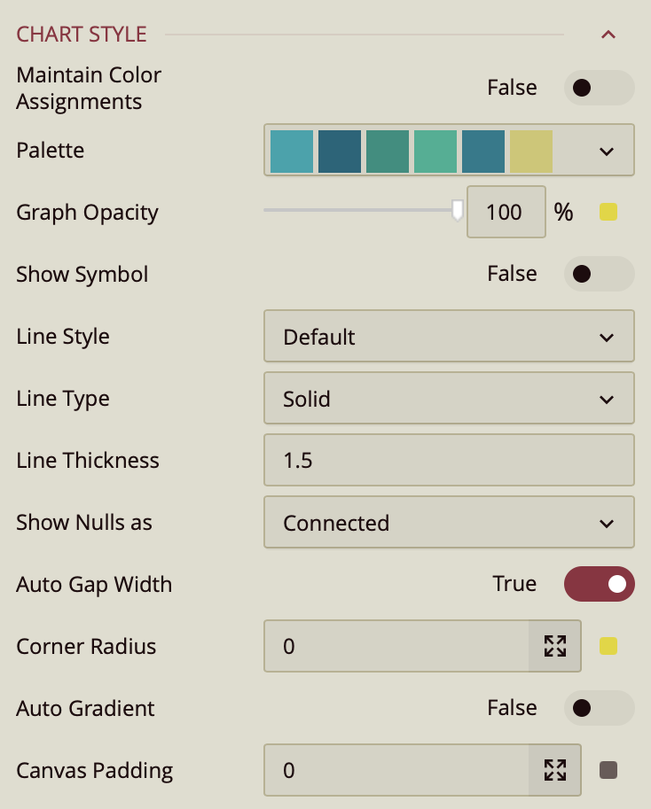
Maintain Color Assignments: Toggle this to True if you want to manually assign specific colors to individual data values instead of using automatic color mapping.
Palette: Lets you customize the color scheme applied to the chart. Use the dropdown to choose from available color palettes based on the current Theme.
Graph Opacity: Controls the transparency of the chart. Set to 0% for fully transparent or 100%for fully opaque.
Show Symbol – Toggles the display of symbols at each data point. When set to True, additional symbol properties appear:
Symbol Shape – Choose the shape for the marker: Dot, Box, Triangle, Diamond, Plus, or X.
Symbol Size – Specifies the size of the symbol in pixels. Enter a numeric value.
Symbol Fill – Sets the fill color inside the symbol.
Symbol Stroke – Sets the border color (stroke) around the symbol.
Line Style – Defines the curve or shape of the line. Choose from:
Default – Straight lines between data points.
Spline – Smooth, curved lines between data points.
Step – Right-angled lines that connect points in a stepped pattern.
Line Type – Sets the visual style of the line. Choose Solid for an unbroken line or Dashed for a line made of dashes.
Line Thickness – Specifies the thickness of the line in pixels. Enter a numeric value.
Show Null As – Determines how the chart displays null (missing) values. Choose from:
Connected – Joins the points on either side of the null value with a line.
Gaps – Leaves an empty space where the null value occurs.
Zeros – Treats null values as zero.
Auto Gap Width – When enabled, automatically determines and applies the optimal spacing between chart elements (such as bars or columns) based on the available chart area and data. By default, this property is set to true.
Corner Radius: Rounds the outer edges of each slice; by default, it is 0, resulting in sharp edges, but increasing it will soften the slice borders.
Auto Gradient – A toggle option that, when enabled, automatically applies a gradient color effect to the plotted symbols. Default is false.
Canvas Padding – Controls the amount of blank space between the plotted data area and the edges of the chart canvas. Accepts a numerical value.
Data Visualization
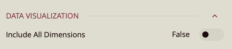
Include All Dimensions – When enabled, ensures that all available dimension values are included in the visualization, even if they have no corresponding measure values. This can help maintain consistent category representation across views. Default: Off.
Left Value Data Labels
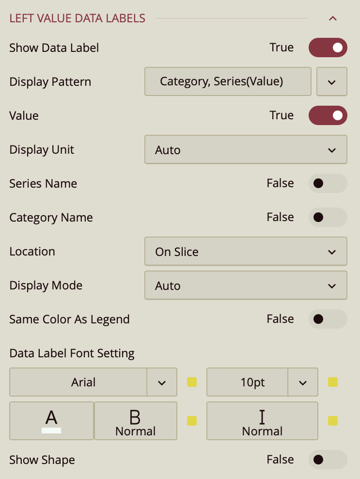
Show Data Label: Toggle this on to enable data labels on the chart.
Display Pattern: Choose a label structure from:
Series (Value/Percentage)
Series Value/Percentage
Note: This controls the format, but not which elements are shown.
Toggle Visibility for Each Element:
Value – must be set to true to display values.
Value As Percentage – toggle on to display the value as a percentage.
Decimal Places – set the number of decimal places on the percentage value.
Series Name: Set to True to show the series name.
Location: Choose between On Slice or Around.
Line Width: Set the line width of the data label.
Connecting Line Color: Set the color of the connecting line on the data label.
Display Mode: Determines how data labels are displayed on the chart. You can choose between:
Auto: The chart automatically decides which data labels to show, based on available space.
All: Forces all data labels to be displayed, regardless of space constraints.
Same Color As Legend: A toggle option that controls the color of data labels.
On/True: Data labels adopt the same color as their corresponding bars in the chart, matching the legend.
Off/False: Data labels use the default color, independent of the bar colors.
Data Label Font Setting:
Font family, size (pt), color, weight, and italic styling.
Show Shape: Toggle on to add a background shape to the label.
Upload a Shape Image.
Adjust placement and size with:
Shape X Center
Shape Y Center
Shape X Scale
Shape Y Scale
Right Value Data Labels
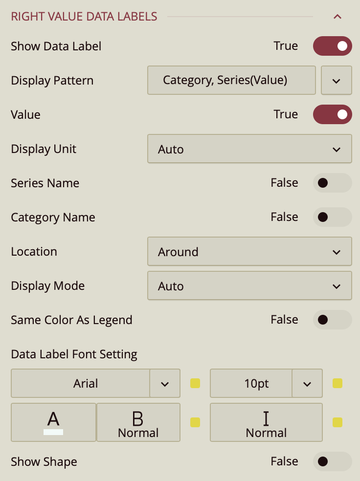
Show Data Label: Toggle this on to enable data labels on the chart.
Display Pattern: Choose a label structure from:
Series (Value/Percentage)
Series Value/Percentage
Note: This controls the format, but not which elements are shown.
Toggle Visibility for Each Element:
Value – must be set to true to display values.
Value As Percentage – toggle on to display the value as a percentage.
Decimal Places – set the number of decimal places on the percentage value.
Series Name: Set to True to show the series name.
Location: Choose between On Slice or Around.
Line Width: Set the line width of the data label.
Connecting Line Color: Set the color of the connecting line on the data label.
Display Mode: Determines how data labels are displayed on the chart. You can choose between:
Auto: The chart automatically decides which data labels to show, based on available space.
All: Forces all data labels to be displayed, regardless of space constraints.
Same Color As Legend: A toggle option that controls the color of data labels.
On/True: Data labels adopt the same color as their corresponding bars in the chart, matching the legend.
Off/False: Data labels use the default color, independent of the bar colors.
Data Label Font Setting:
Font family, size (pt), color, weight, and italic styling.
Show Shape: Toggle on to add a background shape to the label.
Upload a Shape Image.
Adjust placement and size with:
Shape X Center
Shape Y Center
Shape X Scale
Shape Y Scale
Tooltip
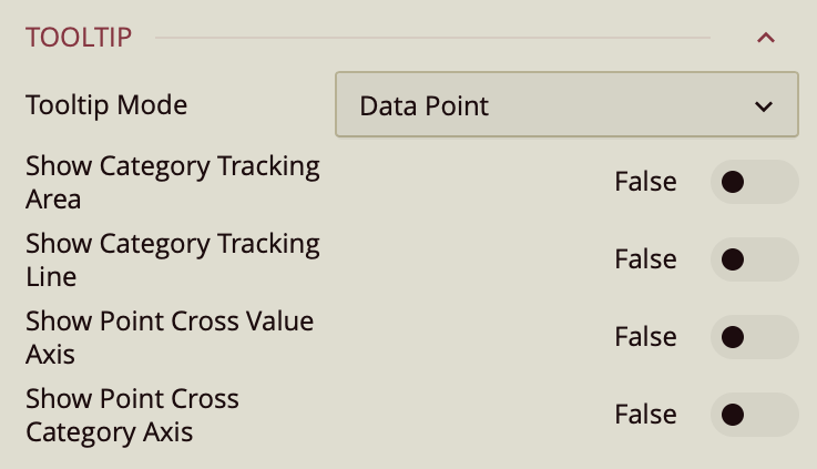
Tooltip Mode – Determines how tooltips are displayed when hovering over the chart:
None – Disables tooltips.
Data Point (default) – Shows a tooltip for the specific data point under the pointer.
Category – Shows a tooltip for all data points that share the same category value.
Show Category Tracking Area – Highlights the entire area of the chart that corresponds to the hovered category, helping visually connect related data points.
Show Category Tracking Line – Draws a vertical or horizontal line (depending on chart orientation) across the chart at the hovered category to make it easier to see alignment across series.
Show Point Cross Value Axis – Draws a line from the hovered point to the value axis, making it easy to identify the exact value.
Show Point Cross Category Axis – Draws a line from the hovered point to the category axis, making it easy to identify the exact category.
Axis (Category)
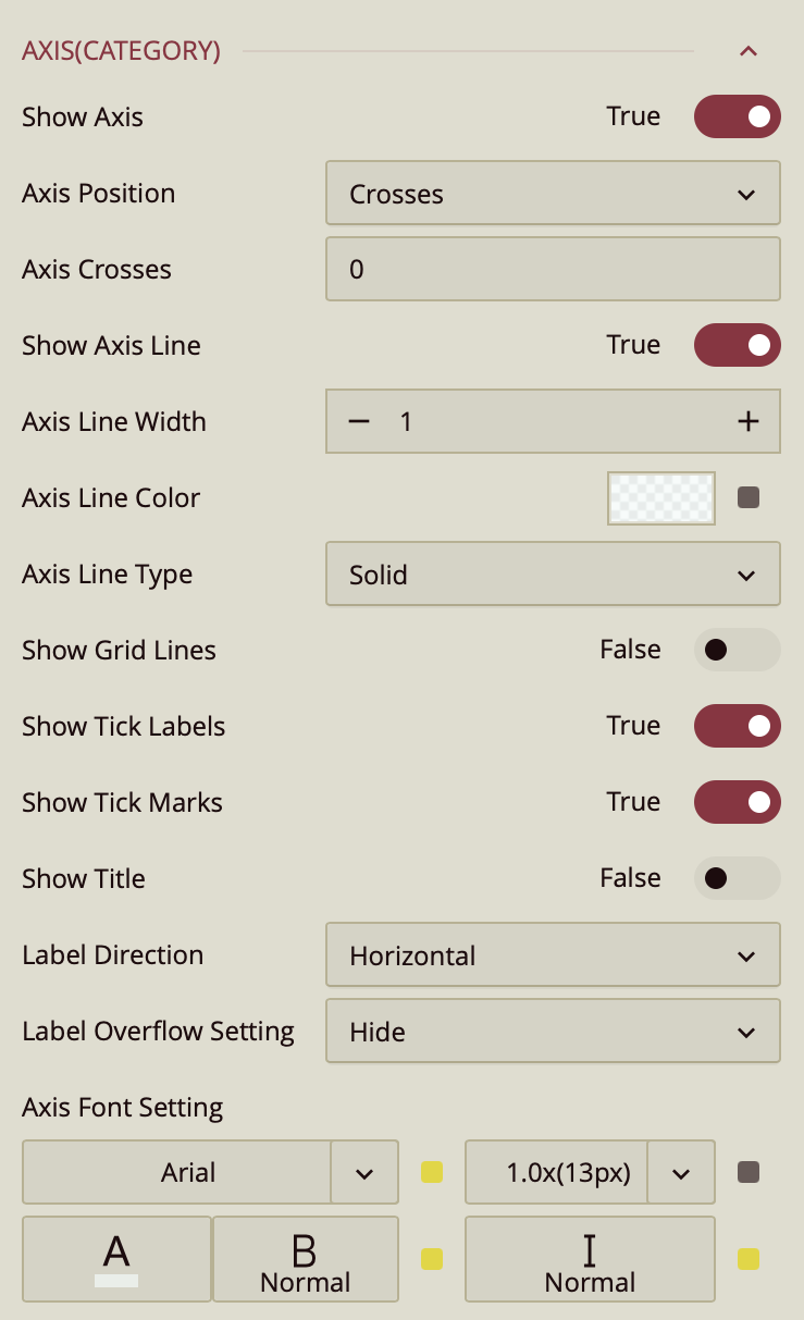
Show Axis – Toggles the visibility of the X-axis. Default is On.
Max Value / Min Value – Define the numeric upper and lower bounds for the axis scale. Leaving these blank allows the chart to automatically determine the range based on the data.
Interval – Sets the spacing between axis tick marks. If left blank, the chart automatically calculates an appropriate interval.
Axis Position – Determines the placement of the X-axis relative to the chart area. Options:
Crosses (default) – Positions the axis at the crossing point defined by Axis Crosses.
Bottom – Places the axis along the bottom edge of the chart.
Top – Places the axis along the top edge of the chart.
Axis Crosses – Numeric value indicating the point on the opposite axis where this axis intersects.
Show Axis Line – Toggles the visibility of the axis baseline. Default is On.
Axis Line Width / Color / Type – Control the thickness, color, and style (solid or dashed) of the axis line.
Show Grid Lines – Toggles horizontal grid lines extending from axis tick marks into the chart. Default is Off.
Show Tick Labels – Toggles the display of numeric or category labels along the axis.
Show Tick Marks – Toggles small marks indicating individual axis intervals.
Show Title – Toggles the display of an axis title. Default is Off. Once enabled, the axis automatically takes the name of the data attribute it is bound to. To change that, you can enter a title in Custom Title.
Format – Determines how axis values are displayed: General(default), Number, Currency, Percentage, or Custom.
Display Unit – Scales displayed values to a chosen unit: Auto (default), None, Thousands, Millions, Billions, Trillions.
Label Direction – Sets the orientation of axis labels: Horizontal (default), Vertical, Diagonal.
Label Overflow Setting – Defines how overflowing labels are handled: Hide (default), Ellipsis, Wrap.
Axis Font Setting – Controls the font family, size, color, weight, and style for axis labels.
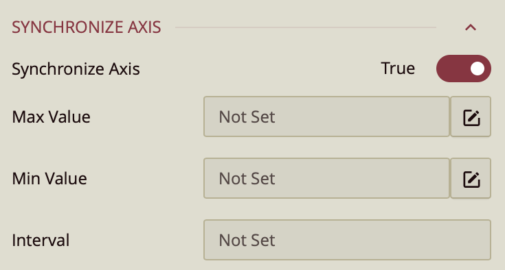
Synchronize Axis – When enabled, aligns the value scales of all axes in the combined chart so that data from different series can be compared directly on a uniform scale. By default, this property is set to true.
Max Value / Min Value – Define the numeric upper and lower bounds for the axis scale. Leaving these blank allows the chart to automatically determine the range based on the data.
Interval – Sets the spacing between axis tick marks. If left blank, the chart automatically calculates an appropriate interval.
Value Axis 1
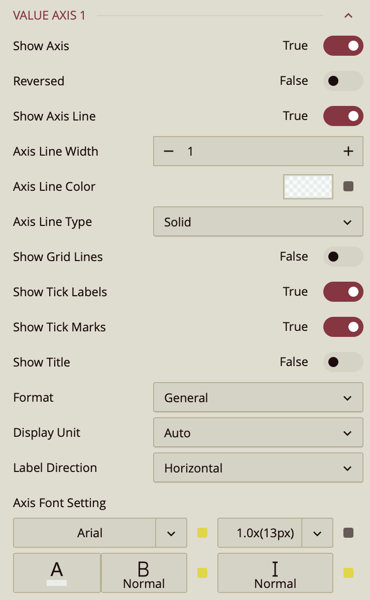
Show Axis – Toggles the visibility of the X-axis. Default is On.
Max Value / Min Value – Define the numeric upper and lower bounds for the axis scale. Leaving these blank allows the chart to automatically determine the range based on the data.
Interval – Sets the spacing between axis tick marks. If left blank, the chart automatically calculates an appropriate interval.
Axis Position – Determines the placement of the X-axis relative to the chart area. Options:
Crosses (default) – Positions the axis at the crossing point defined by Axis Crosses.
Bottom – Places the axis along the bottom edge of the chart.
Top – Places the axis along the top edge of the chart.
Axis Crosses – Numeric value indicating the point on the opposite axis where this axis intersects.
Show Axis Line – Toggles the visibility of the axis baseline. Default is On.
Axis Line Width / Color / Type – Control the thickness, color, and style (solid or dashed) of the axis line.
Show Grid Lines – Toggles horizontal grid lines extending from axis tick marks into the chart. Default is Off.
Show Tick Labels – Toggles the display of numeric or category labels along the axis.
Show Tick Marks – Toggles small marks indicating individual axis intervals.
Show Title – Toggles the display of an axis title. Default is Off. Once enabled, the axis automatically takes the name of the data attribute it is bound to. To change that, you can enter a title in Custom Title.
Format – Determines how axis values are displayed: General(default), Number, Currency, Percentage, or Custom.
Display Unit – Scales displayed values to a chosen unit: Auto (default), None, Thousands, Millions, Billions, Trillions.
Label Direction – Sets the orientation of axis labels: Horizontal (default), Vertical, Diagonal.
Label Overflow Setting – Defines how overflowing labels are handled: Hide (default), Ellipsis, Wrap.
Axis Font Setting – Controls the font family, size, color, weight, and style for axis labels.
Value Axis 2
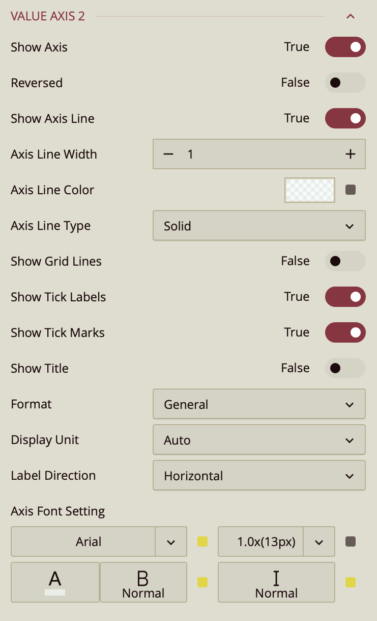
Show Axis – Toggles the visibility of the X-axis. Default is On.
Max Value / Min Value – Define the numeric upper and lower bounds for the axis scale. Leaving these blank allows the chart to automatically determine the range based on the data.
Interval – Sets the spacing between axis tick marks. If left blank, the chart automatically calculates an appropriate interval.
Axis Position – Determines the placement of the X-axis relative to the chart area. Options:
Crosses (default) – Positions the axis at the crossing point defined by Axis Crosses.
Bottom – Places the axis along the bottom edge of the chart.
Top – Places the axis along the top edge of the chart.
Axis Crosses – Numeric value indicating the point on the opposite axis where this axis intersects.
Show Axis Line – Toggles the visibility of the axis baseline. Default is On.
Axis Line Width / Color / Type – Control the thickness, color, and style (solid or dashed) of the axis line.
Show Grid Lines – Toggles horizontal grid lines extending from axis tick marks into the chart. Default is Off.
Show Tick Labels – Toggles the display of numeric or category labels along the axis.
Show Tick Marks – Toggles small marks indicating individual axis intervals.
Show Title – Toggles the display of an axis title. Default is Off. Once enabled, the axis automatically takes the name of the data attribute it is bound to. To change that, you can enter a title in Custom Title.
Format – Determines how axis values are displayed: General(default), Number, Currency, Percentage, or Custom.
Display Unit – Scales displayed values to a chosen unit: Auto (default), None, Thousands, Millions, Billions, Trillions.
Label Direction – Sets the orientation of axis labels: Horizontal (default), Vertical, Diagonal.
Label Overflow Setting – Defines how overflowing labels are handled: Hide (default), Ellipsis, Wrap.
Axis Font Setting – Controls the font family, size, color, weight, and style for axis labels.
Legend
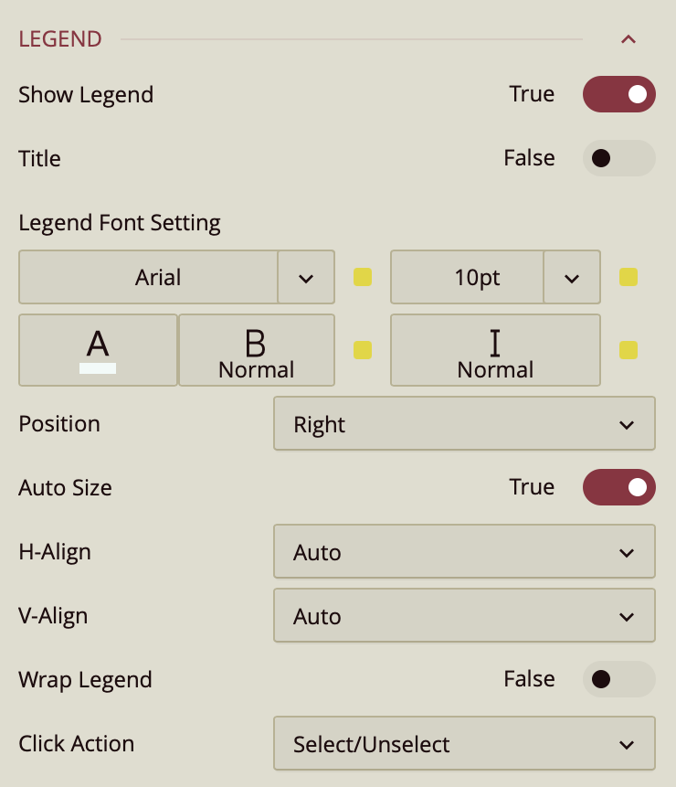
By default, the Show Legend toggle is set to False. To include a title for the legend, enable the Title toggle as well. Once enabled, the axis automatically takes the name of the data attribute it is bound to. To change that, you can enter a title in Custom Title. You can customize the title by setting the Font Family (e.g., Arial), Font Size, Text Color, Font Weight (such as bold), and applying Italic styling if desired.
The Position property allows you to position the legend title to the left, center, or right of the chart area.
The legend is set to Auto Size by default. To manually define the legend size, disable this setting by setting Auto Size to False. You can also control the Horizontal and Vertical Alignment, which are both set to Auto by default but can be changed using dropdown options. To allow legend labels to wrap across lines, set the Wrap Legend option to True.
The Click Action property defines how interactions with items in the chart legend affect the data displayed in the rose chart.
You can choose from two options in the dropdown menu:
Select/Unselect
When this option is selected, clicking a legend item highlights the corresponding data attribute on the chart and dims the others. This allows you to focus on a single series or category at a time. Clicking the legend item again restores the full view of all data attributes.
Hide/Show
When this option is selected, clicking a legend item temporarily hides the corresponding data attribute from the chart. Clicking it again redisplays the hidden data attribute. This is useful for quickly including or excluding specific data attributes without affecting the rest of the chart configuration.
Trellis
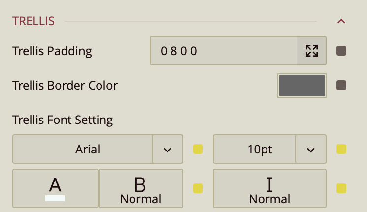
Use the Trellis properties when you create a Trellis Chart. This can be done in the Data Binding Tab. Drag and drop the attribute to Trellis.
You can set the Padding around the Trellis Chart to control the spacing between the chart content and its edges. You can also define a Trellis Border Color to outline each panel of the trellis. Additionally, the Trellis Font Settings allow you to customize the font family, size, color, weight, and style of the text used in the trellis layout.
Drill Down Setting
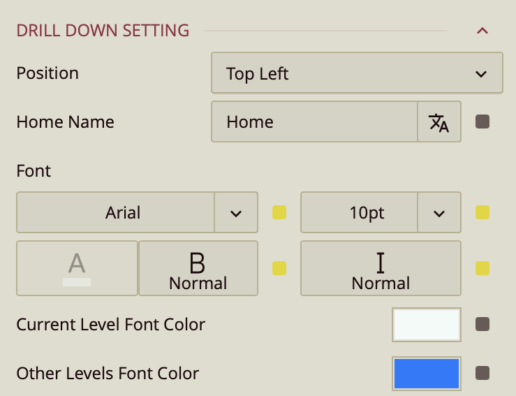
Position – Determines where the drill-down navigation bar is displayed on the chart. Options include:
Top left (default)
Top center
Top right
Bottom left
Bottom center
Bottom right
Home Name – Specifies the text label for the top-level view in the drill-down hierarchy. The default label is Home, but you can change it to something more descriptive, such as All Regions or Main Category.
Font – Configures the font family, size, color, weight (e.g., bold), and style (e.g., italic) for all drill-down navigation text.
Current Level Font Color – Sets the color for the label of the currently active drill-down level, helping it stand out from other levels.
Other Levels Font Color – Sets the color for labels representing all non-active drill-down levels, allowing users to visually distinguish between the active and inactive levels in the navigation path.