-
Interactive DashboardsCreate interactive BI dashboards with dynamic visuals.
-
End-User BI ReportsCreate and deploy enterprise BI reports for use in any vertical.
-
Wyn AlertsSet up always-on threshold notifications and alerts.
-
Localization SupportChange titles, labels, text explanations, and more.
-
Wyn ArchitectureA lightweight server offers flexible deployment.
-
 Wyn Enterprise 7.1 is ReleasedThis release emphasizes Wyn document embedding and enhanced analytical express...
 -
 Choosing an Embedded BI Solution for SaaS ProvidersAdding BI features to your applications will improve your products, better serve your customers, and more. But where to start? In this guide, we discuss the many options.
-
Visual GalleryInteractive sample dashboards and reports.
-
BlogExplore Wyn, BI trends, and more.
-
WebinarsDiscover live and on-demand webinars.
-
Customer SuccessVisualize operational efficiency and streamline manufacturing processes.
-
Knowledge BaseGet quick answers with articles and guides.
-
VideosVideo tutorials, trends and best practices.
-
WhitepapersDetailed reports on the latest trends in BI.
-
 Choosing an Embedded BI Solution for SaaS ProvidersAdding BI features to your applications will impr...
 -

- Getting Started
- Administration Guide
-
User Guide
- An Introduction to Wyn Enterprise
- Document Portal for End Users
- Data Governance and Modeling
- View and Manage Documents
- Working with Resources
- Working with Reports
-
Working with Dashboards
- Tour the Dashboard Designer
- Create a Dashboard
- Configure Dashboard
- Dashboard Data Binding
-
Scenarios
- Common Scenario Properties
-
Charts
- Common Chart Properties
- Column Chart
- Range Column Chart
- Column Chart - Breakdown of Properties
- Stacked Column Chart
- Percent Stacked Column Chart
- Bar Chart
- Range Bar Chart
- Stacked Bar Chart
- Percent Stacked Bar Chart
- Area Chart
- Range Area Chart
- Stacked Area Chart
- Percent Stacked Area Chart
- Line Chart
- Pie Chart
- Donut Chart
- Rose Chart
- Radial Stacked Bar Chart
- Sunburst Chart
- Bar Chart in Polar Coordinates
- Stacked Bar Chart in Polar Coordinates
- Radar Chart
- Filled Radar Chart
- Scatter Chart
- Bubble Chart
- Treemap
- Candlestick Chart
- Funnel Chart
- Card Chart
- Combined Chart
- Decomposition Tree
- Tables
- Indicators
- Maps
- Slicers
- Others
- Topology
- ECharts
- 3D Scenes
- Floorplan
- Component Templates
- Appearance
- Component Management
- Parameters
- Interactions
- Finalize Your Dashboard
- Using AI in Wyn
- Working with Notebooks
- Wyn Analytical Expressions
- Section 508 Compliance
- Subscribe to RSS Feed for Wyn Builds Site
- Developer Guide
Candlestick Chart
Candlestick charts are used to visualize changes in financial or time-series data by displaying the open, high, low, and close values for each time period. Each candlestick provides a compact summary of market movement, making this chart ideal for analyzing trends, volatility, and patterns in stock or commodities data. In Wyn, you configure the chart by binding fields for open, high, low, and close values as well as the category axis—typically a date field. You can also customize the appearance of rising and falling candles, modify axis formatting, and adjust tooltip behaviors. This article explains the required data bindings and describes the main properties you can use to tailor the chart’s look and interactivity.
Data Binding
The Data Binding tab allows you to assign data fields to candlestick chart elements and configure how the data is displayed.
Date – Drag a field here to define the date or time for each candlestick.
High – Drag a numeric field here to define the highest value for each candlestick.
Ellipsis menu:
Data Format – Opens the data format dialog to customize number formatting.
Low – Drag a numeric field here to define the lowest value for each candlestick.
Open – Drag a numeric field here to define the opening value for each candlestick.
Close – Drag a numeric field here to define the closing value for each candlestick.
MA Lines – Drag a numeric field here to add moving average lines.
Ellipsis menu:
Chart Type – Select the chart type for the MA line: Line Chart or Scatter.
Tooltip – Drag one or more fields here to display additional information when a user hovers over a candlestick.
Ellipsis menu: Opens a settings window with a text editor to customize the tooltip content.
Property Reference
Chart Style
Candlestick charts in Wyn can be extensively styled and configured using the Inspector panel. Below are key settings you can modify:
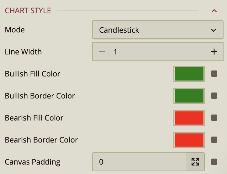
Mode – A dropdown list that determines the display style of the chart. Options include:
Candlestick (default) – Displays price movements using candlestick shapes.
Bar – Displays price movements using OHLC (Open-High-Low-Close) bars.
Line Width – Specifies the thickness of the candlestick wicks or bars. Accepts a numeric value.
Bullish Fill Color – Sets the fill color of bullish (upward) candlesticks. Accepts a color value. Default: Green.
Bullish Border Color – Sets the border color of bullish candlesticks. Accepts a color value. Default: Green.
Bearish Fill Color – Sets the fill color of bearish (downward) candlesticks. Accepts a color value. Default: Red.
Bearish Border Color – Sets the border color of bearish candlesticks. Accepts a color value. Default: Red.
Canvas Padding – Defines the amount of spacing (in pixels) between the chart area and the edge of the canvas. Accepts a numeric value.
Moving Average Style

Maintain Color Assignments: Toggle this to True if you want to manually assign specific colors to individual data values instead of using automatic color mapping.
Palette: Lets you customize the color scheme applied to the chart. Use the dropdown to choose from available color palettes based on the current Theme.
Graph Opacity: Controls the transparency of the chart. Set to 0% for fully transparent or 100%for fully opaque.
Line Style – Defines the curve or shape of the line. Choose from:
Default – Straight lines between data points.
Spline – Smooth, curved lines between data points.
Step – Right-angled lines that connect points in a stepped pattern.
Line Type – Sets the visual style of the line. Choose Solid for an unbroken line or Dashed for a line made of dashes.
Line Thickness – Specifies the thickness of the line in pixels. Enter a numeric value.
Show Null As – Determines how the chart displays null (missing) values. Choose from:
Connected – Joins the points on either side of the null value with a line.
Gaps – Leaves an empty space where the null value occurs.
Zeros – Treats null values as zero.
Show Symbol – Toggles the display of symbols at each data point. When set to True, additional symbol properties appear:
Symbol Shape – Choose the shape for the marker: Dot, Box, Triangle, Diamond, Plus, or X.
Symbol Size – Specifies the size of the symbol in pixels. Enter a numeric value.
Symbol Fill – Sets the fill color inside the symbol.
Symbol Stroke – Sets the border color (stroke) around the symbol.
Moving Average Legend
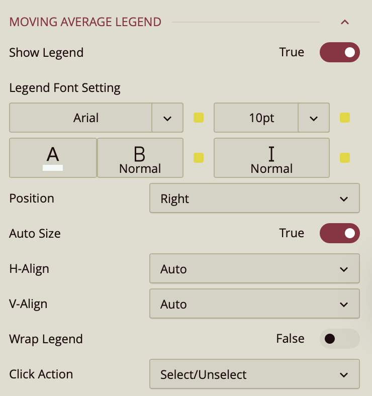
By default, the Show Legend toggle is set to False. To include a title for the legend, enable the Title toggle as well. You can customize the title by setting the Font Family (e.g., Arial), Font Size, Text Color, Font Weight (such as bold), and applying Italic styling if desired.
The Position property allows you to position the legend title to the left, center, or right of the chart area.
The legend is set to Auto Size by default. To manually define the legend size, disable this setting by setting Auto Sizeto False. You can also control the Horizontal and Vertical Alignment, which are both set to Auto by default but can be changed using dropdown options. To allow legend labels to wrap across lines, set the Wrap Legend option to True.
Data Visualization
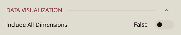
Include All Dimensions – When enabled, ensures that all available dimension values are included in the visualization, even if they have no corresponding measure values. This can help maintain consistent category representation across views. Default: Off.
Tooltip
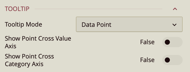
Tooltip Mode – Determines how tooltips are displayed when hovering over the chart:
None – Disables tooltips.
Data Point (default) – Shows a tooltip for the specific data point under the pointer.
Category – Shows a tooltip for all data points that share the same category value.
Show Point Cross Value Axis – Draws a line from the hovered point to the value axis, making it easy to identify the exact value.
Show Point Cross Category Axis – Draws a line from the hovered point to the category axis, making it easy to identify the exact category.
Axis (Category)
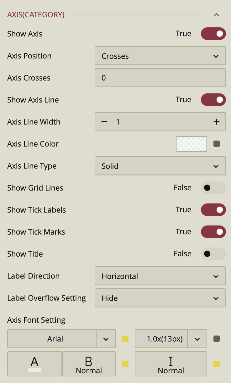
Show Axis – Toggles the visibility of the X-axis. Default is On.
Max Value / Min Value – Define the numeric upper and lower bounds for the axis scale. Leaving these blank allows the chart to automatically determine the range based on the data.
Interval – Sets the spacing between axis tick marks. If left blank, the chart automatically calculates an appropriate interval.
Axis Position – Determines the placement of the X-axis relative to the chart area. Options:
Crosses (default) – Positions the axis at the crossing point defined by Axis Crosses.
Bottom – Places the axis along the bottom edge of the chart.
Top – Places the axis along the top edge of the chart.
Axis Crosses – Numeric value indicating the point on the opposite axis where this axis intersects.
Show Axis Line – Toggles the visibility of the axis baseline. Default is On.
Axis Line Width / Color / Type – Control the thickness, color, and style (solid or dashed) of the axis line.
Show Grid Lines – Toggles horizontal grid lines extending from axis tick marks into the chart. Default is Off.
Show Tick Labels – Toggles the display of numeric or category labels along the axis.
Show Tick Marks – Toggles small marks indicating individual axis intervals.
Show Title – Toggles the display of an axis title. Default is Off.
Format – Determines how axis values are displayed: General(default), Number, Currency, Percentage, or Custom.
Display Unit – Scales displayed values to a chosen unit: Auto (default), None, Thousands, Millions, Billions, Trillions.
Label Direction – Sets the orientation of axis labels: Horizontal (default), Vertical, Diagonal.
Label Overflow Setting – Defines how overflowing labels are handled: Hide (default), Ellipsis, Wrap.
Axis Font Setting – Controls the font family, size, color, weight, and style for axis labels
Value Axis
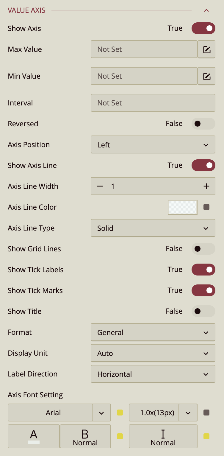
Show Axis – Toggles the visibility of the X-axis. Default is On.
Max Value / Min Value – Define the numeric upper and lower bounds for the axis scale. Leaving these blank allows the chart to automatically determine the range based on the data.
Interval – Sets the spacing between axis tick marks. If left blank, the chart automatically calculates an appropriate interval.
Axis Position – Determines the placement of the X-axis relative to the chart area. Options:
Crosses (default) – Positions the axis at the crossing point defined by Axis Crosses.
Bottom – Places the axis along the bottom edge of the chart.
Top – Places the axis along the top edge of the chart.
Axis Crosses – Numeric value indicating the point on the opposite axis where this axis intersects.
Show Axis Line – Toggles the visibility of the axis baseline. Default is On.
Axis Line Width / Color / Type – Control the thickness, color, and style (solid or dashed) of the axis line.
Show Grid Lines – Toggles horizontal grid lines extending from axis tick marks into the chart. Default is Off.
Show Tick Labels – Toggles the display of numeric or category labels along the axis.
Show Tick Marks – Toggles small marks indicating individual axis intervals.
Show Title – Toggles the display of an axis title. Default is Off.
Format – Determines how axis values are displayed: General(default), Number, Currency, Percentage, or Custom.
Display Unit – Scales displayed values to a chosen unit: Auto (default), None, Thousands, Millions, Billions, Trillions.
Label Direction – Sets the orientation of axis labels: Horizontal (default), Vertical, Diagonal.
Label Overflow Setting – Defines how overflowing labels are handled: Hide (default), Ellipsis, Wrap.
Axis Font Setting – Controls the font family, size, color, weight, and style for axis labels.