-
Interactive DashboardsCreate interactive BI dashboards with dynamic visuals.
-
End-User BI ReportsCreate and deploy enterprise BI reports for use in any vertical.
-
Wyn AlertsSet up always-on threshold notifications and alerts.
-
Localization SupportChange titles, labels, text explanations, and more.
-
Wyn ArchitectureA lightweight server offers flexible deployment.
-
 Wyn Enterprise 7.1 is ReleasedThis release emphasizes Wyn document embedding and enhanced analytical express...
 -
 Choosing an Embedded BI Solution for SaaS ProvidersAdding BI features to your applications will improve your products, better serve your customers, and more. But where to start? In this guide, we discuss the many options.
-
Visual GalleryInteractive sample dashboards and reports.
-
BlogExplore Wyn, BI trends, and more.
-
WebinarsDiscover live and on-demand webinars.
-
Customer SuccessVisualize operational efficiency and streamline manufacturing processes.
-
Knowledge BaseGet quick answers with articles and guides.
-
VideosVideo tutorials, trends and best practices.
-
WhitepapersDetailed reports on the latest trends in BI.
-
 Choosing an Embedded BI Solution for SaaS ProvidersAdding BI features to your applications will impr...
 -

- Getting Started
- Administration Guide
-
User Guide
- An Introduction to Wyn Enterprise
- Document Portal for End Users
- Data Governance and Modeling
- View and Manage Documents
- Working with Resources
- Working with Reports
-
Working with Dashboards
- Tour the Dashboard Designer
- Create a Dashboard
- Configure Dashboard
- Dashboard Data Binding
-
Scenarios
- Common Scenario Properties
-
Charts
- Common Chart Properties
- Column Chart
- Range Column Chart
- Column Chart - Breakdown of Properties
- Stacked Column Chart
- Percent Stacked Column Chart
- Bar Chart
- Range Bar Chart
- Stacked Bar Chart
- Percent Stacked Bar Chart
- Area Chart
- Range Area Chart
- Stacked Area Chart
- Percent Stacked Area Chart
- Line Chart
- Pie Chart
- Donut Chart
- Rose Chart
- Radial Stacked Bar Chart
- Sunburst Chart
- Bar Chart in Polar Coordinates
- Stacked Bar Chart in Polar Coordinates
- Radar Chart
- Filled Radar Chart
- Scatter Chart
- Bubble Chart
- Treemap
- Candlestick Chart
- Funnel Chart
- Card Chart
- Combined Chart
- Decomposition Tree
- Tables
- Indicators
- Maps
- Slicers
- Others
- Topology
- ECharts
- 3D Scenes
- Floorplan
- Component Templates
- Appearance
- Component Management
- Parameters
- Interactions
- Finalize Your Dashboard
- Using AI in Wyn
- Working with Notebooks
- Wyn Analytical Expressions
- Section 508 Compliance
- Subscribe to RSS Feed for Wyn Builds Site
- Developer Guide
Column Chart - Breakdown of Properties
Customize the Chart Style
The Chart Style section contains the visual and formatting settings that define the appearance of your column chart. These options are managed in the Inspector Panel and include layout, spacing, color, and stylistic adjustments that help you tailor the chart to your dashboard’s design requirements.
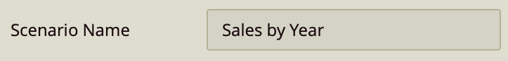
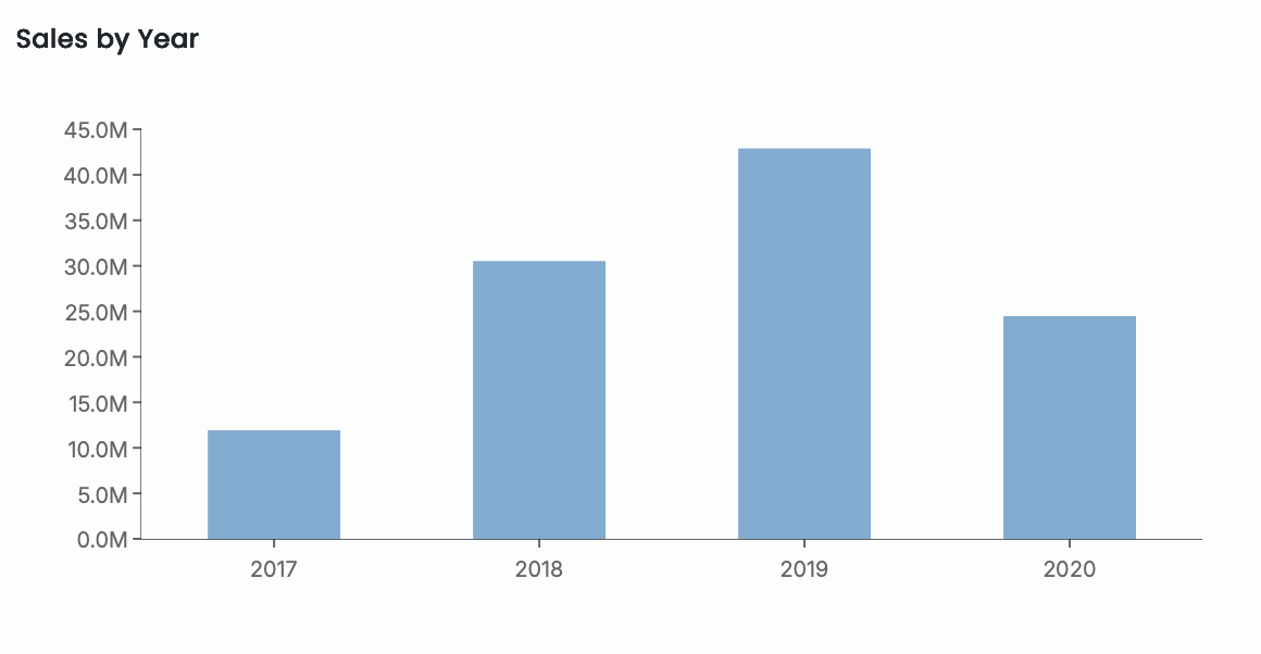
Scenario Name
The Scenario Name is the label shown in Wyn’s Explorer.
Choose a name that reflects the purpose of the visualization.
For more details, see Explorer documentation.
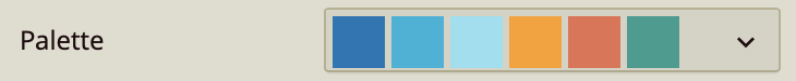
Palette
Controls whether the chart uses theme colors or custom colors.
Off (default): chart uses the dashboard theme.
On: unlocks manual color selection for each column.
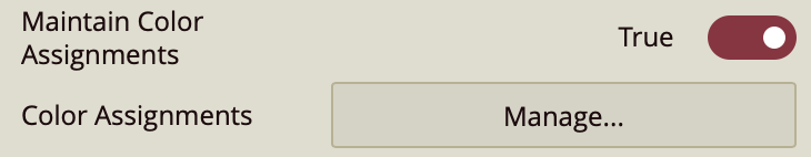
Color Assignments
Defines custom colors when Maintain Color Assignments is enabled.
Assign colors to individual categories or series.
Use when theme colors do not meet your design needs.
Graph Opacity
Adjusts the transparency of the columns.
Default is 100% (fully opaque).
Lower values create translucent columns for layered or subtle visual styles.
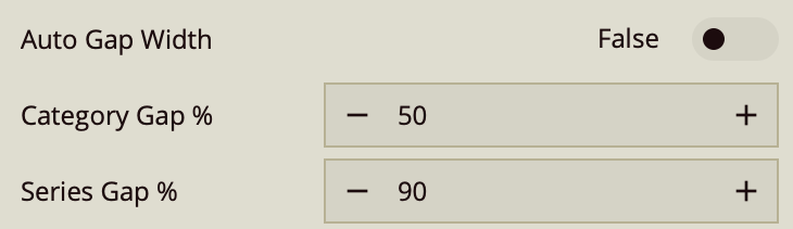
Auto Gap Width
Automatically manages spacing between columns.
On: Wyn determines optimal spacing.
Off: manually set Category Gap and Series Gap.
Category Gap controls spacing between categories; Series Gap controls spacing within grouped columns.
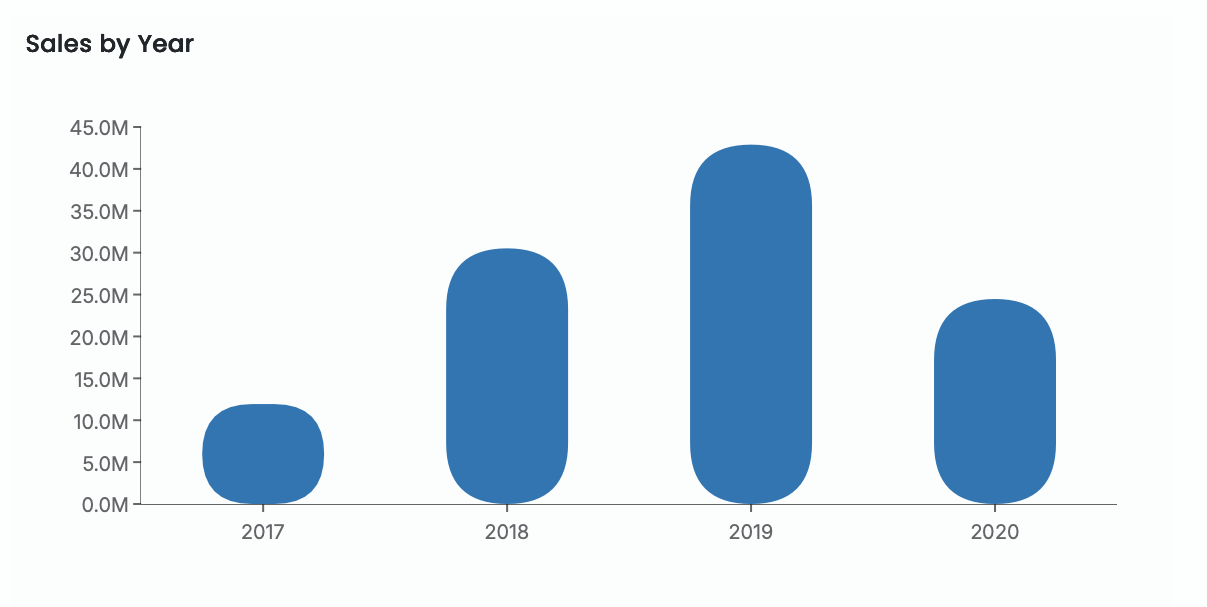
Corner Radius
Rounds the edges of the columns.
Apply a uniform radius or expand to set values per corner.
Use for softer, more modern visual styling.
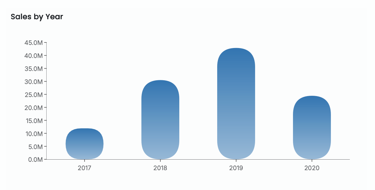
Auto Gradient
Applies a gradient fill to column colors.
On: Wyn auto-generates gradient effects.
Off: columns use flat colors.
Padding
Adds spacing between the chart and the scenario’s boundaries.
Increase padding for a more open layout.
Reduce padding to maximize plot area.