-
Interactive DashboardsCreate interactive BI dashboards with dynamic visuals.
-
End-User BI ReportsCreate and deploy enterprise BI reports for use in any vertical.
-
Wyn AlertsSet up always-on threshold notifications and alerts.
-
Localization SupportChange titles, labels, text explanations, and more.
-
Wyn ArchitectureA lightweight server offers flexible deployment.
-
 Wyn Enterprise 7.1 is ReleasedThis release emphasizes Wyn document embedding and enhanced analytical express...
 -
 Choosing an Embedded BI Solution for SaaS ProvidersAdding BI features to your applications will improve your products, better serve your customers, and more. But where to start? In this guide, we discuss the many options.
-
Embedded BIEmbed reporting & analytics within your own custom apps.
-
Self-ServiceEnable users to create custom ad hoc reports and dashboards.
-
MultitenancyEnhance your SaaS apps with a multitenant BI platform.
-
Data Governance and ModelingTransform raw data into insights quickly to reveal trends.
-
Scheduled DistributionSend data insights via scheduled email and chat notifications.
-
Extensible SecurityWyn delivers extensible security for your access control needs.
-
Visual GalleryInteractive sample dashboards and reports.
-
BlogExplore Wyn, BI trends, and more.
-
WebinarsDiscover live and on-demand webinars.
-
Customer SuccessVisualize operational efficiency and streamline manufacturing processes.
-
Knowledge BaseGet quick answers with articles and guides.
-
VideosVideo tutorials, trends and best practices.
-
WhitepapersDetailed reports on the latest trends in BI.
-
 Choosing an Embedded BI Solution for SaaS ProvidersAdding BI features to your applications will impr...
 -

- Getting Started
- Administration Guide
-
User Guide
- An Introduction to Wyn Enterprise
- Document Portal for End Users
- Data Governance and Modeling
- View and Manage Documents
- Working with Resources
- Working with Reports
-
Working with Dashboards
- Tour the Dashboard Designer
- Create a Dashboard
- Dashboard Data Binding
- Scenarios
- Appearance
- Component Management
- Parameters
- Interactions
- Finalize Your Dashboard
- Using AI in Wyn
- Working with Notebooks
- Wyn Analytical Expressions
- Section 508 Compliance
- Subscribe to RSS Feed for Wyn Builds Site
- Developer Guide
Focus

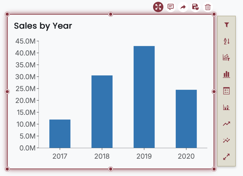
The Focus button is one of the data exploration buttons that appears when a scenario (such as a chart or table) is selected in a dashboard. When clicked, it enlarges the selected scenario to fill the entire dashboard canvas, helping users analyze data in greater detail without distractions from other components.
What Focus Mode Does
Maximizes the selected scenario to occupy the full dashboard space.
Hides other dashboard components temporarily for a cleaner, single-visual view.
Improves readability, especially for dense data visualizations or large data sets.
Interactive Behavior in Focus Mode
Depending on the visualization type, Focus may also enhance the way you interact with data:
Column Charts: Enables horizontal scrolling when there are too many data points to fit in the available space.
Bar Charts: Enables vertical scrolling.
Other Chart Types: Behavior varies based on chart layout and available space, but focus mode always enlarges the component for improved visibility.
How to Use
Select a scenario within the dashboard.
Click the Focus button from the data exploration options.
The selected scenario expands to fill the entire canvas area.
To exit focus mode, simply click the Focus button again. This returns the scenario to its original size and restores the full dashboard layout.
Use Cases
Viewing long category labels or many data points in charts like column or line charts.
Isolating a specific visual to present or analyze without dashboard-level noise.
Improving accessibility for users who need larger, clearer visualizations.