-
Interactive DashboardsCreate interactive BI dashboards with dynamic visuals.
-
End-User BI ReportsCreate and deploy enterprise BI reports for use in any vertical.
-
Wyn AlertsSet up always-on threshold notifications and alerts.
-
Localization SupportChange titles, labels, text explanations, and more.
-
Wyn ArchitectureA lightweight server offers flexible deployment.
-
 Wyn Enterprise 7.1 is ReleasedThis release emphasizes Wyn document embedding and enhanced analytical express...
 -
 Choosing an Embedded BI Solution for SaaS ProvidersAdding BI features to your applications will improve your products, better serve your customers, and more. But where to start? In this guide, we discuss the many options.
-
Visual GalleryInteractive sample dashboards and reports.
-
BlogExplore Wyn, BI trends, and more.
-
WebinarsDiscover live and on-demand webinars.
-
Customer SuccessVisualize operational efficiency and streamline manufacturing processes.
-
Knowledge BaseGet quick answers with articles and guides.
-
VideosVideo tutorials, trends and best practices.
-
WhitepapersDetailed reports on the latest trends in BI.
-
 Choosing an Embedded BI Solution for SaaS ProvidersAdding BI features to your applications will impr...
 -

- Getting Started
- Administration Guide
-
User Guide
- An Introduction to Wyn Enterprise
- Document Portal for End Users
- Data Governance and Modeling
- View and Manage Documents
- Working with Resources
- Working with Reports
-
Working with Dashboards
- Tour the Dashboard Designer
- Create a Dashboard
- Dashboard Data Binding
- Scenarios
- Appearance
- Component Management
- Parameters
- Interactions
- Finalize Your Dashboard
- Using AI in Wyn
- Working with Notebooks
- Wyn Analytical Expressions
- Section 508 Compliance
- Subscribe to RSS Feed for Wyn Builds Site
- Developer Guide
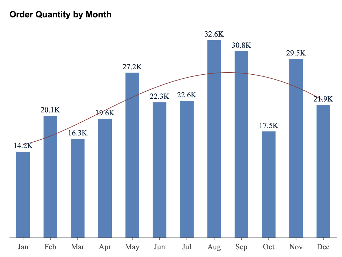
Trend Line
A trend line is a visual guide that shows the general direction or pattern of your data points. It helps you understand overall trends — such as whether your values are increasing, decreasing, or following a specific pattern — even when the data fluctuates.
Add a Trend Line
Select the chart you created.
When the chart is selected, the action buttons appear on the right-hand side of the designer.
Click the Trend Line button.
A panel appears where you can configure the trend line properties.
Trend Line Type
In the Type dropdown, you can select the kind of trend line you want to apply.
None — No trend line is applied.
Linear — Displays a straight line that best fits your data. Use this when your data increases or decreases at a steady rate.
Polynomial — Displays a curved line that can model data that rises and falls. Use this when your data shows fluctuations or a single peak/trough (for example, seasonal trends).
Power — Displays a curved line that is useful when your data increases at a specific rate (e.g., y = a·x^b). Works best with positive values.
Logarithmic — Displays a line that rises or falls quickly and then levels off. Use this when the rate of change decreases over time.
Exponential — Displays a line that increases or decreases at an increasingly higher rate (e.g., population growth, compound interest).
Fourier — Displays a wave-like curve suitable for cyclical or periodic patterns that repeat over time.
Degree
For Polynomial and Fourier trend lines, you can specify the Degree on the right-hand side of the panel.
The degree determines how complex the curve is.
A lower degree (e.g., 2) captures a simple curve (one rise and fall).
A higher degree (e.g., 3 or 4) allows for more inflection points (multiple ups and downs).
Use a higher degree only if the data clearly shows multiple cycles — otherwise, the line may overfit random fluctuations.
Line Style
The Line Style dropdown allows you to control the appearance of the trend line.
Solid — A continuous line (default).
Dashed — A dashed or broken line.
This helps distinguish the trend line from the main data series if needed.
Line Width
The Line Width property defines the thickness of the trend line.
Enter a numeric value to adjust how bold or subtle the line appears.
A larger value creates a thicker line, while a smaller value keeps it thin and minimal.
Line Color
The Line Color property lets you customize the color of the trend line.
Use the color picker to select a preferred color.
This helps differentiate multiple trend lines or align the line’s color with your dashboard theme.
Scope
The Scope setting determines how the trend line is calculated when your chart contains groups or categories:
Total — The trend line is calculated based on all data points in the chart.
Group — A separate trend line is calculated for each group (for example, each region, product category, or series).
Use Total to show the overall pattern across all data, or Group to show the trend within each subgroup.
Apply or Confirm
Once you’ve set the trend line properties, you can click Apply to preview how the line looks on the chart.
If you are satisfied with the result, click OK to confirm your changes.
Example
Here is an example chart using the Adventure Works data source, showing a Polynomial trend line that highlights the overall pattern of monthly order quantity throughout the year.