-
Interactive DashboardsCreate interactive BI dashboards with dynamic visuals.
-
End-User BI ReportsCreate and deploy enterprise BI reports for use in any vertical.
-
Wyn AlertsSet up always-on threshold notifications and alerts.
-
Localization SupportChange titles, labels, text explanations, and more.
-
Wyn ArchitectureA lightweight server offers flexible deployment.
-
 Wyn Enterprise 7.1 is ReleasedThis release emphasizes Wyn document embedding and enhanced analytical express...
 -
 Choosing an Embedded BI Solution for SaaS ProvidersAdding BI features to your applications will improve your products, better serve your customers, and more. But where to start? In this guide, we discuss the many options.
-
Visual GalleryInteractive sample dashboards and reports.
-
BlogExplore Wyn, BI trends, and more.
-
WebinarsDiscover live and on-demand webinars.
-
Customer SuccessVisualize operational efficiency and streamline manufacturing processes.
-
Knowledge BaseGet quick answers with articles and guides.
-
VideosVideo tutorials, trends and best practices.
-
WhitepapersDetailed reports on the latest trends in BI.
-
 Choosing an Embedded BI Solution for SaaS ProvidersAdding BI features to your applications will impr...
 -

- Getting Started
- Administration Guide
-
User Guide
- An Introduction to Wyn Enterprise
- Document Portal for End Users
- Data Governance and Modeling
- View and Manage Documents
- Working with Resources
- Working with Reports
-
Working with Dashboards
- Tour the Dashboard Designer
- Create a Dashboard
- Dashboard Data Binding
- Scenarios
- Appearance
- Component Management
- Parameters
- Interactions
- Finalize Your Dashboard
- Using AI in Wyn
- Working with Notebooks
- Wyn Analytical Expressions
- Section 508 Compliance
- Subscribe to RSS Feed for Wyn Builds Site
- Developer Guide
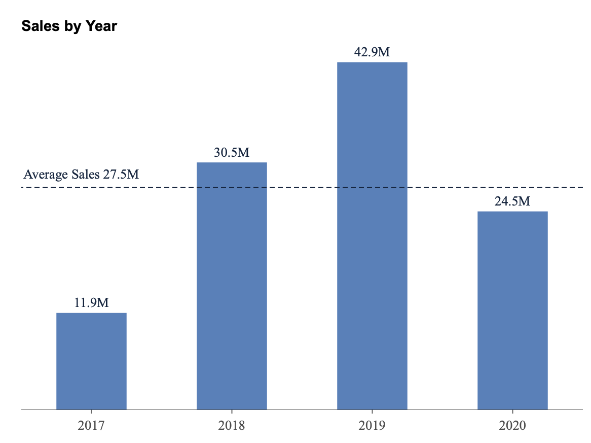
Reference Line
A Reference Line is a visual guide that helps highlight key values or thresholds on a chart, such as an average, minimum, or target value. It allows you to draw attention to important points within your data and make comparisons easier for report viewers.
You can add one or multiple reference lines to most chart types in Wyn to provide contextual insights — for example, marking the average sales value or a target quota line across a column or bar chart.
Adding a Reference Line
Select the chart on your report canvas.
Once the chart is selected, a set of action buttons appears on the right-hand side of the visualization.
Click the Reference Line button.
This opens the Reference Line window, where you can configure the properties of your reference line.
Reference Line Properties
Below is a description of each property available in the Reference Line window:
Name
You can give your reference line a custom name.
This name can optionally be displayed on the chart (see the Text property below).
By default, if you don’t enter a name, the name will match the selected line type (for example, Average Line or Max Line).
Show Name
Enable or disable whether the reference line name is displayed below the line.
Type
Choose the type of reference line you want to display.
From the dropdown, you can select from several predefined line types:
Constant Line – A line fixed at a specific value.
Max Line – Displays a line at the maximum value in the dataset.
Min Line – Displays a line at the minimum value.
Median Line – Displays a line at the median value.
Average Line – Displays a line at the average value.
Count Line – Displays a line representing the total count of data points.
Percentile Line – Displays a line at a specific percentile (for example, the 90th percentile).
Line Style
Defines the appearance of the line itself.
The default style is dashed, but you can change it to solid from the dropdown.
Scope
Determines the range of data that the reference line applies to.
There are three scope options:
Total – The reference line is calculated across all data in the chart.
Group – The reference line is calculated separately for each group or category (for example, a line per region or per product category).
Trellis Cell – Applies when using a Trellis chart (a grid of small multiples). The reference line is calculated and displayed separately within each trellis cell.
Line Width
Specifies the thickness of the reference line. Enter a numeric value to increase or decrease the width.
Line Color
Choose a color for the line using the color picker.
Text
Determines what label appears with the reference line.
You can choose from:
None – No text displayed.
Name – Displays only the reference line’s name.
Name and Value – Displays both the name and the calculated value.
Position
Sets where the label (name or name and value) appears relative to the chart.
Available positions include:
Top Left
Top Center
Top Right
Bottom Left
Bottom Center
Bottom Right
Font Style
Customize the appearance of the label text, including its color, weight (bold/regular), and font style.
Example
Here is an example of a Reference Line added to a chart created using the Adventure Works data source.
After creating the chart, select it, click the Reference Line action button, and set the following:
Type: Average Line
Scope: Total
Line Style: Dashed
Line Color: Blue
Text: Name and Value
Position: Top Left
This adds an average sales line across the chart, allowing you to visually compare how each value relates to the overall average.