- Getting Started
- Administration Guide
-
User Guide
- An Introduction to Wyn Enterprise
- Document Portal for End Users
- Data Governance and Modeling
- View and Manage Documents
- Working with Resources
- Working with Reports
-
Working with Dashboards
- Tour the Dashboard Designer
- Create a Dashboard
- Configure Dashboard
- Dashboard Data Binding
-
Scenarios
- Global Inspector Properties
-
Charts
- Common Chart Properties
- Column Chart
- Range Column Chart
- Stacked Column Chart
- Percent Stacked Column Chart
- Bar Chart
- Range Bar Chart
- Stacked Area Chart
- Stacked Bar Chart
- Range Area Chart
- Percent Stacked Bar Chart
- Percent Stacked Area Chart
- Area Chart
- Line Chart
- Pie Chart
- Donut Chart
- Rose Chart
- Sunburst Chart
- Radial Stacked Bar Chart
- Bar Chart in Polar Coordinates
- Stacked Bar Chart in Polar Coordinates
- Radar Chart
- Filled Radar Chart
- Scatter Chart
- Bubble Chart
- Treemap
- Candlestick Chart
- Funnel Chart
- Card Chart
- Combined Chart
- Decomposition Tree
- Indicators
- Tables
- Maps
- Slicers
- Others
- Topology
- ECharts
- 3D Scenes
- Floorplan
- Component Templates
- Appearance
- Component Management
- Parameters
- Interactions
- Finalize Your Dashboard
- Using AI in Wyn
- Working with Notebooks
- Wyn Analytical Expressions
- Section 508 Compliance
- Subscribe to RSS Feed for Wyn Builds Site
- Developer Guide
Data Visualization
The Data Visualization settings control how categorical values and dimensions are displayed within a chart. These options help you refine how data is grouped, highlighted, and represented—even in cases where certain categories have no underlying values. The two primary features in this section are Top N Grouping and Include All Dimensions.
Top N Grouping
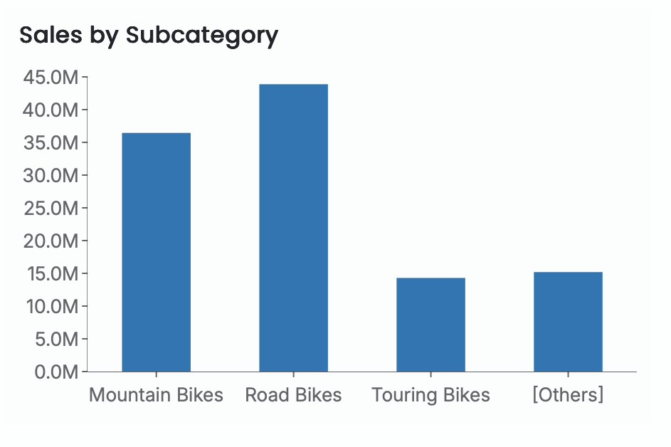
Top N Grouping allows you to focus your visualization on the highest-performing categories by displaying only the top N results and consolidating all remaining categories into a single Other group. This makes it easier to compare your most significant values against the rest of the dataset without clutter or noise.
Once Top N Grouping is enabled, you can specify how many top categories to display. The default is 3, but you can set any number based on your analysis needs.
This feature is particularly useful when you want to highlight leading contributors, show concentration of values, or simplify complex datasets by grouping long tails.
Note: Top N Grouping is available only for the following visualizations:
Column Chart, Stacked Column Chart, Percent Stacked Column Chart, Bar Chart, Stacked Bar Chart, Percent Stacked Bar Chart, Area Chart, Stacked Area Chart, Percent Stacked Area Chart, Line Chart, Pie Chart, Donut Chart, Radar Chart, Filled Radar Chart, Bubble Chart, Treemap Chart, and Funnel Chart.
Here is an example of a column chart that displays Sales by Subcategory for the top three categories.

Include All Dimensions
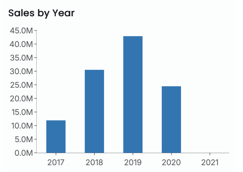
Include All Dimensions ensures that all dimension members appear in the visualization—even when no data values exist for them. When this option is enabled, categories without associated measures are still displayed on the axis, allowing the viewer to see the full range of possible dimension values rather than only those with data.
This is useful when you want to:
Show continuity across time periods
Display complete category ranges
Highlight missing or zero-value data explicitly
For example, in a Sales by Year column chart, the dataset may not contain values for 2021. When Include All Dimensions is enabled, the year 2021 still appears on the axis, even though no bar is plotted for that year.


