-
Interactive DashboardsCreate interactive BI dashboards with dynamic visuals.
-
End-User BI ReportsCreate and deploy enterprise BI reports for use in any vertical.
-
Wyn AlertsSet up always-on threshold notifications and alerts.
-
Localization SupportChange titles, labels, text explanations, and more.
-
Wyn ArchitectureA lightweight server offers flexible deployment.
-
 Wyn Enterprise 7.1 is ReleasedThis release emphasizes Wyn document embedding and enhanced analytical express...
 -
 Choosing an Embedded BI Solution for SaaS ProvidersAdding BI features to your applications will improve your products, better serve your customers, and more. But where to start? In this guide, we discuss the many options.
-
Visual GalleryInteractive sample dashboards and reports.
-
BlogExplore Wyn, BI trends, and more.
-
WebinarsDiscover live and on-demand webinars.
-
Customer SuccessVisualize operational efficiency and streamline manufacturing processes.
-
Knowledge BaseGet quick answers with articles and guides.
-
VideosVideo tutorials, trends and best practices.
-
WhitepapersDetailed reports on the latest trends in BI.
-
 Choosing an Embedded BI Solution for SaaS ProvidersAdding BI features to your applications will impr...
 -

- Getting Started
- Administration Guide
-
User Guide
- An Introduction to Wyn Enterprise
- Document Portal for End Users
- Data Governance and Modeling
- View and Manage Documents
- Working with Resources
- Working with Reports
-
Working with Dashboards
- Tour the Dashboard Designer
- Create a Dashboard
- Configure Dashboard
- Dashboard Data Binding
-
Scenarios
- Common Scenario Properties
-
Charts
- Common Chart Properties
- Column Chart
- Range Column Chart
- Column Chart - Breakdown of Properties
- Stacked Column Chart
- Percent Stacked Column Chart
- Bar Chart
- Range Bar Chart
- Stacked Bar Chart
- Percent Stacked Bar Chart
- Area Chart
- Range Area Chart
- Stacked Area Chart
- Percent Stacked Area Chart
- Line Chart
- Pie Chart
- Donut Chart
- Rose Chart
- Radial Stacked Bar Chart
- Sunburst Chart
- Bar Chart in Polar Coordinates
- Stacked Bar Chart in Polar Coordinates
- Radar Chart
- Filled Radar Chart
- Scatter Chart
- Bubble Chart
- Treemap
- Candlestick Chart
- Funnel Chart
- Card Chart
- Combined Chart
- Decomposition Tree
- Tables
- Indicators
- Maps
- Slicers
- Others
- Topology
- ECharts
- 3D Scenes
- Floorplan
- Component Templates
- Appearance
- Component Management
- Parameters
- Interactions
- Finalize Your Dashboard
- Using AI in Wyn
- Working with Notebooks
- Wyn Analytical Expressions
- Section 508 Compliance
- Subscribe to RSS Feed for Wyn Builds Site
- Developer Guide
Trellis Columns/Rows
Trellis Columns and Trellis Rows
Trellis Columns and Trellis Rows allow you to break a single visualization into multiple smaller charts based on a secondary grouping. Instead of filtering the chart to show one group at a time, trellis layouts display several charts simultaneously—either side by side or stacked vertically—making it easier to compare patterns across categories.
This technique is especially useful when you want to analyze how the same measure behaves across different groups while keeping scales, axes, and visual structure consistent.
Trellis Columns
Trellis Columns arrange charts side by side, with each column representing a distinct value from the trellis grouping.
To build a chart that displays data side by side, bind a field to the Trellis Columns slot in the Data Binding tab.
For example, this chart has:
Sales bound to the Values data binding slot
Category bound to the Axis (Category) data binding slot
Year bound to the Trellis Columns data binding slot
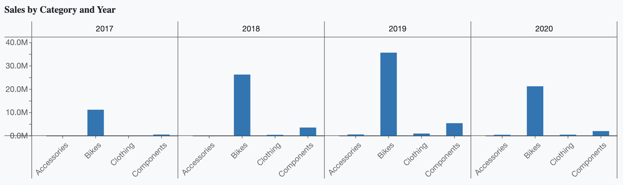
In this configuration, a separate chart is rendered for each year, allowing you to compare categories across years at a glance.
Trellis Rows
Trellis Rows arrange charts row by row, with each row representing a distinct value from the trellis grouping.
To build a chart that displays data vertically, bind a field to the Trellis Rows slot in the Data Binding tab.
For example, this chart has:
Sales are bound to the Values data binding slot
Category bound to the Axis (Category) data binding slot
Year bound to the Trellis Rows data binding slot
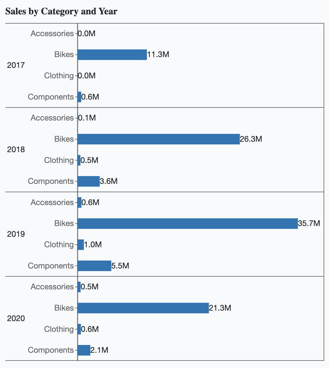
This configuration produces a separate chart for each year, stacked vertically, which is useful when horizontal space is limited or when reading trends from top to bottom.
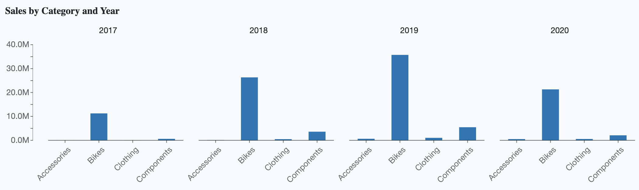
Trellis Properties
Once a trellis layout is applied, you can further customize its appearance and spacing using the Trellis properties available in the Inspector Panel.
Trellis Padding
The Trellis Padding settings control the spacing between individual charts and the borders of the trellis layout.
Increasing padding adds more space around each chart, which is particularly helpful when axis labels or titles are long. For example, in a column chart with lengthy category names, increasing the left-side padding ensures that labels fit within the trellis boundaries.
In the example below, the left padding has been increased to 25 because the "Accessories" data label was too long to fit within the available space.
You can adjust padding independently on each side by clicking the four-arrow control.
Trellis Border Color
You can customize the appearance of trellis borders by adjusting the Trellis Border Color and its opacity using the color picker.
If you want to remove trellis borders entirely, set the border opacity to 0, as shown in the example below.
Trellis Font Settings
You can further customize the appearance of trellis labels shown within the layout by adjusting the following font-related properties:
Font family
Font size
Font color
Font weight
Font style (italic or normal)
These settings help ensure that trellis labels remain readable and visually consistent with the rest of your report.