-
Interactive DashboardsCreate interactive BI dashboards with dynamic visuals.
-
End-User BI ReportsCreate and deploy enterprise BI reports for use in any vertical.
-
Wyn AlertsSet up always-on threshold notifications and alerts.
-
Localization SupportChange titles, labels, text explanations, and more.
-
Wyn ArchitectureA lightweight server offers flexible deployment.
-
 Wyn Enterprise 7.1 is ReleasedThis release emphasizes Wyn document embedding and enhanced analytical express...
 -
 Choosing an Embedded BI Solution for SaaS ProvidersAdding BI features to your applications will improve your products, better serve your customers, and more. But where to start? In this guide, we discuss the many options.
-
Visual GalleryInteractive sample dashboards and reports.
-
BlogExplore Wyn, BI trends, and more.
-
WebinarsDiscover live and on-demand webinars.
-
Customer SuccessVisualize operational efficiency and streamline manufacturing processes.
-
Knowledge BaseGet quick answers with articles and guides.
-
VideosVideo tutorials, trends and best practices.
-
WhitepapersDetailed reports on the latest trends in BI.
-
 Choosing an Embedded BI Solution for SaaS ProvidersAdding BI features to your applications will impr...
 -

- Getting Started
- Administration Guide
-
User Guide
- An Introduction to Wyn Enterprise
- Document Portal for End Users
- Data Governance and Modeling
- View and Manage Documents
- Working with Resources
- Working with Reports
-
Working with Dashboards
- Tour the Dashboard Designer
- Create a Dashboard
- Configure Dashboard
- Dashboard Data Binding
-
Scenarios
- Common Scenario Properties
-
Charts
- Common Chart Properties
- Column Chart
- Range Column Chart
- Column Chart - Breakdown of Properties
- Stacked Column Chart
- Percent Stacked Column Chart
- Bar Chart
- Range Bar Chart
- Stacked Bar Chart
- Percent Stacked Bar Chart
- Area Chart
- Range Area Chart
- Stacked Area Chart
- Percent Stacked Area Chart
- Line Chart
- Pie Chart
- Donut Chart
- Rose Chart
- Radial Stacked Bar Chart
- Sunburst Chart
- Bar Chart in Polar Coordinates
- Stacked Bar Chart in Polar Coordinates
- Radar Chart
- Filled Radar Chart
- Scatter Chart
- Bubble Chart
- Treemap
- Candlestick Chart
- Funnel Chart
- Card Chart
- Combined Chart
- Decomposition Tree
- Tables
- Indicators
- Maps
- Slicers
- Others
- Topology
- ECharts
- 3D Scenes
- Floorplan
- Component Templates
- Appearance
- Component Management
- Parameters
- Interactions
- Finalize Your Dashboard
- Using AI in Wyn
- Working with Notebooks
- Wyn Analytical Expressions
- Section 508 Compliance
- Subscribe to RSS Feed for Wyn Builds Site
- Developer Guide
Value Axis
The Value Axis displays the values of a chart. It defines how numeric data points are scaled, grouped, and ordered along the axis and corresponds directly to the Values slot in the Data Binding tab. For more information about how fields are assigned to data binding slots, see the Bind Data and Add Scenarios article.
Note
The Value Axis is a configurable property available for many chart types in Wyn, including Column Chart, Range Column Chart, Stacked Column Chart, Percent Stacked Column Chart, Bar Chart, Range Bar Chart, Stacked Bar Chart, Percent Stacked Bar Chart, Area Chart, Range Area Chart, Stacked Area Chart, Percent Stacked Area Chart, Line Chart, Radial Stacked Bar Chart, Bar Chart in Polar Coordinates, Stacked Bar Chart in Polar Coordinates, Radar Chart, Filled Radar Chart, Scatter Chart, Bubble Chart, and Candlestick Chart.
Disable the Value Axis
You can hide the Value Axis by setting Show Axis to False under Value Axis properties.
Disabling the Value Axis is particularly useful when value information is already displayed directly on the chart through data labels. In these scenarios, removing the axis can reduce visual clutter while preserving readability. For more details, see the Value Data Label section of the Data Labels article.
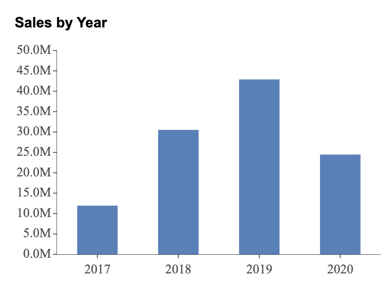
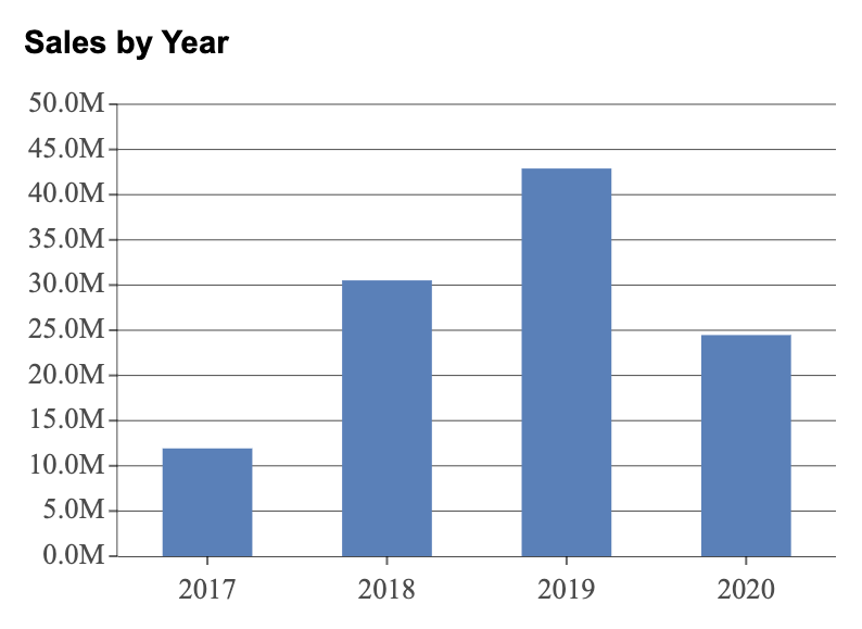
Max Value, Min Value, Interval
You can control the Max Value, Min Value, and Interval of your Value Axis by assigning a numeric value to each property.
For example, this chart has a Max Value of 50,000,000 (50M), a Min Value of 0, and an Interval of 5,000,000 (5M).
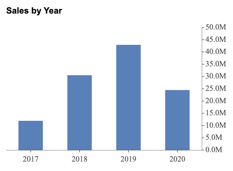
Axis Position
Automatically, the Axis Position is set to Left, but it can also be set to the right as in the example below.
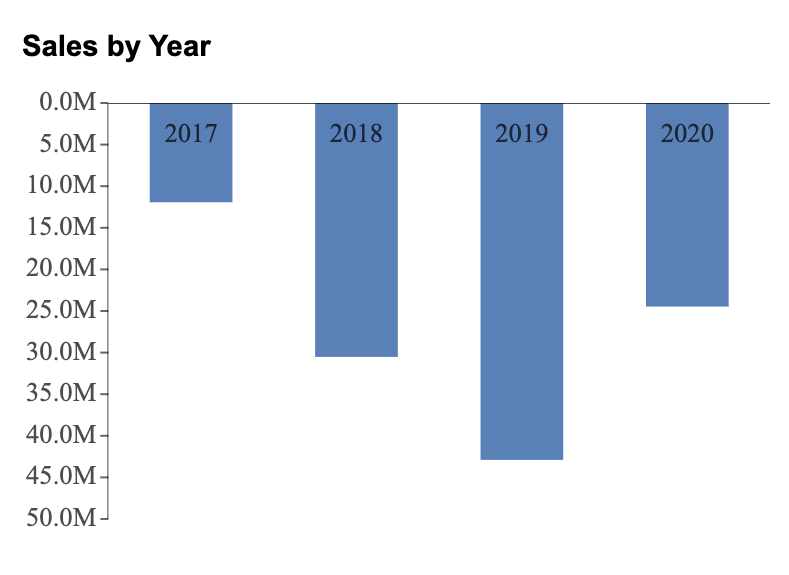
Reversed
You can reverse the Value Axis by enabling Reversed. When this option is enabled, values increase from top to bottom, and the categorical axis is automatically moved to the top of the chart, as shown in the example below.
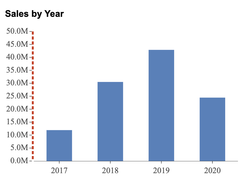
Axis Line Properties
You can disable the axis line by setting Show Axis Line to False. You can also customize the appearance of the Value Axis line by adjusting the following properties:
Axis Line Width
Axis Line Color
Axis Line Type (solid or dashed)
For example, the chart below has an axis line width of 3, an axis line color set to red, and an axis line type set to dashed.
Grid Line Properties
You can enable grid lines to improve readability by setting Show Grid Lines to True. Grid lines help you visually track data points across the chart and align them with the Value Axis.
You can further customize grid lines by adjusting the Grid Line Width, Grid Line Color, and Grid Line Type.
For example, in the chart below, grid lines have been enabled.
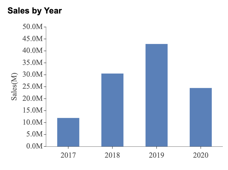
Show Tick Labels, Tick Marks, and Title
You can individually enable or disable Tick Labels, Tick Marks, and the Axis Title. By default, tick labels and tick marks are enabled, while the axis title is disabled.
If the Axis Title is enabled, you can also insert a Custom Title. In addition to this, the Axis Title displays the unit in the label. By default, the Display Units' Label is enabled.
For example, in the chart below, the chart has Tick Labels, Tick Marks, and an Axis Title.
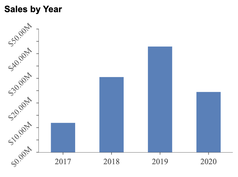
Format
You can control how values are displayed on the Value Axis by setting the Format property. Available options include General, Number, Currency, Percentage, or a custom format.
For example, in the chart below, the Value Axis format has been set to Currency.

Display Unit
The Display Unit of the Value Axis is set to Auto by default. You can manually set it to Auto, None, Thousands, Millions, Billions, or Trillions, depending on how you want values to be scaled and displayed.
Label Direction
You can change the orientation of Value Axis labels using the Label Direction property. Labels can be displayed horizontally, vertically, or diagonally.
For example, in the chart below, the Value Axis labels have been set to diagonal.
Axis Font Settings
You can further customize the appearance of Value Axis labels by adjusting font-related properties, including:
Font family
Font size
Font color
Font weight
Font style (italic or normal)
These settings allow you to align Value Axis labels with the overall visual design and branding of your dashboard.