- Getting Started
- Administration Guide
-
User Guide
- An Introduction to Wyn Enterprise
- Document Portal for End Users
- Data Governance and Modeling
- View and Manage Documents
- Working with Resources
- Working with Reports
-
Working with Dashboards
- Tour the Dashboard Designer
- Create a Dashboard
- Configure Dashboard
- Dashboard Data Binding
-
Scenarios
- Global Inspector Properties
-
Charts
- Common Chart Properties
- Column Chart
- Range Column Chart
- Stacked Column Chart
- Percent Stacked Column Chart
- Bar Chart
- Range Bar Chart
- Stacked Area Chart
- Stacked Bar Chart
- Range Area Chart
- Percent Stacked Bar Chart
- Percent Stacked Area Chart
- Area Chart
- Line Chart
- Pie Chart
- Donut Chart
- Rose Chart
- Sunburst Chart
- Radial Stacked Bar Chart
- Bar Chart in Polar Coordinates
- Stacked Bar Chart in Polar Coordinates
- Radar Chart
- Filled Radar Chart
- Scatter Chart
- Bubble Chart
- Treemap
- Candlestick Chart
- Funnel Chart
- Card Chart
- Combined Chart
- Decomposition Tree
- Indicators
- Tables
- Maps
- Slicers
- Others
- Topology
- ECharts
- 3D Scenes
- Floorplan
- Component Templates
- Appearance
- Component Management
- Parameters
- Interactions
- Finalize Your Dashboard
- Using AI in Wyn
- Working with Notebooks
- Wyn Analytical Expressions
- Section 508 Compliance
- Subscribe to RSS Feed for Wyn Builds Site
- Developer Guide
Axis (Category)
The Category Axis displays the primary grouping of a chart. It defines how data points are grouped and ordered along the axis and corresponds directly to the Axis (Category) slot in the Data Binding tab. For more information about how fields are assigned to data binding slots, see the Data Binding article.
Note
The Axis (Category) is a configurable property available for many chart types in Wyn, including Column Chart, Range Column Chart, Stacked Column Chart, Percent Stacked Column Chart, Bar Chart, Range Bar Chart, Stacked Bar Chart, Percent Stacked Bar Chart, Area Chart, Range Area Chart, Stacked Area Chart, Percent Stacked Area Chart, Line Chart, Radial Stacked Bar Chart, Bar Chart in Polar Coordinates, Stacked Bar Chart in Polar Coordinates, Radar Chart, Filled Radar Chart, Scatter Chart, Bubble Chart, and Candlestick Chart.
Disable the Category Axis
You can hide the Category Axis by setting Show Axis to False under Axis (Category) properties.
Disabling the Category Axis is particularly useful when category information is already displayed directly on the chart through data labels. In these scenarios, removing the axis can reduce visual clutter while preserving readability. For more details, see the Category Name Data Label section of the Data Labels article.
Axis Position
You can control where the Category Axis appears by setting the Axis Position property to Crosses, Bottom, or Top.
When Crosses is selected, the category axis intersects the value axis at a specific point. To define this intersection, set the Axis Crosses property to a numeric value.
For example, if Axis Position is set to Crosses and Axis Crosses is set to 5,000,000 (5M), the category axis will intersect the value axis at five million.
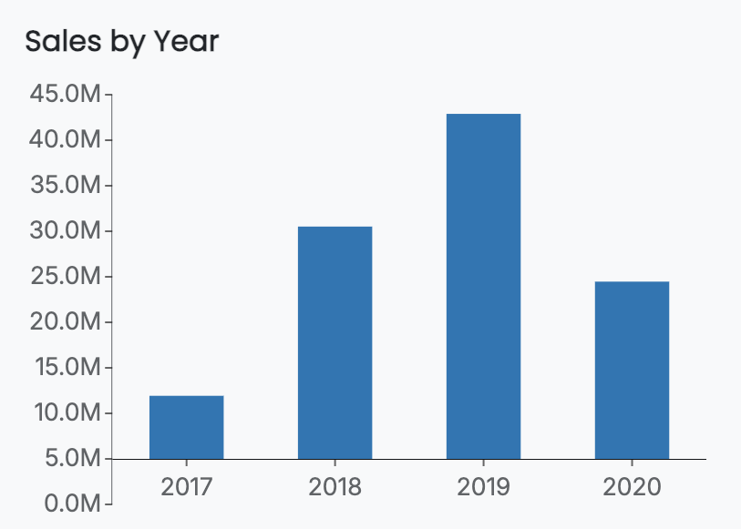
Alternatively, you can position the category axis at the Bottom of the chart or at the Top, depending on the layout and emphasis you want to achieve.
Axis Line Properties
You can customize the appearance of the Category Axis line by adjusting the following properties:
Axis Line Width
Axis Line Color
Axis Line Type (solid or dashed)
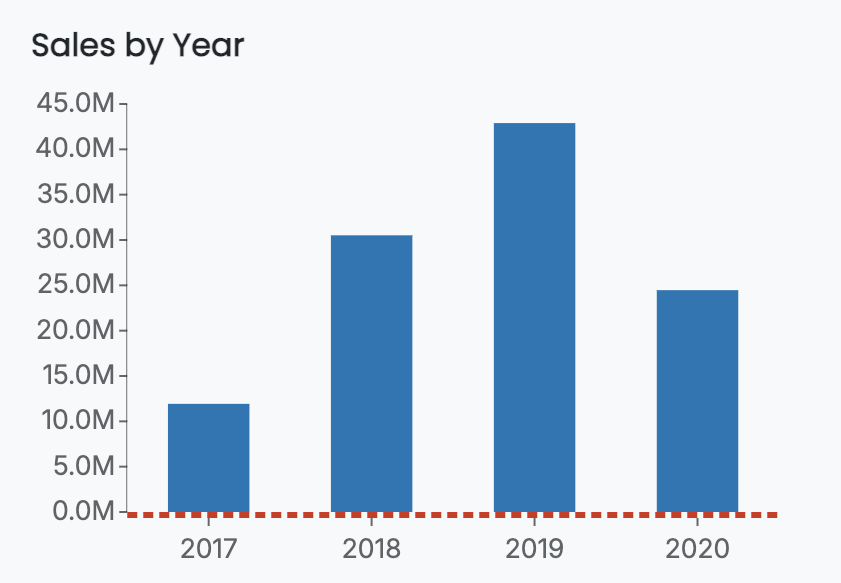
These settings allow you to visually emphasize or de-emphasize the axis. For example, the column chart below has an Axis Line Width of 3, an Axis Line Color in red, and an Axis Line Type set to Dashed. The Axis Position has been set to the Bottom of the chart.
Grid Line Properties
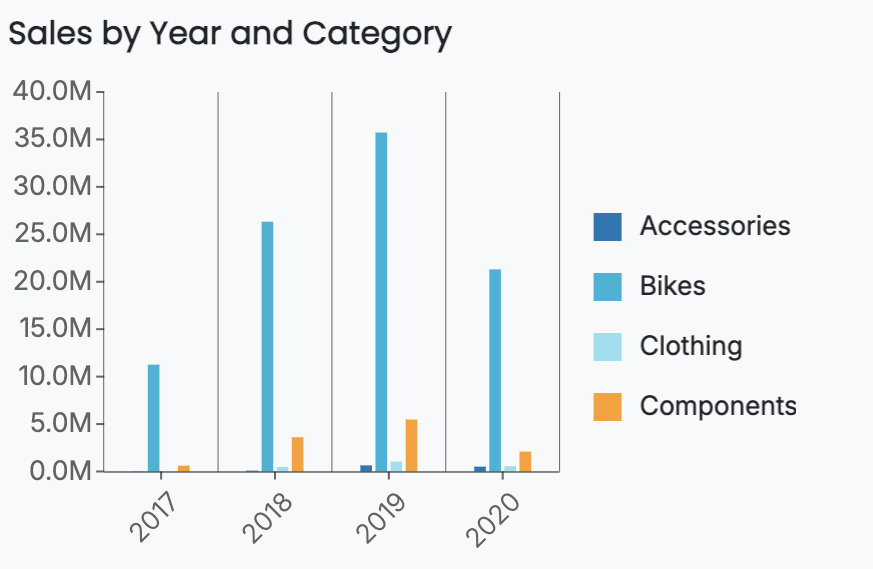
You can enable grid lines to improve readability by setting the Show Grid Lines toggle item to True. Grid lines can be customized using the following properties:
Grid line width
Grid line color
Grid line type (solid or dashed)
For example, this is a grouped column chart that has grid lines. For more information on grouped column charts, see the Grouped Column Chart section in the Column Charts article.
Show Tick Labels, Tick Marks, and Title
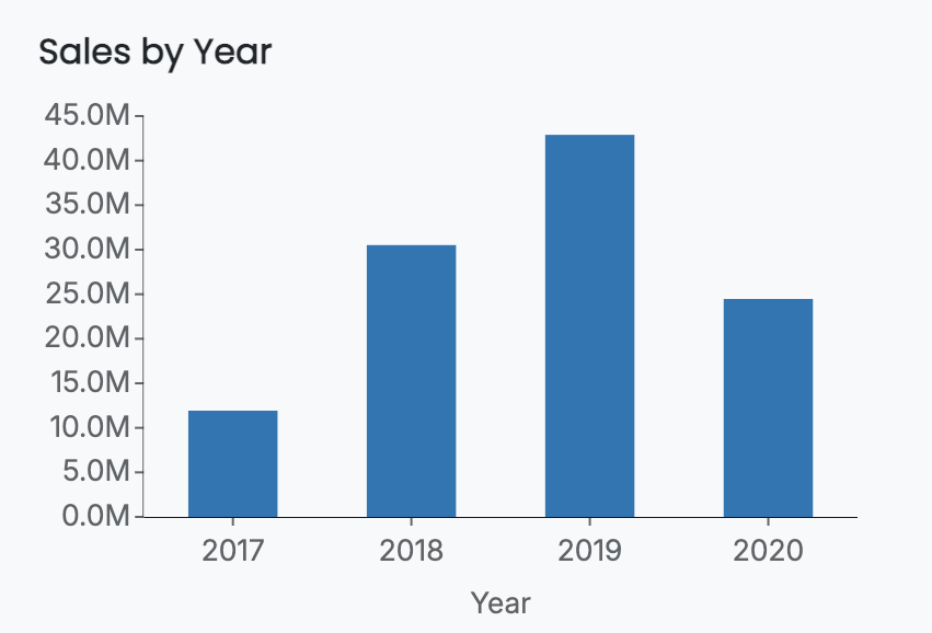
You can individually enable or disable Tick Labels, Tick Marks, and the Axis Title.
By default, tick labels and tick marks are enabled, while the axis title is disabled. For example, this is a chart that has all three enabled.
Label Direction
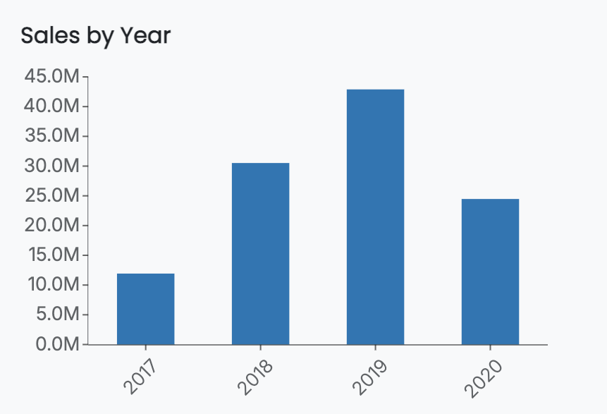
The Label Direction property controls the orientation of category labels. You can set the Label Direction to Horizontal, Vertical, or Diagonal.
For example, this chart has the axis labels set diagonally.
Label Overflow Settings
Label overflow settings control how category labels behave when they are too long to fit within the available space. You can choose to:
Hide overlapping labels to prevent crowding
Truncate labels using an Ellipsis (…) to show only the beginning of the label
Wrap labels onto multiple lines
For example, this chart has the Label Overflow setting set to Wrap.

Axis Font Settings
You can further customize the appearance of category axis labels by adjusting font-related properties, including:
Font family
Font size
Font color
Font weight
Font style (italic or normal)
These settings allow you to align axis labels with the overall visual design and branding of your dashboard.


